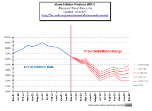
Historically, Stocks tend to soar in years when inflation is falling. But typically, inflation doesn't fall until the fed-funds rate rises above the current inflation rate... The last data we have as of this writing is that inflation was 6.45% in December, and the FED funds rate was 4.1%. That is still a significant gap. But inflation is already falling. Monthly inflation began a dramatic slowdown last July. Monthly inflation has fallen by 80% over that timeframe (bringing annual inflation down by 33%). At this point, the majority of our annual inflation occurred during the first six months of 2022. January through June of 2022 had an average of 1.02% inflation per month. The second … [Read more...]
Is the FED Tightening or Is Hyperinflation on the Horizon?
Recently a prophecy has been trending on YouTube. In it, the possibility of major upheaval in November is mentioned, combined with the possibility of hyperinflation. As I've mentioned before, beginning in March 2020, the FED created massive amounts of liquidity through Quantitative Easing in an effort to combat the monetary effects of shutting the country down due to the virus. If that is combined with a reduction in the quantity of goods and services created due to the virus or riots shutting down the means of production we could see hyperinflation. So that would play into fulfilling that prophesy. Back on April 1st, I wrote an article entitled Will the $2 Trillion Covid-19 Stimulus … [Read more...]
CPI Index Down but Annual Inflation Flat
The Bureau of Labor Statistics (BLS) released their monthly Consumer Price Index (CPI-U) and Inflation report for the year ending in August on September 16th. The CPI index fell slightly from 238.654 in July to 238.316 in August resulting in monthly deflation but Annual Inflation for the year ending in August was 0.20% up from 0.17% for the year ending in July. That means that something that cost $100 a year ago would cost $100.20 today. That is compared to the typical inflation of around 3% which would mean that something that cost $100 last year would cost $103 this year. The CPI-U index a year ago was 237.852 and is currently 238.316. On an Annual basis Energy fell 15.0% over the … [Read more...]
Active Trading Methodologies
There is a big difference between "Trading" and "Investing". Investors research companies and then based on the fundamentals of the company they buy stocks for the longer term and expect the growth prospects of the company and the industry and the overall economy to take care of the growth of their portfolio. "Active trading" on the other hand is much more like a full time job. It requires watching your investments much closer and buying and selling more often. Thus the commissions you pay are much higher and so finding a broker with low fees is also critical. Position Trading (Long Term) According to Investopedia "Many position traders will take a look at weekly or monthly charts to get … [Read more...]
A Reader Question About IRAs and Gold Stocks
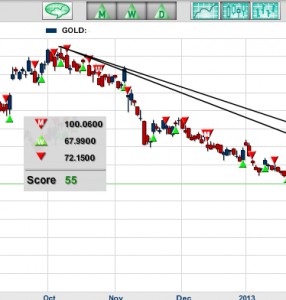
I recently got an excellent question from a longtime reader named Bob and I thought I would pass along some of what I told him. Bob has invested a good portion of his IRA in shares of Randgold Resources. The NASDAQ symbol is GOLD. Randgold Resources is a gold mining business based primarily in Mali. Its headquarters are in Jersey, the Channel Islands, it is listed on the London and the NASDAQ stock exchanges. Bob has been accumulating shares of Randgold because he feels that as a mining company it is a productive asset rather than physical gold (or paper derivatives of gold) which earns no interest (or dividends). Randgold peaked at around $127 back in October 2012 and has been trending … [Read more...]
What are Derivatives and How do they Work?
Derivatives Defined According to Dictionary.com the term "derivative" means 1. derived. or 2. not original; secondary. In the financial arena derivatives are derived from a basic commodity and can be a portion of that original commodity. They are essentially contracts between two or more people. You can think of derivatives as ways of "slicing and dicing" financial contracts. For instance, a normal bond could be broken into two parts. The first part would be the underlying asset itself and any appreciation thereon. The second part could be all the interest due on that bond. This way one investor would get more leverage on the appreciation of the bond while the other investor would … [Read more...]
What Does 8% Inflation Really Mean?

By Dennis Miller Eight percent is not good news. In my latest article I shared some reader feedback from our inflation survey, and in case you missed it, the Money Forever Reader Poll Inflation Rate is 8%. But what does that number really mean for us – seniors and savers trying to protect our buying power? It's time to read the tea leaves and find out. Up to Your Ass in Alligators You may remember the old poster that read, "When you are up to your ass in alligators, it's tough to remember the goal was to drain the swamp." You may have felt overwhelmed during the last few years, as the investment options for your retirement portfolio changed. You might read about the benefits of gold … [Read more...]
The Impact of Inflation on Savings
The obvious impact of inflation on your savings is that the purchasing power is erroded. This means that if you stash $100 under the mattress today and inflation is 3% per year when you come back a year from now your $100 will buy 3% less stuff. Put another way you would need $103 to buy the same amount of goods a year later. When you extend this to 10 years you might think that it would mean that you would need $130 to buy the same amount of goods but because of the effects of compounding you would actually need $134.39. You can use the Retirement Planning Calculator to calculate the impact of inflation on your savings. As time goes on the impact of "only" 3% inflation compounds making … [Read more...]
Inflation’s Effect on Retirement Savings
Inflation and Retirement The stock market crash of 2008 may have left you feeling a little nervous about investing your money in the market. The fear of losing everything to another recession or depression has caused many people to make “safer” investment choices, and some people aren’t even investing at all, choosing to place their money in a “high yield” savings account, instead. Unfortunately, "high yield" these days is still lower than the rate of inflation, causing you to actually lose money. Inflation Worse than a Crash Losing your money to inflation is actually much scarier than losing your money to a stock market crash. Stock market crashes are rare, but inflation is inevitable. … [Read more...]
Effects of Inflation on Savings
Inflation Effects Everyday we hear of commodity prices going up and the value of money going down. We've also heard of inflation and the global economic crisis having a far-reaching effects on the world economy. But have you ever stopped to think how inflation is affecting your everyday financial matters? How is it affecting your savings account? If you haven't given it much thought, perhaps it is time to do so. Below are few ways inflation affects your savings. By giving it a bit of thought, you can work out an alternate plan or be prepared, so you can keep more of your savings. Take a close look: Inflation Reduces the Value of Money: Initially you may have been able to buy … [Read more...]
