• Home
  • Related Sites
    • Financial Trend Forecaster
      • Moore Inflation Predictor
      • NYSE Rate of Change (ROC)
      • NASDAQ Rate of Change (ROC)
      • Crypto ROC- BTC & ETH
    • Unemployment Data
      • Historical Employment Data
      • Unemployment Rate Chart
      • Labor Force Participation Rate
    • Optio Money
    • Elliott Wave University
    • More Resources
  • Definitions
    • What is Inflation?
    • What is Core Inflation?
    • Inflation vs CPI
    • What is Deflation?
    • What is Disinflation?
    • What is Agflation?
    • What is Stagflation?
    • What is Hyperinflation?
    • What is Quantitative Easing?
    • What is Quantitative Tightening?
    • What is Velocity of Money?
    • What is Fiat Currency?
    • How Do I Calculate Inflation?
    • What are “Sticky Prices” and Why Do They Matter?
  • Featured Content
  • About Us
  • Feedback
    • Sitemap
  • Subscribe Now

InflationData.com

Your Place in Cyber Space for Inflation Data

CPIWidget-Jan26
  • Numerical Inflation Data
    • Current Inflation Rate
    • Monthly Inflation Rate (Moved)
    • Historical U.S. Inflation Rates
    • Historical CPI
  • Inflation Charts
    • Ann. Inf. Rate Chart
    • Long Term Inflation >
      • Ave. Inf. by Decade
      • Total Inf. by Decade
      • Inflation 1913-1919
      • Inflation 1920-1929
      • Inflation 1930-1939
      • Inflation 1940-1949
      • Inflation 1950-1959
      • Inflation 1960-1969
      • Inflation 1970-1979
    • Cumulative Inflation
    • FED Monetary Policy and Inflation
    • Inflation and Recession
    • Confederate Inflation (1861 – 1865)
    • Misery Index
    • The 3 Stages of Inflation
    • 15-Yr Inflation Trends Chart
  • Inflation Calculators
    • Cumulative Inf. Calc.
    • How Much Would it Cost
    • Salary Inf. Calc.
    • Cost of Living Calc.
    • U.K. Inf. Calc.
    • Cost of Gas Calc.
    • Net Worth Calc.
    • Lifetime Earnings Calc.
    • Savings Goal Calc.
    • Financial Calculators
  • Inf. Adjusted Prices
    • Energy >
      • Inflation Adj. Gas Prices
      • Historical Oil Prices Chart
      • Crude Oil Price (Table)
      • Natural Gas Prices
      • Electricity Prices
      • Oil vs Gold
    • Gold >
      • Inflation Adjusted Annual Average Gold Prices
      • Gold is a “Crisis Hedge” not an  “Inflation Hedge”
      • Comparing Oil vs. Gold
    • Corn Prices
    • Education Inflation
    • Housing Prices
    • Mortgage Rates
    • NYSE Index
    • Inf. Indexed Bonds
    • Movie Revenues
    • Inflation-Adjusted Wages
  • Cost of Living
    • Calculate Cost of Living
    • Cost-of-living Adj. (COLA)
    • Consumer Price Index CPI
      • Historical CPI
      • Current CPI
      • CPI Release Dates
    • Gas Prices >
      • Cost of Gas
      • Cost of Gas Per Month
      • Gas vs. Oil Price Chart
    • Food Prices 1913 vs 2013
    • Health Insurance
  • Blog
    • Key Inflation Articles
    • International Inflation
    • Historical Inflation Rates for Japan (1971 to 2014)
You are here: Home » Cost of Living- Links » Health Insurance Inflation

Health Insurance Inflation

January 31, 2019 by Tim McMahon

Health insurance costs seem to be a major concern these days. But prior to the 1960s, most people didn’t even have health insurance. Why was that? Perhaps because health care costs were so low. According to Parents Magazine the average cost of a normal delivery and newborn care as of 2018 was about $30,000 and if you needed a C-section it was about $50,000. According to the U.S. Census Bureau, the median Household income (i.e. total of both wage earners) is $57,617. So a C-section costs almost all the money a family made in a whole year.

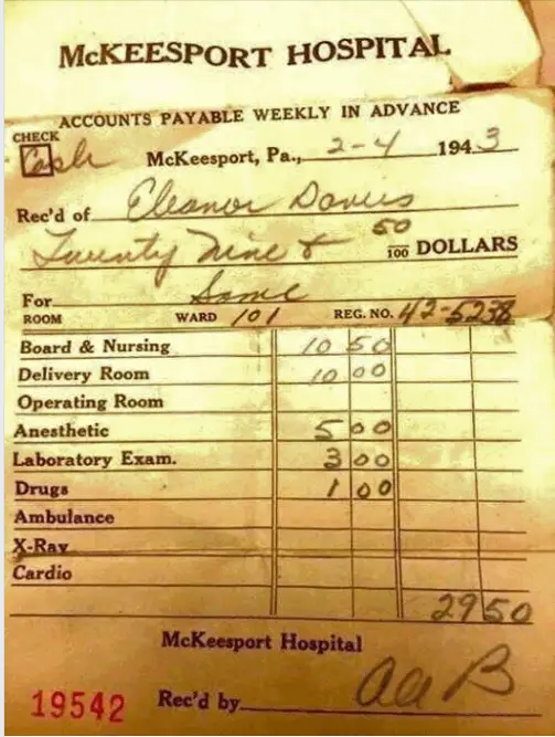
But back in 1943, Mrs. Davis paid a whopping $29.50 for her hospital stay. This may not have included the Doctor’s bill so we might assume that the total cost was twice as much. So perhaps $60 total? The minimum wage in 1943 was 30¢/hr. so if Mrs. Davis worked a 40 hour week she made $12 per week. So her entire delivery cost was roughly 5 weeks income (at minimum wage!) If her husband worked in manufacturing he would earn about $41 per week, so her delivery including doctor and hospital would have cost about 1.5 weeks wages, compared to 6 months today. Plus hospitals made payment plans available. No wonder they didn’t need insurance.

1943 Hospital Delivery Bill

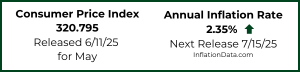
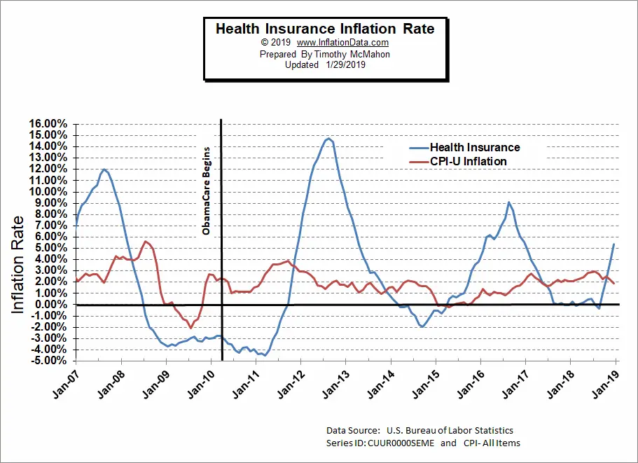
Insurance was such a non-issue that the U.S. Bureau of Labor Statistics didn’t even begin tracking insurance costs separately until 2005 (when they set the index equal to 100).  On the chart below, we can see the annual percentage increase of health insurance compared to the Consumer Price index. Obviously, some years health insurance costs increased much more than the average item.  For instance, in 2007, insurance costs increased 12% while overall prices increased 4% at most. Then prices actually fell more than average beginning in mid-2008 through mid-2011. Then health insurance costs jumped again to regain losses, peaking at an almost 15% increase in 2012. Prices began increasing at a slower rate and once again prices actually fell briefly in 2014 (i.e. prices are below the zero line) but recovered in 2016. And were basically flat with 0% growth from mid-2017 through mid-2008 before spiking again in the second half of 2018. However, based on this chart it is easy to see that health insurance prices are more volatile than average, but it is still difficult to determine whether they actually increased faster than average.


Health Insurance Percentage Inflation Chart

So, we need to look at cumulative prices to get the full picture.

Cumulative Health Insurance Inflation

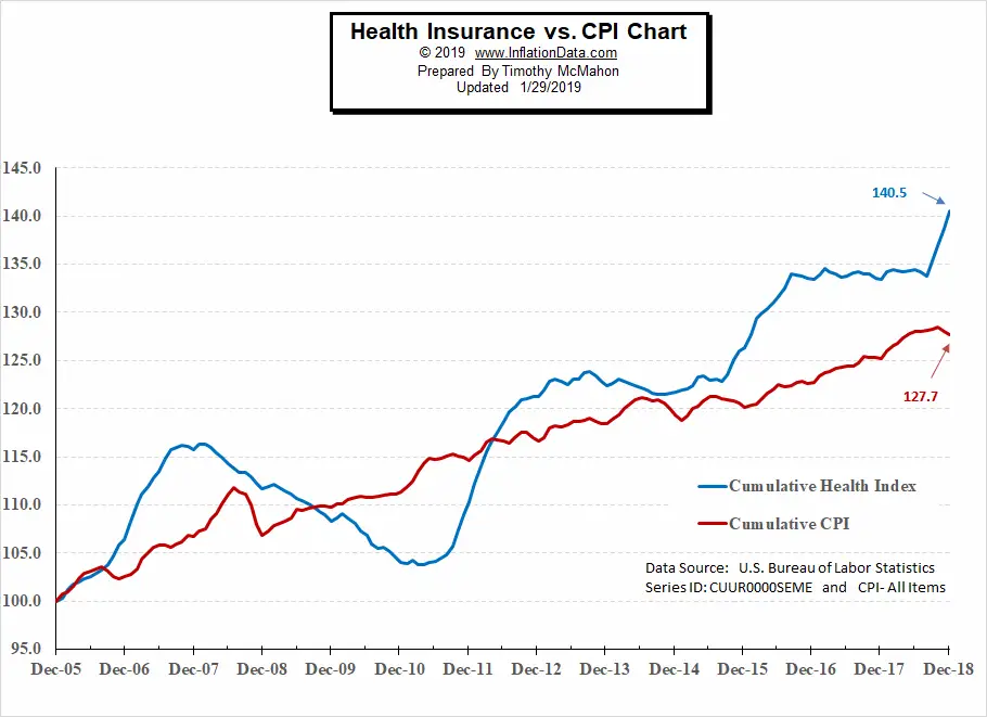
In the chart above we can see how the health insurance index compares to the Consumer Price Index for all Urban Consumers (CPI-U). Since the Health index was set to 100 in December 2005. The BLS set the CPI-U to 100 on an average date somewhere between 1982 and 1984 so by 2005 the actual index had approximately doubled to 196.8. So we had to mathematically adjust the CPI-U index to also be 100 on December 2005 for chart purposes. The Health insurance Index is in Blue and the CPI-U index is in red. From this chart, it appears that Health insurance rose sharply higher than average for the first two years then actually fell from 2008-2010 while most prices fell and then recovered. But then health insurance costs spiked and not only caught up with overall prices but actually shot above and never looked back. From the chart, we can see that the CPI increased roughly 27.7% from 100 in December 2005 to 127.7 in December 2018. During the same timeframe, health insurance costs increased by 40.5% from 100 to 140.5. So yes, Health Insurance costs increased about 46% faster than prices in general.

See Also:

  • Inflation Adjusted Oil Price
  • Inflation Adjusted Electricity Prices
  • Gold and Inflation
  • Inflation Adjusted Gasoline Prices
  • What is the Real Definition of Inflation?
  • Cost of Living

About Tim McMahon

Connect with Tim on Google+.

  • Web
  • |
  • Twitter
  • |
  • Facebook
  • |
  • LinkedIn
  • |
  • More Posts(409)

Latest Posts

  • BLS Inflation Data Delayed
  • Updated Cumulative Inflation Calculator
  • Inflation-Adjusted Silver Prices
  • December Inflation Down Slightly, Not Flat
  • December 2025 Inflation Report for November
  • How Deflation Created the Middle Class
  • October Inflation Numbers Delayed
  • Why the 2.8% COLA May Fall Short of Real Inflation

Sponsored:

As a Seasoned Investor I thought I'd seen everything... But recently I discovered TradingView which has really improved the information I have at my fingertips.~ Tim McMahon, editor

TradingView gives me an edge... including powerful charting tools, real-time market data, and a global community of traders—all in one easy to use platform. It has hundreds of indicators, and even custom scripts for more advanced users, and you don't need to change Brokers just use its seamless brokerage integration... TradingView isn't just a charting tool—it's your full trading command center.

Trade smarter. Trade faster. Check Out TradingView for free.

----------

The Best Place to Buy Your Crypto

Coinbase is the largest Crypto Trading platform in the U.S. and the easiest to use. ~Tim McMahon, editor

Check out Coinbase here

Subscribe Now

eTrends Signup Form

Elliott Wave Resources

Free Elliott Wave Resources

What is Waveopedia?

Waveopedia is EWI’s free, comprehensive index of Elliott wave patterns and terms. Everyone from beginners to experts can benefit from it. It’s a great place to send your followers if they’re new to Elliott waves.

  • Deflation Hits China is the U.S. Next?

  • Why You Must Avoid the Herding Trap

  • Chasing Trends Can Cost You

  • More Education Resources

Post Archives

Home | Articles | Sitemap | Terms of Service | Privacy | Disclaimer | Advertise With Us

Copyright © 1996-2026 · Capital Professional Services, LLC · Maintained by Design Synergy Studio · Admin

Do Not Sell My Personal Information