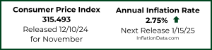
Annual Inflation… 2.75% in November 2024
- Annual Inflation rose from 2.60% in October to 2.75% in November
- CPI Index fell from 315.664 to 315.493
- Monthly Inflation was -0.05% in November up from 2023’s -0.20%
- Monthly Inflation for October 2024 was 0.12%
- Next release January 15th 2025
As you can see from our MIP projection from last month, the result was slightly above our “Most Likely” projection.
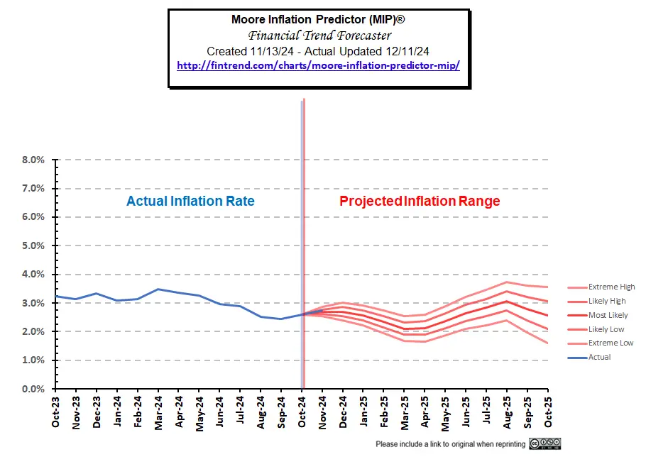 See: Moore Inflation Predictor (MIP) for current projections.
The BLS Commissioner reported:
“The Consumer Price Index for All Urban Consumers (CPI-U) increased 0.3 percent on a seasonally adjusted basis in November, after rising 0.2 percent in each of the previous 4 months, the U.S. Bureau of Labor Statistics reported today. Over the last 12 months, the all items index increased 2.7 percent before seasonal adjustment.
The index for shelter rose 0.3 percent in November, accounting for nearly forty percent of the monthly all items increase. The food index also increased over the month, rising 0.4 percent as the food at home index increased 0.5 percent and the food away from home index rose 0.3 percent. The energy index rose 0.2 percent over the month, after being unchanged in October.”
Individual Components:
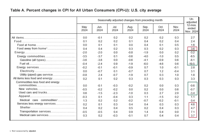
Looking at “Table A” below we can see that just like it has been for most of the year, energy and commodities are reducing overall inflation but Services are pushing up overall inflation. The biggest gainers on an annual basis were Services like shelter, transportation & medical care services, and food away from home.
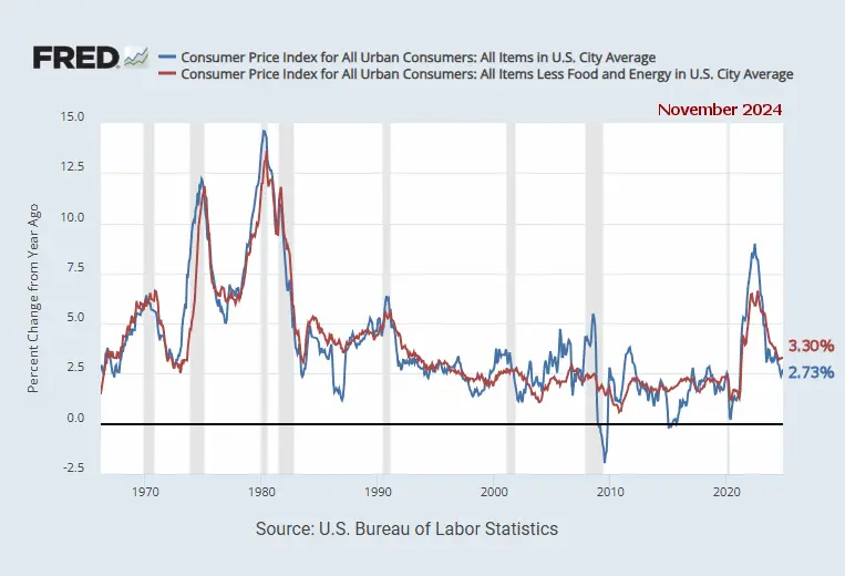
 Although these “Seasonally Adjusted” numbers are slightly different than those typically presented by the BLS, the following chart from the Federal Reserve shows the gap between inflation with and without Food and Energy. So, we can see how much food and energy are contributing toward overall inflation. Over the last few months, energy prices have actually been pulling overall inflation down (i.e. blue line below the red line). Without food and energy, inflation would be 3.30%. But due to the downward pressure of Energy total inflation according to the FED is 2.73%.
Source: St. Louis FED
Inflation Chart since 1989
Beginning in 1989, the longer-term trend was downward until 2021.
(Note the declining “previous resistance” line.) But… Early in 2021, inflation started spiking and quickly broke through the channel’s top, and then exceeded the pink “previous resistance” line with barely a hiccup as it passed through. Inflation peaked at 9.06% in June 2022 and bottomed at 2.97% in June 2023. By September it was back up to 3.70% before falling back to 3.09% in January 2024.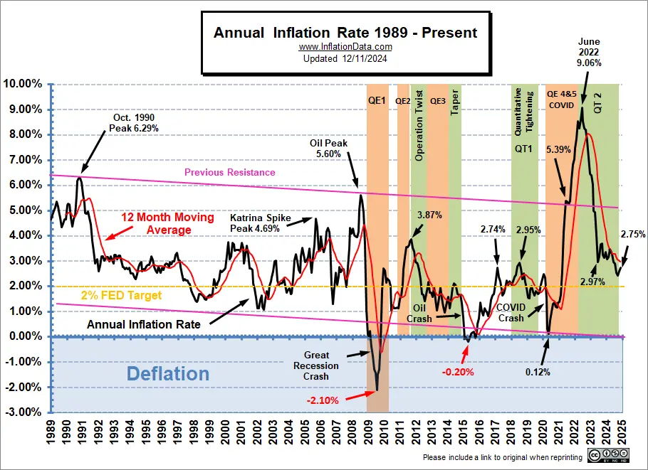
(click on chart for larger image)
Please check our usage policy if you want to use any of our charts.
Data Source: US Bureau of Labor Statistics CPI-U
Current Annual Inflation Commentary
Annual Inflation:
The Annual inflation Rate peaked in June 2022 at 9.06% which was the highest level since November 1981, when it was 9.59%. It had fallen to 4.93% in April 2023 and by June 2023 it was down to 2.97%. Then it rebounded to 3.7% in September 2023 before falling to 2.44% in September 2024 before turning up slightly in October and November.
Monthly Inflation
2022 started with very high monthly inflation even for the first quarter of a year when monthly inflation is already high… Typically, monthly inflation from January through May, is often in the 0.30% to 0.50% range. But in 2022, January was 0.84%, February was 0.91%, and March was 1.34%.
Typically, in June, inflation moderates into a lower range, but in 2022 monthly inflation in June was even higher than March, i.e., 1.37%. So the two-month inflation for May and June alone was 2.49%, i.e., almost a 1/2% higher than the FED’s 2% ANNUAL target.
November 2024 was a relatively low -0.05%but not as low as 2023’s -0.20% so annual inflation rose. December 2023 was also negative, so any positive monthly inflation at all in December 2024, will cause the Annual inflation rate to rise again.
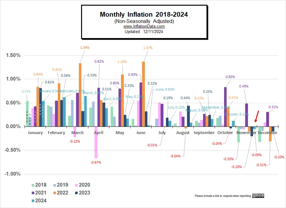
| Monthly Inflation Table: | |||||
| Month | 2020 | 2021 | 2022 | 2023 | 2024 |
| January | 0.39% | 0.43% | 0.84% | 0.80% | 0.54% |
| February | 0.27% | 0.55% | 0.91% | 0.56% | 0.62% |
| March | -0.22% | 0.71% | 1.34% | 0.33% | 0.65% |
| April | -0.67% | 0.82% | 0.56% | 0.51% | 0.39% |
| May | 0.002% | 0.80% | 1.10% | 0.25% | 0.17% |
| June | 0.55% | 0.93% | 1.37% | 0.32% | 0.03% |
| July | 0.51% | 0.48% | -0.01% | 0.19% | 0.12% |
| August | 0.32% | 0.21% | -0.04% | 0.44% | 0.08% |
| September | 0.14% | 0.27% | 0.22% | 0.25% | 0.16% |
| October | 0.04% | 0.83% | 0.41% | -0.04% | 0.12% |
| November | -0.06% | 0.49% | -0.10% | -0.20% | -0.05% |
| December | 0.09% | 0.31% | -0.31% | -0.10% | |
In the chart below, we can see how the UNADJUSTED monthly inflation compares between 2018 (light green), 2019 (light blue), 2020 (pink), 2021 (purple), 2022 (orange), 2023 (dark), 2024 (teal). Interestingly, January 2018 and January 2024 are identical.
January through March 2024 monthly inflation was higher than average at 0.54%, 0.62%, 0.65%, respectively. But April, through September 2024 came in significantly lower than 2023, which brought annual inflation down. June was a very low 0.03%, July was only 0.12%, and August was 0.08% and September was 0.16%. October saw an uptick in 2024 and although November was negative it wasn’t as negative as 2023.
2022-3 Annual Inflation
| Date | Annual Inflation Rate |
| December 2023 | 3.35% |
| November 2023 | 3.14% |
| October 2023 | 3.24% |
| September 2023 | 3.70% |
| August 2023 | 3.67% |
| July 2023 | 3.18% |
| June 2023 | 2.97% |
| May 2023 | 4.05% |
| April 2023 | 4.93% |
| March 2023 | 4.98% |
| February 2023 | 6.04% |
| January 2023 | 6.41% |
| December 2022 | 6.45% |
| November 2022 | 7.11% |
| October 2022 | 7.75% |
| September 2022 | 8.20% |
| August 2022 | 8.26% |
| July 2022 | 8.52% |
| June 2022 | 9.06% |
| May 2022 | 8.58% |
| April 2022 | 8.26% |
| March 2022 | 8.54% |
| February 2022 | 7.87% |
| January 2022 | 7.48% |
Inflation Peaks:
| Date | Peak |
| June 2022 | 9.06% |
| December 2021 | 7.04% |
| November 2021 | 6.81% |
| October 2021 | 6.22% |
| June & September 2021 | 5.39% |
| January 2020 | 2.49% |
| July 2018 | 2.95% |
| February 2017 | 2.74% |
| May 2014 | 2.13% |
| September 2011 | 3.87% |
| July 2008 | 5.60% |
| October 1990 | 6.29% |
| March 1980 | 14.76% |
The 2022 inflation had its roots in the COVID crash of 2020. The FED was concerned with a market meltdown due to falling oil prices and the Coronavirus. So, the FED embarked on an unprecedentedly massive money creation scheme of Quantitative Easing (QE4&5). Although June 2020 saw a reduction in FED Assets, beginning in July, the FED started increasing assets again. (See FED Actions below). But to make matters worse under Biden, congress passed massive spending bills to boost the already overheated economy.
See: If Trump Won the 2020 Election Would Inflation Be Lower? for more information.
Historically, if inflation climbs toward 3%, the FED gets worried. This generally results in raising the FED funds rate. If inflation reaches 5%, people start to worry about a decrease in purchasing power and may spend faster (before prices go up more), increasing the velocity of money and further fanning the flames of inflation.
This time the FED abandoned all common sense and called rising inflation “Transitory” while ignoring the signs and continuing its Quantitative Easing in the face of rising inflation (the monetary equivalent of throwing gasoline on a fire).
By March of 2023, inflation had fallen back below that critical 5% level. (Although the BLS is rounding to exactly 5%).
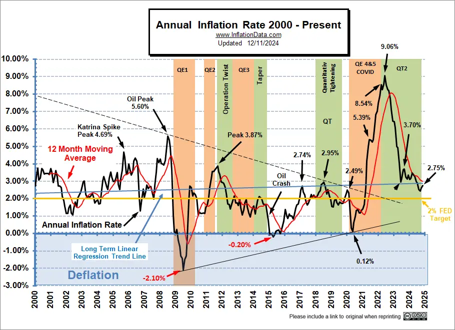
In the following chart, we look at a bit shorter-term (i.e., since 2000), and we see that although in the longer-term chart above, there was a downward channel since 1989, in this chart, there was more of a “Pennant” formation (i.e., less volatility centering around about 1.4%). The initial COVID deflationary pressures (as things shut down) caused the annual inflation rate in April 2020 to break below the previous “pennant” support, bottoming at 0.12% (which is low for a month, let alone a whole year), causing a new support line to be drawn.
FED Actions
The FED Actions Section has been given its own page.
See: FED Monetary Policy and Inflation.
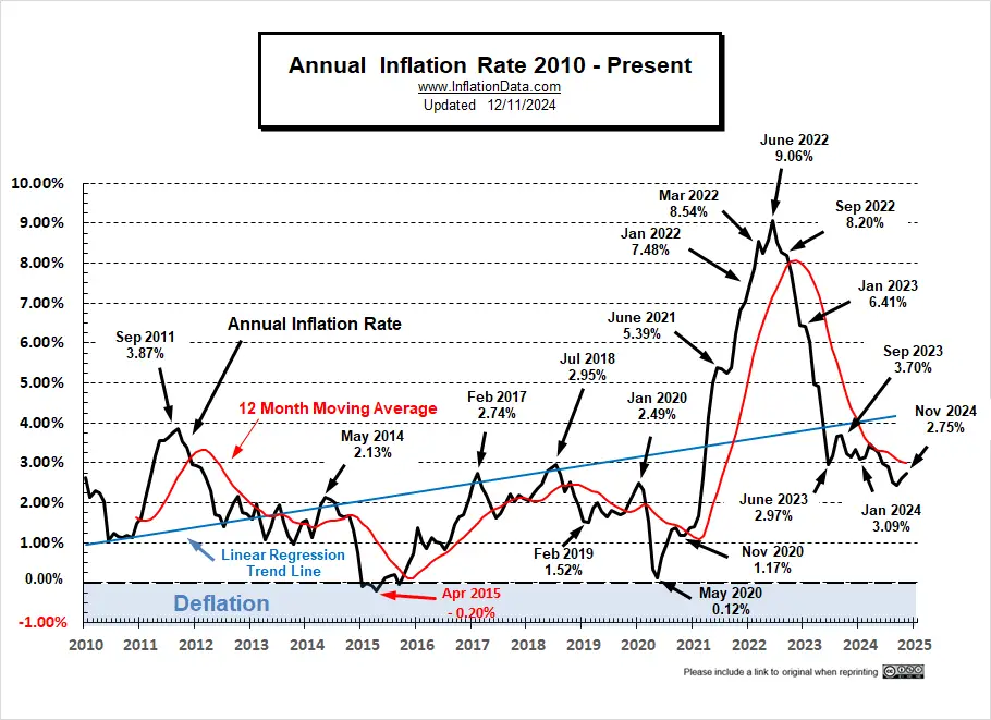
Inflation Since 2010
Up until 2021, the linear regression line was still tilted slightly downward. But the recent upward spike is dragging it ever upward. So looking at only this chart, it’s hard to believe that the long-term trend was down. This could indicate the beginning of a different long-term trend and that July 2009 was the bottom, with higher lows in April 2015 and May 2020.
The last quarter of the year typically sees disinflation, i.e., low or even negative monthly numbers moderating the annual inflation rate.
Before 2020, the FED could use Quantitative Easing because there were massive deflationary forces in the market. But then, in 2021, without those deflationary pressures, Congress continued to push for more “stimulus” despite the FED’s reluctance to go along. Ultimately, Congress got its way, and now inflation is surging. One day maybe Congress will realize “there ain’t no free lunch”, i.e., you can’t just print money without consequences. But I’m probably dreaming.
Remember, as recently as March of 2021, FED Chairman Jerome Powell said inflation was “transitory” and NOT a problem. However, at the time, we said that was VERY UNLIKELY. So, with the transitory idea in vogue, the FED went merrily on its way, creating trillions more via Quantitative Easing. So as FED assets went from 4 Trillion to 9 Trillion, annual inflation went from virtually zero to 9%.
Data Source: US Bureau of Labor Statistics CPI-U
See:
- Inflation Adjusted Gasoline Hits New High (almost )
- Worldwide Inflation by Country 2022
- Roots of Our Current Inflation
- The Fed’s New “Tightening” Plan Is Too Little, Too Late
- Keynesians and Market Monetarists Didn’t See Inflation Coming
- Inflation Expectations and the Massive Fed Stimulus
- Will the $2 Trillion Covid-19 Stimulus Cause Inflation?
For a discussion on how this affects the stock market, see NYSE Rate of Change Commentary.
Annual Inflation Table:
| Month | 2017 | 2018 | 2019 | 2020 | 2021 | 2022 | 2023 | 2024 |
| January | 2.50% | 2.07% | 1.55% | 2.49% | 1.40% | 7.48% | 6.41% | 3.09% |
| February | 2.74% | 2.21% | 1.52% | 2.33% | 1.68% | 7.87% | 6.04% | 3.15% |
| March | 2.38% | 2.36% | 1.86% | 1.54% | 2.62% | 8.54% | 4.98% | 3.48% |
| April | 2.20% | 2.46% | 2.00% | 0.33% | 4.16% | 8.26% | 4.93% | 3.36% |
| May | 1.87% | 2.80% | 1.79% | 0.12% | 4.99% | 8.58% | 4.05% | 3.27% |
| June | 1.63% | 2.87% | 1.65% | 0.65% | 5.39% | 9.06% | 2.97% | 2.97% |
| July | 1.73% | 2.95% | 1.81% | 0.99% | 5.37% | 8.52% | 3.18% | 2.89% |
| August | 1.94% | 2.70% | 1.75% | 1.33% | 5.25% | 8.26% | 3.67% | 2.53% |
| September | 2.23% | 2.28% | 1.71% | 1.37% | 5.39% | 8.20% | 3.70% | 2.44% |
| October | 2.04% | 2.52% | 1.76% | 1.18% | 6.22% | 7.75% | 3.24% | 2.60% |
| November | 2.20% | 2.18% | 2.05% | 1.17% | 6.81% | 7.11% | 3.14% | 2.75% |
| December | 2.11% | 1.91% | 2.29% | 1.36% | 7.04% | 6.45% | 3.35% |
See:
- America & Money: Cool Facts About the History of Our Monetary System
- The U.S. Economy, Payrolls & FOMC
- Is a Second OPEC Cut In The Cards?
- Are Oil Production Costs Rising or Falling?
Calculating the Current Inflation Rate
If we compare May 2020’s cpi index (256.394) with May 2021 (269.195), we can see a 12.801 point increase in the 12-month period. 12.801 / 256.394=0.049927, which, when converted to a percentage and rounded to 2 decimal places, equals 4.99% annual inflation.
Likewise, if we compare March 2022’s cpi index (287.504) with March 2023 (301.836), we can see a 14.359 point increase in the 12-month period. 14.332 / 287.504=0.04985, which, when converted to a percentage and rounded to 2 decimal places, equals 4.98% annual inflation. So, it took almost two years to return to the 5% level.
Monthly Inflation/Deflation:
See monthly Inflation for a table of all the individual months since 1913.
Cost of Gas:
A significant component in Consumer Price Inflation is the price of energy, primarily gasoline for consumer’s vehicles, but also heating oil and Electricity (which are also dependent on oil prices).
| January 2013 | $3.29 |
| January 2014 | $3.31 |
| January 2015 | $2.08 |
| January 2016 | $1.87 |
| January 2017 | $2.33 |
| January 2018 | $2.52 |
| January 2019 | $2.24 |
| January 2020 | $2.58 |
| January 2021 | $2.31 |
| January 2022 | $3.30 |
| February 2022 | $3.48 |
| March 2022 | $4.32 |
| April 2022 | $4.09 |
| May 2022 | $4.40 |
| June 2022 | $4.99 |
| July 2022 | $4.61 |
| August 2022 | $4.01 |
| September 2022 | $3.71 |
| October 2022 | $3.91 |
| November 2022 | $3.80 |
| December 2022 | $3.24 |
| January 2023 | $3.27 |
| February 2023 | $3.41 |
| March 2023 | $3.46 |
| April 2023 | $3.62 |
| May 2023 | $3.53 |
| June 2023 | $3.59 |
| July 2023 | $3.54 |
| August 2023 | $3.83 |
| September 2023 | $3.85 |
| October 2023 | $3.65 |
| November 2023 | $3.35 |
| December 2023 | $3.14 |
| January 2024 | $3.08 |
| February 2024 | $3.23 |
| March 2024 | $3.39 |
| April 2024 | $3.62 |
| May 2024 | $3.61 |
| June 2024 | $3.45 |
| July 2024 | $3.54 |
| August 2024 | $3.44 |
| September 2024 | $3.26 |
| October 2024 | $3.21 |
Gas Prices Source: AAA
The retail cost of Gasoline (Regular) averaged $3.29 nationwide in January 2013, then increased to $3.77 in February. By January 2014, the nationwide average price for regular gasoline was back down to $3.31, almost identical to January 2013, January 2014, January 2021, January 2022, and January 2023. It increased again to $3.64/gallon in April 2014, with Premium averaging just under $4.00 nationwide.
But by January 2015, the nationwide average had fallen to $2.08, with some localities registering prices below $2.00/gallon. In February 2015, gasoline prices had ticked up again slightly and averaged $2.343/ gallon.
In January 2016, the nationwide average was $1.87, then it fell to $1.71 in February but rose to $1.96 in March. Of course, prices vary widely due primarily to state taxes on gasoline. For instance, California imposes 38.13 cents per gallon taxes on gasoline in addition to the federal 18.4 cents per gallon tax, while many other states impose less than 20 cents per gallon.
In January 2017, several states adjusted their highway taxes. Pennsylvania already had the largest gas tax in the country, at 50.4 cents per gallon, but they increased it by another 7.9 cents per gallon on January 1st to 58.2 cents per gallon.
We have published several articles on how the petrodollar affects oil prices. But gasoline prices are also affected by state and federal highway taxes. Historically Democrats have pushed for an increase in the 18.4 cents per gallon federal highway tax, which funds the Highway Trust Fund, the primary source for funding federal highway and transit programs. This would increase the price you pay at the pump, not just while gas prices are low but even if gasoline prices are higher.
See:
- Death of the Petrodollar
- Total War over the Petrodollar
- More on the PetroDollar
- The current map of gas prices by county
- Gasoline Taxes by State
Note:
At InflationData.com, we like to take our inflation numbers straight with as slight adjustment as possible, so we only look at the non-adjusted numbers. So often, you will hear different numbers quoted in the popular media because they usually use the “Seasonally Adjusted” numbers.
Many people believe that the “Official Government numbers” are fudged. See Can We Trust Government Inflation Numbers? and Is the Government Fudging Unemployment Numbers? and Employment vs. Unemployment for more evidence the Government is fudging the Unemployment numbers.
Other Articles:
- Former Treasury Secretary Larry Summers on the Current Inflation Situation and Insufficient Labor
- How Quickly Can The FED Get Inflation Under Control?
- Spoiler: The FED Guaranteed To Fight Inflation… Sooner Or Later
- Why Quantitative Easing is Inflationary… Sometimes
- Millennials Have Never Seen Inflation This High
- How Nixon’s Revolutionary Move Affected Inflation for 50 Years
- What is Quantitative Tightening
The Velocity of Money:
The average annual inflation rate for the entire period since 1913 has been 3.15% per year. (Using Geometric Mean). For more information on the Geometric Mean, see: Inflation by Decade.
