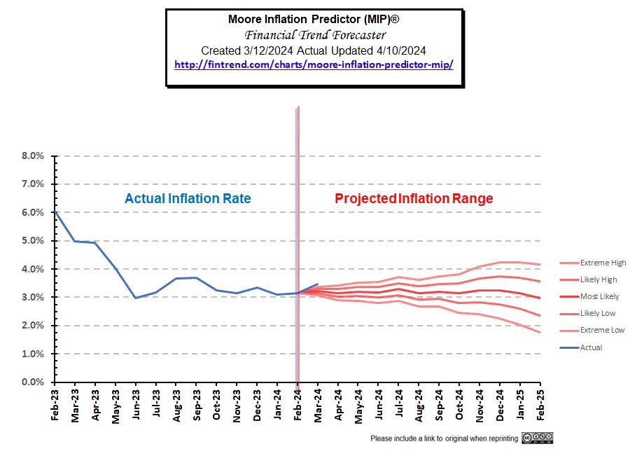
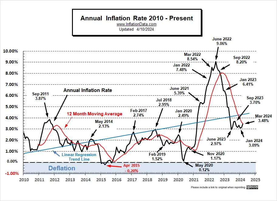
Annual Inflation… Up Again in March
Annual inflation was 3.09% in January, 3.15% in February and 3.48% in March.
As you can see from our MIP projection from last month, inflation was above the high end of our projected range again. This could indicate some remaining inflationary pressure stemming from services rather than the supply chain issues that previously reigned.
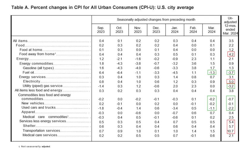
 BLS Commentary:
The BLS Commissioner reported:
“The Consumer Price Index for All Urban Consumers (CPI-U) increased 0.4 percent in March on a seasonally adjusted basis, the same increase as in February, the U.S. Bureau of Labor Statistics reported today. Over the last 12 months, the all items index increased 3.5 percent before seasonal adjustment.
The index for shelter rose in March, as did the index for gasoline. Combined, these two indexes contributed over half of the monthly increase in the index for all items. The energy index rose 1.1
percent over the month. The food index rose 0.1 percent in March. The food at home index was unchanged, while the food away from home index rose 0.3 percent over the month.”
Looking at table A below we can see that on an annual basis energy is still down but on a monthly basis it is up fairly significantly. The biggest gainers on an annual basis were Services like Food away from home, shelter and transportation services.
Individual Components
 Although the numbers are slightly different than those typically presented by the BLS, the following chart from the Federal Reserve shows the gap between inflation with and without Food and Energy. So, we can see how much food and energy are contributing toward overall inflation.
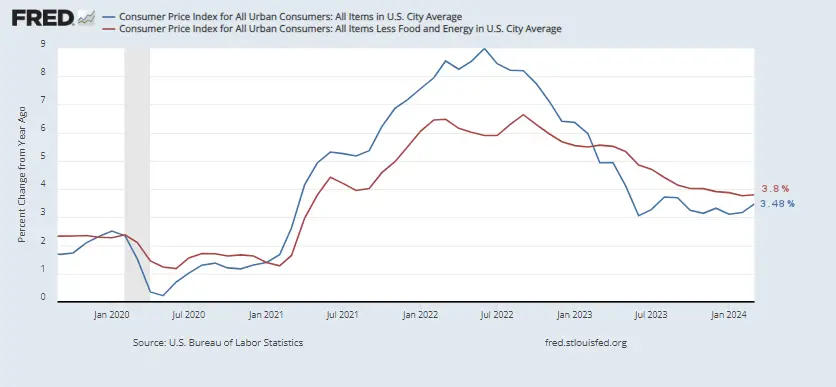 If the blue line is above the red line, food and energy, are adding to the overall inflation rate. But if blue is below the red line, they are actually mitigating overall inflation. As the blue line rose toward the red line from June through August 2023, we noted that energy was doing less to keep down overall inflation. But in October through January gas prices were falling again helping to drag down overall inflation. If it wasn’t for falling energy prices inflation would be 3.76%, which is down from 3.91% in December and 3.87% in January.
Source: St. Louis FED
Energy Prices
Overall energy prices have been down over the last year because the government has been flooding the market with cheap oil by depleting our strategic petroleum reserves. But at some point, they have to replace those reserves (perhaps at much higher prices). That is what is happening now as the SPR is slowly being replenished.
Note: Reserves would have started at much higher levels had Democrats not refused Trump’s request to increase reserves when oil was dirt cheap.
This chart from the U.S. EIA shows the extent of the recent strategic petroleum reserve drawdown compared to those of Desert Storm, various hurricanes, and other supply disruptions. Unfortunately, the E.I.A. is always a couple of months behind in updating its chart. But with the data we have, we can see that the recent draw-down dwarfs all of the others combined. In July 2020, the SPR stood at 656.140 million barrels.
As of June 2023, the SPR was down to 347.158 million or roughly -47.1% below July 2020 levels, which were already below 2010 levels. From January to February, levels were unchanged, so we were hoping that they had halted the drawdown, but drawdowns continued through June. By September there was a slight increase to 351.274 million and it has shown a minuscule increase through January 2024 to 358.013 million (the most recent data available).
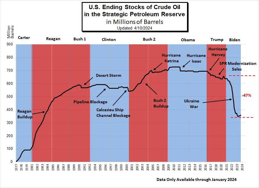
Note: Section 404 of the Bipartisan Budget Act of 2015 authorizes the Secretary of Energy to draw down and sell up to $2 billion of SPR crude oil, for fiscal years (FY) 2017 through 2020, to carry out an SPR modernization program.
EIA Data History of SPR Releases
U.S. Ending Stocks of Crude Oil in SPR
(Million Barrels)
| Jan | Feb | Mar | Apr | May | Jun | Jul | Aug | Sep | Oct | Nov | Dec | |
| 2010 | 726.612 | 726.608 | 726.604 | 726.599 | 726.594 | 726.591 | 726.586 | 726.581 | 726.513 | 726.550 | 726.547 | 726.545 |
| 2020 | 634.967 | 634.967 | 634.967 | 637.826 | 648.326 | 656.023 | 656.140 | 647.530 | 642.186 | 638.556 | 638.085 | 638.086 |
| 2021 | 638.085 | 637.773 | 637.774 | 633.428 | 627.585 | 621.304 | 621.302 | 621.302 | 617.768 | 610.646 | 601.467 | 593.682 |
| 2022 | 588.317 | 578.872 | 566.061 | 547.866 | 523.109 | 493.324 | 468.006 | 445.057 | 416.393 | 398.569 | 388.419 | 372.030 |
| 2023 | 371.579 | 371.579 | 371.175 | 363.723 | 354.366 | 347.158 | 347.454 | 350.330 | 351.274 | 351.274 | 351.911 | 354.684 |
| 2024 | 358.013 | NA | NA | NA | NA | NA | NA | NA | NA | NA | NA | NA |
According to the statutory drawdown rules this drawdown looks illegal. The rules regarding drawdown of the SPR are:
In no case may the Reserve be drawn down –
(A) in excess of an aggregate of 30,000,000 barrels with respect to each such shortage;
(B) for more than 60 days with respect to each such shortage;
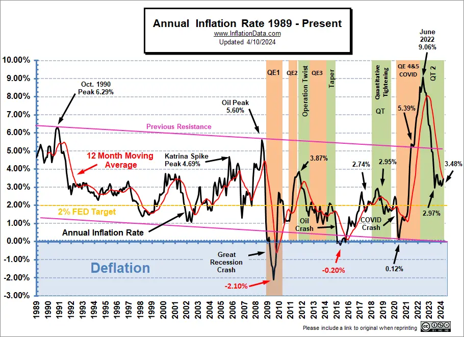
Inflation Chart since 1989
Beginning in 1989, the longer-term trend was downward until 2021.
(Note the declining “previous resistance” line.) But… Early in 2021, inflation started spiking and quickly broke through the channel’s top and then exceeded the pink previous resistance line with barely a hiccup as it passed through. Inflation peaked at 9.06% in June 2022 and bottomed at 2.97% in June 2023. By September it was back up to 3.70% before falling back to 3.09% in January 2024. Mr. Market thought that meant inflation was licked and has been dismayed as it rose back to 3.48% by March.
 (click on chart for larger image)
Please check our usage policy if you want to use any of our charts.
Data Source: US Bureau of Labor Statistics CPI-U
See our Moore Inflation Predictor for more information.
Current Annual Inflation Commentary
Annual Inflation:
The Current Annual inflation Rate for the 12 months ending in January was 3.09%, in February it was 3.15% and March’s 3.48% exceeded December’s 3.35%. This was still well below the peak of 9.06% in June 2022, which was the highest level since November 1981, when it was 9.59%. March 2023 was 4.98%, so current levels are still below that. Back, when inflation was below 3%, everyone thought the FED had beaten inflation. But we said, “just wait, a rebound is on the way”. And that is what happened.
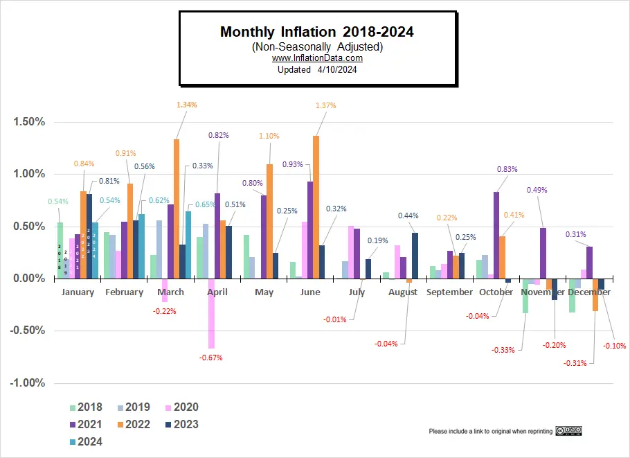
Monthly Inflation
2022 started out with very high monthly inflation even for the first quarter of a year when monthly inflation is already high… Typically, monthly inflation from January through May, is often in the 0.30% to 0.50% range. But in 2022, January was 0.84%, February was 0.91%, and March was 1.34%.
Typically, in June, inflation moderates into a lower range, but in 2022 monthly inflation in June was also high, i.e., 1.37%. So the two-month inflation for May and June alone was 2.49%.
So far in 2024 monthly inflation has been a bit higher than average at 0.54%, 0.62%, and 0.65% with February and March both significantly higher than 2023.
| Monthly Inflation Table: | |||||
| Month | 2020 | 2021 | 2022 | 2023 | 2024 |
| January | 0.39% | 0.43% | 0.84% | 0.80% | 0.54% |
| February | 0.27% | 0.55% | 0.91% | 0.56% | 0.62% |
| March | -0.22% | 0.71% | 1.34% | 0.33% | 0.65% |
| April | -0.67% | 0.82% | 0.56% | 0.51% | |
| May | 0.002% | 0.80% | 1.10% | 0.25% | |
| June | 0.55% | 0.93% | 1.37% | 0.32% | |
| July | 0.51% | 0.48% | -0.01% | 0.19% | |
| August | 0.32% | 0.21% | -0.04% | 0.44% | |
| September | 0.14% | 0.27% | 0.22% | 0.25% | |
| October | 0.04% | 0.83% | 0.41% | -0.04% | |
| November | -0.06% | 0.49% | -0.10% | -0.20% | |
| December | 0.09% | 0.31% | -0.31% | -0.10% | |
In the chart below, we can see how the monthly inflation compares between 2018 (light green), 2019 (light blue), 2020 (pink), 2021 (purple), 2022 (orange), 2023 (dark), 2024 (teal). Interestingly, January 2018 and January 2024 are identical. We had hoped that the rest of 2024 would follow 2018’s lead, but February 2024 is much higher than February 2018.
2022-3 Annual Inflation
| Date | Annual Inflation Rate |
| December 2023 | 3.35% |
| November 2023 | 3.14% |
| October 2023 | 3.24% |
| September 2023 | 3.70% |
| August 2023 | 3.67% |
| July 2023 | 3.18% |
| June 2023 | 2.97% |
| May 2023 | 4.05% |
| April 2023 | 4.93% |
| March 2023 | 4.98% |
| February 2023 | 6.04% |
| January 2023 | 6.41% |
| December 2022 | 6.45% |
| November 2022 | 7.11% |
| October 2022 | 7.75% |
| September 2022 | 8.20% |
| August 2022 | 8.26% |
| July 2022 | 8.52% |
| June 2022 | 9.06% |
| May 2022 | 8.58% |
| April 2022 | 8.26% |
| March 2022 | 8.54% |
| February 2022 | 7.87% |
| January 2022 | 7.48% |
Inflation Peaks:
| Date | Peak |
| June 2022 | 9.06% |
| December 2021 | 7.04% |
| November 2021 | 6.81% |
| October 2021 | 6.22% |
| June & September 2021 | 5.39% |
| January 2020 | 2.49% |
| July 2018 | 2.95% |
| February 2017 | 2.74% |
| May 2014 | 2.13% |
| September 2011 | 3.87% |
| July 2008 | 5.60% |
| October 1990 | 6.29% |
| March 1980 | 14.76% |
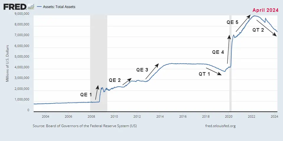
The current inflation has its roots in the COVID crash of 2020. The FED was concerned with a market meltdown due to falling oil prices and the Coronavirus. So, the FED embarked on an unprecedentedly massive money creation scheme of Quantitative Easing (QE4&5). Although June 2020 saw a reduction in FED Assets, beginning in July, the FED started increasing assets again. (See FED Actions below).
Historically, if inflation climbs toward 3%, the FED gets worried. This generally results in raising the FED funds rate. If inflation reaches 5%, people start to worry about a decrease in purchasing power and may spend faster (before prices go up more), increasing the velocity of money and further fanning the flames of inflation. This time the FED abandoned all common sense and called rising inflation “Transitory” while ignoring the signs and continuing its Quantitative Easing in the face of rising inflation (the monetary equivalent of throwing gasoline on a fire). But in March of 2023, inflation fell back below that critical 5% level. (Although the BLS is rounding to exactly 5%).
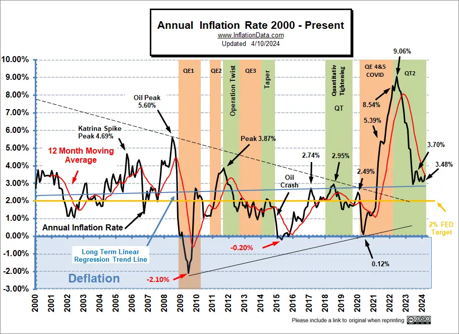
In the following chart, we look at a bit shorter-term (i.e., since 2000), and we see that although in the longer-term chart above, there was a downward channel since 1989, in this chart, there was more of a “Pennant” formation (i.e., less volatility centering around about 1.4%). The initial COVID deflationary pressures (as things shut down) caused the annual inflation rate in April 2020 to break below the previous “pennant” support, bottoming at 0.12% (which is low for a month, let alone a whole year), causing a new support line to be drawn.
Back in April 2020, we published the March FED Assets chart showing that FED assets could easily reach 9 Trillion…
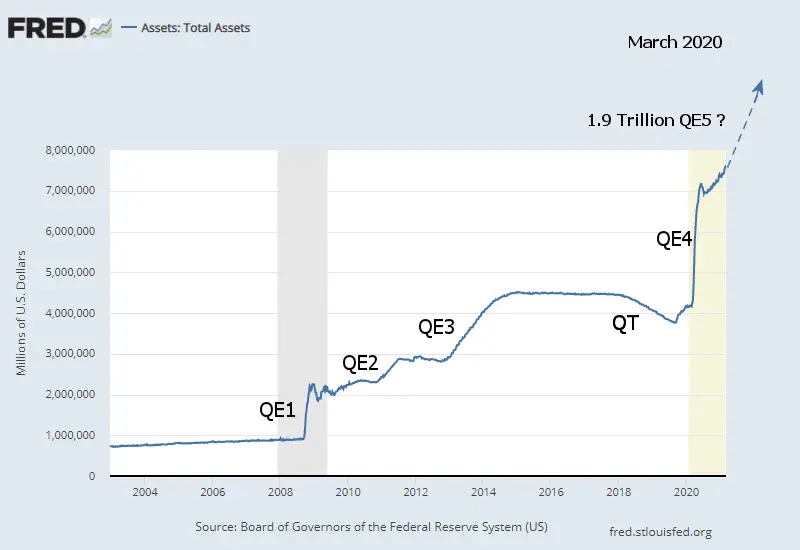 And two years later, that is precisely what happened. FED assets peaked at 8.965 Trillion on April 13th, 2022. By December 7th, FED assets were down to 8.582 Trillion, and on March 1st, they had bottomed at 8.39 Trillion, for roughly a 2/3 Trillion decrease.
But then a banking crisis broke out in California, and the FED jumped it back up, wiping out roughly 38% of the gains they made. Since then, the FED has been decreasing assets again. In July, it broke below the March low hitting 8.298 trillion. By September 6th it was 8.101 trillion and by February 12th it was down to 7.631 trillion. This is still 2/3 of a TRILLION Dollars above where it was after the recession ended in 2020. Basically, QE5 was totally unnecessary and the FED is in the process of sopping up the excess liquidity it created then. But, who knows what will happen if it tries eliminating the liquidity from QE 4.
Source: FED Assets
See: NYSE ROC commentary for more info.
Inflation Since 2010
Up until 2021, the linear regression line was still tilted slightly downward. But the recent upward spike is dragging it ever upward. So looking at only this chart, it’s hard to believe that the long-term trend was down. This could indicate the beginning of a different long-term trend and that July 2009 was the bottom, with higher lows in April 2015 and May 2020.
The last quarter of the year typically sees disinflation, i.e., low or even negative monthly numbers moderating the annual inflation rate.
Before 2020, the FED could use Quantitative Easing because there were massive deflationary forces in the market. But then, in 2021, without those deflationary pressures, Congress continued to push for more “stimulus” despite the FED’s reluctance to go along. Ultimately, Congress got its way, and now inflation is surging. One day maybe Congress will realize “there ain’t no free lunch”, i.e., you can’t just print money without consequences. But I’m probably dreaming.
Remember, as recently as March of 2021, FED Chairman Jerome Powell said inflation was “transitory” and NOT a problem. However, at the time, we said that was VERY unlikely. So, with the transitory idea in vogue, the FED went merrily on its way, creating trillions more via Quantitative Easing. So as FED assets went from 4 Trillion to 9 Trillion, annual inflation went from virtually zero to 9%.
Data Source: US Bureau of Labor Statistics CPI-U
FED Actions
In April 2020, the FED began to fight Deflation with a massive Quantitative Easing program and near Zero Fed Funds rates, and by June, the FED showed signs of slacking off. But through February 2022, it increased assets and kept interest rates very low. With inflation at over 7% (i.e., well over the FED target of 2%), they finally decided to curtail their massive stimulus.
History of Quantitative Easing
The market crash of 2008 destroyed liquidity and created massive deflationary forces, so the FED began fighting against deflation through traditional means and then through newly created Quantitative Easing. Then in November 2015, the FED switched sides and began slowly raising interest rates to fight against Inflation. From there, inflation rose from July 2016 through February 2017, convincing the FED that it was safe to raise rates more aggressively. On March 15, 2017, the Fed voted to raise its benchmark FED-funds rate by a quarter percentage point to a range of 0.75% to 1% on the assumption that inflation was building (and because they were desperate to raise rates so they would have somewhere to go in the next recession). At its June 2017 meeting, they decided to increase it by another quarter percentage point bringing the benchmark rate to a (1.0% to 1.25%) range. Those were their target ranges.
Throughout 2018 the FED followed a policy of Quantitative Tightening (QT) and raised the FED Funds rate that they charge banks. QT is the opposite of Quantitative Easing. In “Quantitative Easing” (QE), the FED acquires government debt by buying it on the open market. QT is a process whereby the FED reduces the debt held by not renewing Federal Debt when it matures.
According to the National Bureau of Economic Research (NBER), the U.S. entered a recession in February 2020 (shaded area) after the longest boom in economic history. According to NBER, the peak occurred in February 2020. Since unemployment was COVID-related rather than just a typical slowing economy, economic activity rose again rather quickly. In July 2021, NBER declared the bottom had occurred only a couple of months after the recession began. Thus giving us the shortest recession on record. But now we are feeling the consequences of all that money pumping.
For more info, see Composition of Fed Assets: St. Louis FED.
See NYSE ROC for more info on how this may affect the stock market.
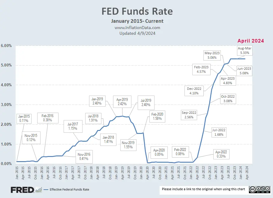
Federal Funds Rate:
The chart below shows the rapid increase in current interest rates. In February 2022, they were just 0.08%… a year later, they were at 4.57%. But in light of the banking crisis, the FED cut back on the rate of increase, only going to 4.65% in March. But now, for the first time in a long time, the FED funds rate is higher than the inflation rate. This is actually a good thing since lenders need to be able to charge more for a loan than they lose due to inflation. In June, the FED barely raised rates at all, indicating that we may be at the top. Or perhaps, they knew (as we did) that annual inflation would fall in June, so they just slacked off. And they once again only raised slightly in July. But in August the FED funds rate bounced up to 5.33%. It remained there through January 2024.
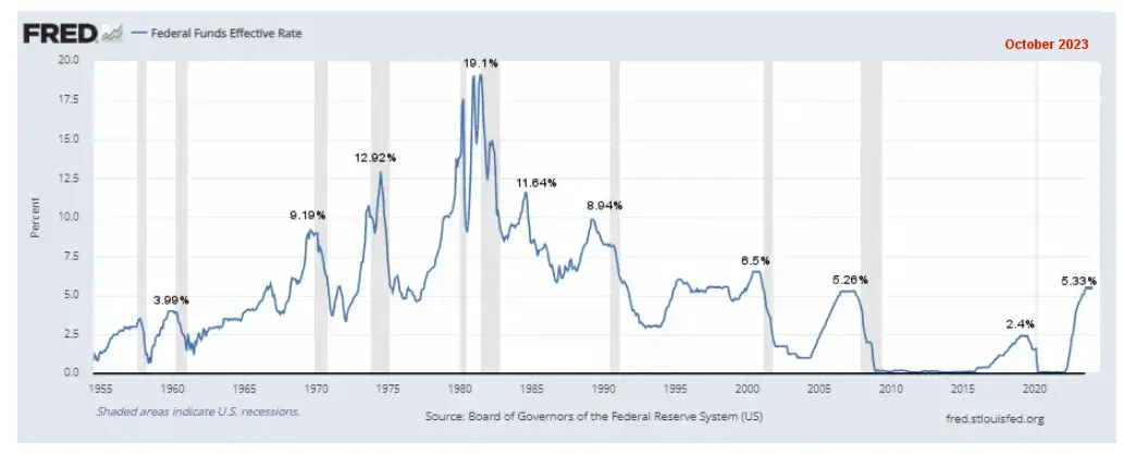
Although the short-term chart (above) looks like a big increase, taking a longer-term view (below) gives a better picture. In this view, we can see that we are above the average rate since 1954, which is 4.6%. And just slightly above the 2007 peak of 5.26%. But the last two times interest rates got this high it was followed in short order by a recession.
Data Source: Board of Governors of the Federal Reserve System (US)
See:
- Inflation Adjusted Gasoline Hits New High (almost )
- Worldwide Inflation by Country 2022
- Roots of Our Current Inflation
- The Fed’s New “Tightening” Plan Is Too Little, Too Late
- Keynesians and Market Monetarists Didn’t See Inflation Coming
- Inflation Expectations and the Massive Fed Stimulus
- Will the $2 Trillion Covid-19 Stimulus Cause Inflation?
For a discussion on how this affects the stock market, see NYSE Rate of Change Commentary.
Annual Inflation Table:
| Month | 2017 | 2018 | 2019 | 2020 | 2021 | 2022 | 2023 | 2024 |
| January | 2.50% | 2.07% | 1.55% | 2.49% | 1.40% | 7.48% | 6.41% | 3.09% |
| February | 2.74% | 2.21% | 1.52% | 2.33% | 1.68% | 7.87% | 6.04% | 3.15% |
| March | 2.38% | 2.36% | 1.86% | 1.54% | 2.62% | 8.54% | 4.98% | 3.48% |
| April | 2.20% | 2.46% | 2.00% | 0.33% | 4.16% | 8.26% | 4.93% | |
| May | 1.87% | 2.80% | 1.79% | 0.12% | 4.99% | 8.58% | 4.05% | |
| June | 1.63% | 2.87% | 1.65% | 0.65% | 5.39% | 9.06% | 2.97% | |
| July | 1.73% | 2.95% | 1.81% | 0.99% | 5.37% | 8.52% | 3.18% | |
| August | 1.94% | 2.70% | 1.75% | 1.33% | 5.25% | 8.26% | 3.67% | |
| September | 2.23% | 2.28% | 1.71% | 1.37% | 5.39% | 8.20% | 3.70% | |
| October | 2.04% | 2.52% | 1.76% | 1.18% | 6.22% | 7.75% | 3.24% | |
| November | 2.20% | 2.18% | 2.05% | 1.17% | 6.81% | 7.11% | 3.14% | |
| December | 2.11% | 1.91% | 2.29% | 1.36% | 7.04% | 6.45% | 3.35% |
See:
- America & Money: Cool Facts About the History of Our Monetary System
- The U.S. Economy, Payrolls & FOMC
- Is a Second OPEC Cut In The Cards?
- Are Oil Production Costs Rising or Falling?
Calculating the Current Inflation Rate
If we compare May 2020’s cpi index (256.394) with May 2021 (269.195), we can see a 12.801 point increase in the 12-month period. 12.801 / 256.394=0.049927, which, when converted to a percentage and rounded to 2 decimal places, equals 4.99% annual inflation.
Likewise, if we compare March 2022’s cpi index (287.504) with March 2023 (301.836), we can see a 14.359 point increase in the 12-month period. 14.332 / 287.504=0.04985, which, when converted to a percentage and rounded to 2 decimal places, equals 4.98% annual inflation. So, it took almost two years to return to the 5% level.
Monthly Inflation/Deflation:
See monthly Inflation for a table of all the individual months since 1913.
Cost of Gas:
A significant component in Consumer Price Inflation is the price of energy, primarily gasoline for consumer’s vehicles, but also heating oil and Electricity (which are also dependent on oil prices).
| January 2013 | $3.29 |
| January 2014 | $3.31 |
| January 2015 | $2.08 |
| January 2016 | $1.87 |
| January 2017 | $2.33 |
| January 2018 | $2.52 |
| January 2019 | $2.24 |
| January 2020 | $2.58 |
| January 2021 | $2.31 |
| January 2022 | $3.30 |
| February 2022 | $3.48 |
| March 2022 | $4.32 |
| April 2022 | $4.09 |
| May 2022 | $4.40 |
| June 2022 | $4.99 |
| July 2022 | $4.61 |
| August 2022 | $4.01 |
| September 2022 | $3.71 |
| October 2022 | $3.91 |
| November 2022 | $3.80 |
| December 2022 | $3.24 |
| January 2023 | $3.27 |
| February 2023 | $3.41 |
| March 2023 | $3.46 |
| April 2023 | $3.62 |
| May 2023 | $3.53 |
| June 2023 | $3.59 |
| July 2023 | $3.54 |
| August 2023 | $3.83 |
| September 2023 | $3.85 |
| October 2023 | $3.65 |
| November 2023 | $3.35 |
| December 2023 | $3.14 |
| January 2024 | $3.08 |
| February 2024 | $3.23 |
| March 2024 | $3.39 |
Gas Prices Source: AAA
The retail cost of Gasoline (Regular) averaged $3.29 nationwide in January 2013, then increased to $3.77 in February. By January 2014, the nationwide average price for regular gasoline was back down to $3.31, almost identical to January 2013, January 2014, January 2021, January 2022, and January 2023. It increased again to $3.64/gallon in April 2014, with Premium averaging just under $4.00 nationwide.
But by January 2015, the nationwide average had fallen to $2.08, with some localities registering prices below $2.00/gallon. In February 2015, gasoline prices had ticked up again slightly and averaged $2.343/ gallon.
In January 2016, the nationwide average was $1.87, then it fell to $1.71 in February but rose to $1.96 in March. Of course, prices vary widely due primarily to state taxes on gasoline. For instance, California imposes 38.13 cents per gallon taxes on gasoline in addition to the federal 18.4 cents per gallon tax, while many other states impose less than 20 cents per gallon.
In January 2017, several states adjusted their highway taxes. Pennsylvania already had the largest gas tax in the country, at 50.4 cents per gallon, but they increased it by another 7.9 cents per gallon on January 1st to 58.2 cents per gallon.
We have published several articles on how the petrodollar affects oil prices. But gasoline prices are also affected by state and federal highway taxes. Historically Democrats have pushed for an increase in the 18.4 cents per gallon federal highway tax, which funds the Highway Trust Fund, the primary source for funding federal highway and transit programs. This would increase the price you pay at the pump, not just while gas prices are low but even if gasoline prices are higher.
See:
- Death of the Petrodollar
- Total War over the Petrodollar
- More on the PetroDollar
- The current map of gas prices by county
- Gasoline Taxes by State
Quantitative Easing (and Inflation)
On November 25, 2008, the Federal Reserve announced that it would purchase up to $600 billion in agency mortgage-backed securities (MBS) and agency debt. This was the beginning of the Quantitative Easing program and later called QE1.
In December, the FED cut interest rates to near Zero.
In March 2009, the FED announced that it would purchase another $750 Billion in junk mortgages (Mortgage Backed Securities) and $300 Billion in Treasury Securities primarily because inflation was still heading down.
There is often a lag in the effects of money creation, but as QE1 ended, the inflation rate again began dropping, spending much of 2010 at just over 1%.
So the FED decides QE2 is necessary, and this time, it purchases another $600 Billion of Longer-Term Treasury Notes. The inflation rate increases to almost 4%, but when QE2 stops, the inflation rate begins falling again. Personally, I would love to see the inflation rate stay between 1 and 2% or, better yet, between 0% and 1%. In the long run, steady low inflation rates benefit everyone as people can accurately judge their future costs and make sound business decisions. But the government prefers a higher inflation rate so it can repay its debts with “cheaper dollars.” Inflation also erodes savings and causes consumers to act imprudently and spend more than they would if they had sound (unchanging) money. This is what the government means by “stimulating the economy”, i.e., causing people to spend more than they would prudently do otherwise. The apparent long-term effects are a society with more debt than it should have, and thus we see crashes as we saw in 2008. Then the government has to “do something,” so it prints more money to fix the problem it created by printing money in the first place. For more detail, see: Stimulate the Economy? Please Don’t!
On September 21, 2011, the Federal Open Market Committee announced Operation Twist.
On September 13, 2012, the FED announced QE3, which was $40 Billion a month in purchases, and on December 12, 2012, they announced an additional $45 Billion per month with no definite end in sight.
We’ve added QE1, QE2, Operation Twist, and QE infinity to the chart so that you can see the effects on the inflation rate. These “Quantitative Easings” were not your typical FED money-printing schemes. In QE1, which lasted from November 25th, 2008 – to March 31, 2010, the FED started by purchasing $500 Billion in Mortgage-backed securities. Most of these securities were virtually worthless at this point. But a few months earlier, they were considered part of the larger money supply. So in effect, the FED bailed out the owners of this junk debt and pumped up the money supply simultaneously by converting worthless junk into “valuable” greenbacks.
In December, Ben Bernanke began “tapering,” which slowly shut off the flow of easy money, and by October 2014, the flow was stopped entirely.
In the video, What is the Real Purpose of the Federal Reserve? Edward Griffen reminds us that the Federal Reserve is just a bank cartel, and it primarily has its members’ interests at heart. So monetizing worthless junk paper and bailing out the banks that held them makes perfect sense when viewed in that light. Operation Twist was announced on September 21, 2011, and it was designed to buy long-term Treasury notes on the open market while simultaneously selling short-term notes. This would have the effect of driving long-term interest rates down. Theoretically, this should have helped mortgage borrowers better afford new homes (but more importantly to the bank cartel), boost the demand for loans, and the bank’s profit margins. To some extent, this has happened but probably not to the extent that they had hoped.
Note:
At InflationData.com, we like to take our inflation numbers straight with as slight adjustment as possible, so we only look at the non-adjusted numbers. So often, you will hear different numbers quoted in the popular media because they usually use the “Seasonally Adjusted” numbers.
Many people believe that the “Official Government numbers” are fudged. See Can We Trust Government Inflation Numbers? and Is the Government Fudging Unemployment Numbers? and Employment vs. Unemployment for more evidence the Government is fudging the Unemployment numbers.
Other Articles:
- Former Treasury Secretary Larry Summers on the Current Inflation Situation and Insufficient Labor
- How Quickly Can The FED Get Inflation Under Control?
- Spoiler: The FED Guaranteed To Fight Inflation… Sooner Or Later
- Why Quantitative Easing is Inflationary… Sometimes
- Millennials Have Never Seen Inflation This High
- How Nixon’s Revolutionary Move Affected Inflation for 50 Years
- What is Quantitative Tightening
The Velocity of Money:
The average annual inflation rate for the entire period since 1913 has been 3.15% per year. (Using Geometric Mean). For more information on the Geometric Mean, see: Inflation by Decade.
