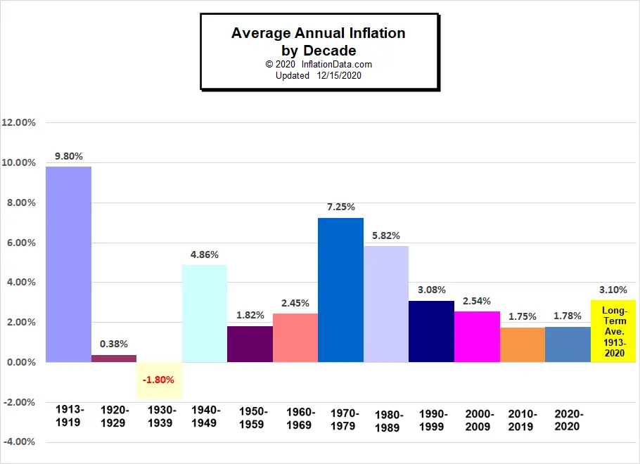
This Chart shows the Average Annual Inflation Rate for each decade. Each bar represents the geometric mean for the decade (not the total cumulative inflation for that 10 year period ).
For two of the decades below you would think the numbers were large enough to be for the entire decade rather than the average annual rate for a single year. Both the teens and the 1970's had huge annual inflation rates. The teens (beginning in 1913 when the U.S. government formed the Federal Reserve and began tracking inflation) averaged almost 10% a year and the 1970's averaged just over 7% a year. This resulted in a cumulative total inflation for the years 1913 until the end of 1919 of 92.86% (in only 7 years) while the inflationary 1970's saw 103.45% over the entire decade (i.e. prices more than doubled in 10 years).
(click to see larger image)
Note: There was so much inflation in January 1920 that if you calculate the average from the end of January 1920 - December 1929 the average for the decade is -0.09% but if you calculate it correctly from the end of December 1919- December 1929 that single month increases the average to 0.38% for the decade.
Note: The reason to calculate from December through December is that the index is set for the end of the month so in order to get a full year you need to use the index from December 31st through December 31st rather than from January 31st through December 31st.
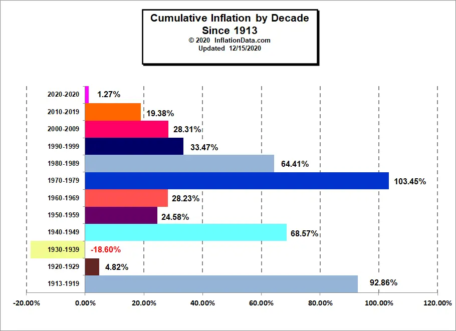
Cumulative Inflation by Decade
Looking at the average inflation rates often gives us the impression that "low" inflation rates like 2% aren't so bad. For instance: You may think that 7% inflation in the 1970's is terrible but 2% or 3% per year isn't so bad right? The average annual inflation from 1990 through the end of 2018 was 2.46%. Well, the total cumulative inflation for the 28 years from January 1990 through November 2020 is 102.40%. In other words, something that cost $100 in January of 1990 would cost $202.40 in December of 2020 in other words prices more than doubled (i.e. purchasing power fell by half) and that is what happens at "low" inflation rates.
The following chart shows how much inflation was "racked up" during each decade rather than simply the average for each year during the decade. See: Cumulative inflation per decade Article for more information about this chart. So we can see that at during the 1990's things cost about 1/3rd more at the end of the decade as they did at the beginning.
As we passed the 100th anniversary of the creation of the FED what have they done to our currency? The following chart shows the trajectory since 1913.
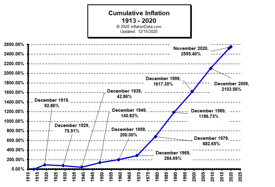
See: total cumulative inflation since 1913 for the full commentary.
Note: We have recently updated the method of calculating the averages so they will be slightly different than you may have seen previously. That means that instead of taking the annual inflation rates for each of the ten years of the decade and then averaging them all together we have used the geometric mean. The geometric mean is also called the compound annual growth rate (CAGR) and is typically used to calculate things like average investment return.
This generally produces a slightly lower number but it is the accepted method of calculating average percentage rates. According to the University of Toronto Mathematics network "The geometric mean is relevant any time several quantities multiply together to produce a product. The geometric mean answers the question, "if all the quantities had the same value, what would that value have to be in order to achieve the same product?" For more information on arithmetic vs. geometric means see: Applications of the Geometric Mean.
The typical way of averaging is called the "arithmetic mean." So exactly how much difference does using the geometric mean make vs. the arithmetic mean make in our data? Interestingly, the answer is "that depends." In our data some decades were almost identical and others were several tenths of a percent apart. The most recent decade (2000-2009) changed from 2.57% to 2.54%. The biggest change came during the six years from 1913-1919. The arithmetic mean produced 8.7% while the geometric mean actually produced a significantly higher number of 9.8%.
It is interesting to note that the inflation for the "teens" decade was the highest at 9.80% and the 70's were close on their heels at 7.25% while the 20's have virtually Zero inflation on an annual basis and about 10% deflation (falling prices) over the entire decade if you don't count the first month of the decade (i.e. January 1920).
The decade of the 30's showed significant deflation where prices actually declined on an annual basis and even over the entire decade. It isn't hard to figure out that prices were falling during the depression (the 30's).
Note that the most prosperous decades were those of low inflation like the roaring twenties (although in that case, the prosperity was primarily for the rich and middle class while the poor farmers suffered due to falling crop prices), the fabulous fifties, and the nineties. Both the 20s and the 90s culminated in a stock market crash while the decade with deflation is known for the poverty they included. Interestingly, deflation doesn't always equal depression. A truly healthy economy with increasing productivity and no increase in money supply will result in lower consumer prices and even more wealth to go around. The same economic conditions combined with moderate inflation may appear healthy but the some of the wealth will be siphoned off to the government via inflation, so the the people will not prosper as much as they would have had there been no inflation at all.
Click Here for information on Gasoline Price Inflation
You may enjoy this article- Is there a correlation between inflation and the stock market ? This chart compares decade inflation and stock market returns during the decade. For a more in depth look at the individual decades see:
- Decade Commentary
- WWI – The beginning of the of the CPI the Inflationary period 1913 – 1919
- The “Roaring Twenties” Inflation and Deflation 1920-1929
- The Great Depression and the Deflationary 1930′s– 1930-1939
- World War II — the volatile 1940′s– High and Low Inflation 1940-1949
- The 1950′s “Happy Days”– Inflation and CPI 1950-1959
- The 1960′s the age of possibility– Low Inflation 1960-1969
- The Inflationary 1970's Inflation and CPI 1970-1979
- The Reagan Era Lower Inflation 1980-1989
Webmasters if you would like to use any of our charts please check our usage policy.
Use our custom search to find more articles like this

Share Your Thoughts