Current Inflation Situation
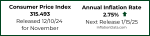
 On October 13th the Bureau of Labor Statistics released the Consumer Price Index inflation information for September. The CPI-U index was 246.819 up from 245.519 in August. This resulted in an annual inflation rate for the 12 months through September 2017 of 2.23% up from 1.94% in August, 1.63% in June and 1.73% in July. Monthly inflation was a whopping 0.53% for September primarily due to a 12% increase in gasoline prices due to refinery shutdowns in response to hurricanes.
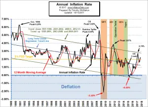
See our Annual Inflation Chart for more info.
NYSE Makes New High in Inflation Adjusted Terms!
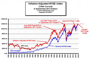 To get a true picture of the state of the market it helps to look at the inflation adjusted NYSE chart so you can see how the NYSE has performed based on the real purchasing power of your dollars, otherwise you are measuring success with a ruler that is constantly changing. Although the NYSE appears to be making new highs every few years, and the news media made a big deal when the “nominal” price finally exceeded the 2007 highs, if you look at the Inflation-adjusted returns on the NYSE you will get an entirely different picture. When we adjust for the depreciating value of the dollar we find that the NYSE has not made new highs in recent years until September 2017.
Looking back we see, the August 2000 stock peak occurred at around 6800 in nominal terms or 9678 in September 2017 inflation adjusted terms. Then it bottomed in April 2002.
The market peaked again in July of 2007 at 12,072 in inflation adjusted September 2017 dollars. This resulted in a 24.7% increase in seven years from peak to peak or about 3.2% per year (compound interest). After the 2007 peak the market lost about 50% of its value and then made a substantial rebound peaking again in 2014 at 11,386 in inflation adjusted terms. But in inflation adjusted terms the NYSE did not exceed its 2007 highs. And in fact, fell below 2000 peak levels in January of 2016. So when measured from August 2000 to January 2016 the market went exactly nowhere! (And that is using the official BLS inflation numbers, if inflation was actually higher the market went less than nowhere it actually lost money!) Recently the market has rebounded again and because inflation has been low the NYSE has exceeded the 2014 level and ten years later it has finally exceeded the 2007 peak in Inflation Adjusted terms!
Exceeding a previous peak is generally considered a bullish signal. Currently the NYSE ROC is in HOLD territory.
See Inflation Adjusted NYSE and NYSE ROC for more information.
Moore Inflation Predictor
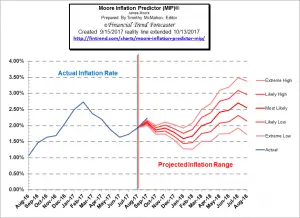 Last month our Moore Inflation Predictor Chart (MIP) was projecting move higher with an extreme high for September of 2.18%. But then along came 2 major hurricanes which drove gasoline prices much higher than projected so although we got the direction right we undershot the target by 0.05%… still just a “rounding error” by BLS standards, so not too bad. Expand the chart to the left to see how last month’s chart compared to reality.
Monthly inflation for September was much higher than normal for this time of year at 0.53% up drastically from 0.30% in August. And more than double the 0.24% of September 2016. Hurricane Harvey and Hurricane Irma had a major effect of driving gas prices up. Initially hurricane Harvey caused roughly 2.33 million b/d of Texas refining capacity to shut down, which is approximately 12.6% of total US capacity. This had the effect of causing a short term 12% spike in gas prices from a nationwide average of $2.36 in mid-August to $2.64 in mid-September. See: MIP for the current Inflation Prediction.
NASDAQ Rate of Change (ROC)©
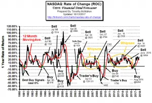 The NASDAQ continues to outperform the NYSE. Annual returns are zoomed upward from 22.8% last month to a whopping 27% this month partially due to the 1% monthly loss a year ago. October 2017 saw a 2.4% monthly gain on top of September’s 3% gain. Monthly returns were 5.35% in May, 1.71% in June, and 0.87% in July. The only losing months so far in 2017 were August at a minor -0.28% and April at -0.88%. In 2016 the NASDAQ saw four losing months, October -0.95, September -0.23, May -3.48% and January with a whopping -9.60% loss.
NASDAQ ROC remains above its moving average thus avoiding a Sell signal, but appears to be losing momentum, making us a bit cautious thus the “hold” signal. See: NASDAQ Rate of Change Chart for more info.
Misery Index:
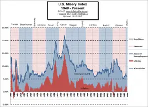 The misery index as of October 2017 (based on the most recent official government data for the 12 months ending in September) is at 6.43% (4.2% unemployment and 2.23% inflation) up from 6.34% in August and 6.03% in June and July but less than half of the peak of 12.87% in both October and November 2011 which was pretty miserable. With inflation up slightly for the month and unemployment down, the Misery index is still 1% below the February 2017 peak of 7.44%. The average inflation rate since the beginning of the Misery Index in January 1948 is 3.53%. See: Misery Index for more info.
You might also like:
Inflation Data:
- 3 Ways Natural Disasters Affect Fuel Prices Everywhere
- Believe Your Own Eyes: Central Banks FOLLOW the Market
Financial Trend Forecaster:
- Bulls, Bears and Fed Bond Purchases
- Gold Production
- The $10 Trillion Resource North Korea Has But Can’t Tap
- Could the Next Oil Price Spike Cripple The Industry?
- New Battery UnVeiled
Unemployment Data:
- September Unemployment Rate Down
- What’s Costing You the Most in Your Hiring Process?
- 5 Old-school Careers That Still Bring Success and Fulfillment
- How Much Should a Commute Influence Future Employment?
- Does a College Degree Really Lead to More Employment Opportunities?
Optio Money:
- Crash and Burn: How to Handle the Lost Wages after a Car Accident
- How to Maximize Your Investments & Grow Your Wealth
- 6 Tips for Financing as a First-Time Homeowner
- 5 Essential Tips for Managing Your Credit Score
Your Family Finances:
- Buyer’s Market: Great Ways to Save Money on Large Home Purchases
- Home Improvements that Will Pay for Themselves Over Time
- Tips for Navigating Your First Home Mortgage
- 5 Money Habits to Develop Before 30
- 5 Critical Things to Do Before You Retire
Elliott Wave University:
- Did You See the 30% Rise in This Major Global Stock Index?
- Silver Chart of the Day
- Gold: Often, Simple Forecasting Tools Are All You Need
- Skeptical Bias Toward Stocks Aligns With Bullish Charts

Leave a Reply