Annual inflation for the 12 months ending in May 2017 was 1.87%. Inflation has steadily moved lower month by month from its peak of 2.74% in February. First falling to 2.38% in March, then down to 2.20% in April, and finally 1.87% in May.
Although Inflation has fallen it is still slightly above its 12 month moving average (Red Line) indicating that the short-term trend is still up, although the gap is closing, a cross below the moving average would indicate that the short term trend has switched to “down”.
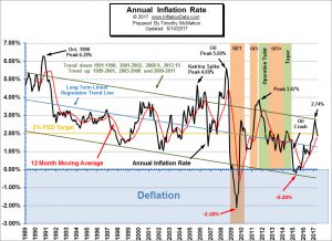
Since 2008, there has been a battle between inflation and deflation with the FED fighting against deflation. In March, the FED has switched sides and is raising interest rates. On March 15, 2017 the Fed voted to raise its benchmark FED-funds rate by a quarter percentage point, to a range of 0.75% to 1% on the assumption that inflation was building (and because they were desperate to raise rates so they will have somewhere to go in the next recession). At its June meeting (yesterday and today), they decided to raise it by ¼% bringing the benchmark rate to a 1.0% to 1.25% range. The Fed also stuck to its projection of another rate hike later this year, followed by three more quarter-point increases in 2018, despite the recent drop in inflation.
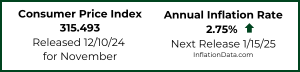
See Annual Inflation Chart for more information.
Inflation Adjusted Housing Prices
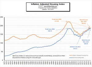 Inflation Adjusted Real Estate Prices- Lets take a look at the idea that housing prices always go up. Of course, each neighborhood is different, so some neighborhoods might be going down while a few miles away housing prices are skyrocketing but by looking at the nationwide average and by adjusting those prices for inflation we can get a better picture of how real estate prices really act…
In the attached chart I’ve extracted the data from the S&P/Case Shiller National Home Price Index and adjusted it for inflation. You can see that the blue line crosses the 100 mark in the year 2000 this is by design as the index was set for January 2000 = 100. But the orange line shows the effects of inflation on the price of houses.
Effects of Inflation on Businesses
 When we think of inflation we usually think of how it affects us as consumers. But the effects of inflation are wide ranging, including not only individuals but also businesses and even countries. Consumers and businesses alike have to deal with the impact of inflation, both good and bad. Early in the inflation cycle, banks are actively expanding their loan portfolio as the easy money policies of the government kick the economy into overdrive. During this artificial “boom” many businesses succumb to the lure of easy money and think that getting a business loan is a good idea. They figure that because inflation rates are rising, the cost (in purchasing power) of paying the loan back will be less than the value of the loan taken out. However, as is the case with any debt, companies must be smart about how much they take out and for what, because even cheaper money won’t bail them out if profits didn’t increase from the new business venture or expansion. Plus, like all games of “musical chairs” eventually the music stops and someone is left without a seat. Read more…
Moore Inflation Predictor
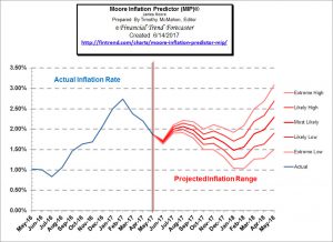 Last month our MIP was projecting that “May should be much more moderate than April”. So we hit the nail on the head for that one. Monthly inflation for January was a massive 0.58%, February was 0.31% and March was only 0.08% but April was 0.30% and May fell to 0.09%.
Current Inflation Forecast- This month, the MIP is projecting that June will be another down month. But then we could see a rebound for July through September.
See the Full Moore Inflation Forecast …
NYSE Rate of Change (ROC)©
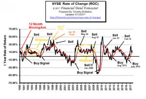 A buy signal was generated in July 2016. In April 2017 we switched to a HOLD signal as the ROC has peaked and nears its moving average. This month rather than cross below the moving average it bounced upward remaining above and keeping the hold signal intact.
This month the monthly rate of return was 2.02% after being 2.11% last month. The annual rate of return rose from 9.32%% in April to 11.92% last month and 14.56% this month. We saw a peak of 26.23% in February after shooting up from below zero so we would expect it to drop through the moving average shortly. If it enters a whipsaw pattern bouncing around 10% like it has in the past (1992-1995) and (2004-2008) the market will be very happy indeed. If it follows the pattern of “recovery” like 2014-2016 not so much. Read more about the NYSE Rate of Change…
NASDAQ Rate of Change (ROC)©
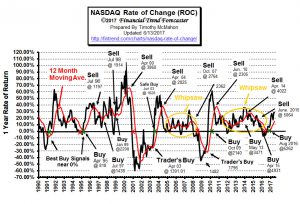 In April the NASDAQ index fell –0.88% since then the NASDAQ has rallied with a vengeance. It gained 5.36% in May and another 1.71% in June bringing Annual returns up to the 28.65% level. It remains well above its moving average thus maintaining a buy signal, but it has faltered thus making us a bit cautious thus the “hold” signal.
Read more about the NASDAQ Rate of Change Chart …
You might also like:
- Real Estate Trends: House Flipping
- Has Permian Shale Productivity Peaked Already?
- How Concerning Are Predictions Of A Stock Market Crash?
- The Silver/Gold Ratio, Inflation/Deflation and The Yield Curve
- 5 Tips to Consider When Purchasing Your First Home
- How to Navigate Through the Emotional Baggage of Bankruptcy
- Plastic Money: Top Tips for First Time Credit Card Holders
- Deciding Which Engineering Degree is Right for You
- What Happens to Your Finances When You Go out on Workers’ Comp
- Budget Busters: How to Handle Unexpected Costs
- Saving Money in the Laundry Room?
- True Cost: How to Calculate the Financial Needs of Your Family
- The Family Minivan: 4 Money-Saving Steps to Fix Up Your Vehicle
- How Bad Credit Happens & How to Keep It from Holding You Back

Leave a Reply