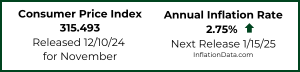
The U.S. Bureau of Labor Statistics released the Annual Inflation Rate data for the year through the end of January on February 14th 2018.
- Annual inflation was 2.07% in January down from 2.11% in December
- CPI-U up from 246.524 to 247.867
- Monthly Inflation for January 0.54% compared to 0.57% in January 2017
- Next release March 13th
Monthly Inflation is High, But…
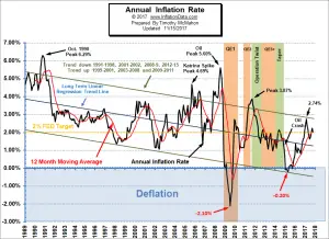 Typically the monthly inflation rate is highest during the first quarter (January through March) and lowest during the last quarter (October through December). January 2017 had inflation of 0.57% and so January 2018’s 0.54% is right in line with that (resulting in annual inflation of 2.07%).
However if we had 11 more months of 0.54% inflation we would have 6.48% annual inflation. But when it is combined with lower inflation months and even some negative months the annual inflation is much lower.
See Annual Inflation Chart for more info.
According to the U.S. Bureau of Labor Statistics (BLS) commissioner’s report-
“The Consumer Price Index for All Urban Consumers (CPI-U) increased 0.5 percent in January on a seasonally adjusted basis, the U.S. Bureau of Labor Statistics reported today. Over the last 12 months, the all items index rose 2.1 percent before seasonal adjustment. The seasonally adjusted increase in the all items index was broad-based, with increases in the indexes for gasoline, shelter, apparel, medical care, and food all contributing. The energy index rose 3.0 percent in January, with the increase in the gasoline index more than offsetting declines in other energy component indexes. The food index rose 0.2 percent with the indexes for food at home and food away from home both rising.”
So although we calculate the annual inflation rate “before seasonal adjustment” as 2.07% the BLS rounds it to 2.1% which is also what they rounded last month’s 2.11% to. The seasonally adjusted increase of 0.5% that they are talking about is the monthly inflation rate (since you can’t seasonally adjust an annual rate).
How Did Quantitative Easing Affect Inflation
I recently answered a question on Quora regarding the effect of the 2008 “money printing” and how it affected inflation and exchange rates. And so I thought I would share my answer with you here.
Quantitative Easing of 2008 wasn’t exactly “money printing” but a way of monetizing certain debts i.e. they took them from one ledger (private) and moved them to another ledger (public), in some cases this could be inflationary and in other cases it wouldn’t be. Partially depending upon which type of debts were involved. But you have to remember that in 2008 the wealth of the world was contracting massively because the value of stocks and housing was in a massive contraction. So even if stocks and housing aren’t part of the “money supply” they still affect the overall wealth. So if you contract one side of the wealth and expand the other has the overall supply really changed? It may have changed hands but the total may not have changed much. For more information see The Effects of Quantitative Easing.
Interestingly throughout the first half of QE1 the inflation rate continued to fall to a deflationary -2.1% then it finally began to rise. But toward the end of QE1 it was actually falling again. So QE2 was put in effect which kicked it up a notch higher. During “Operation Twist” where the government bought long bonds and sold short bonds, Inflation actually fell. And during QE3 inflation oscillated in a fairly narrow range. To see what effect each phase of quantitative easing had on the actual inflation rate see this Annual Inflation Chart with QE Phases.
In regard to exchange rates rather than Inflation, the demand for dollars was also increasing during that time because the Dollar was still considered the best option, not because the dollar was so good but because the other options were even worse.
Misery Index
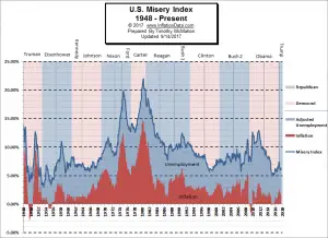 The misery index as of February 2018 (based on the most recent official government data for the 12 months ending in January ) is at 6.17% (4.1% unemployment and 2.07% inflation) down from 6.43% in September but above the 6.03% in June and July. With inflation down and unemployment flat for the month, the Misery index is well below the February peak of 7.44%.[Read More…]
Moore Inflation Predictor
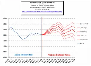 Last month our MIP Chart was projecting a slight down move which is exactly what we got. Annual Inflation was 2.11% last month and it is 2.07% this month. This month, the MIP is projecting a basically flat month possibly very slightly up or down. But the following months will be much more volatile.
See Moore Inflation Forecast for more info.
NYSE Rate of Change (ROC)©
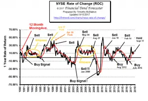 The NYSE index has entered the “Whipsaw period” being above its moving average in November, below in December, above in January and below in February. In December we said, “However at this point in the cycle we could very well be seeing a whipsaw and with the annual rate of return at 14% we wouldn’t jump to sell too quickly.” Which is why we have labeled it “Hold”.
See what the falling NYSE ROC means for you now.
NASDAQ Rate of Change (ROC)©
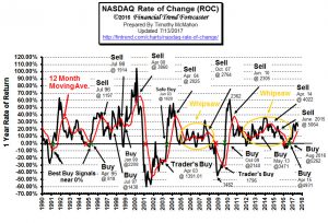
The NASDAQ continues to outperform the NYSE. The annual return for the NASDAQ is 21.67% while the NYSE is around 10%. The NYSE fell -4.78% since last month a little more than cancelling out the previous month’s gain, while the NASDAQ fell -2.9% after having gained 5.09% the previous month.
See NASDAQ ROC for more.
You Might Also Like:
From Financial Trend Forecaster
- Oil Prices Ravaged By Financial Turmoil
- Could Oil Go to $100 a Barrel by 2019?
- Work From Home Trends To Expect In 2018
- Big Picture Update on Commodities & Precious Metals
- Three Trends in America’s Student Debt Today
From Unemployment Data
- Pursuing a Healthcare Career
- How to Pick the Right University so You Can Get the Career You Want
- Hard Day’s Work: 4 Ways to Prepare for Working a Construction Job
- Hardhats Required: 4 Things to Do after an Accident at Work
- January Unemployment Almost “Record Setting”
From OptioMoney
- 6 Budgeting Pointers to Get Your Finances Back on Track
- What Impact Does Divorce Have on Your Finances?
- How to Check Your Credit Score Before Applying for a Mortgage
- Rising Responsibility: 3 Signs You’re Ready to Take on a Mortgage
- How Pro Homeowners Pay off Their Mortgage Faster Than Their Neighbors
From Elliott Wave University
- Urgent Message: Two Must See NASDAQ Charts
- Bitcoin Crashes Below $10,000. What’s Next?
- Stocks Can’t Keep Going Up Forever… Or Can They?
- New Long-Term Equity Breakout
- A Method Traders Can Use to Confirm an Elliott Wave Count
From Your Family Finances
- Cutting Your Home Insurance Bill: Three Secrets That Can Save You A Bundle
- Money Saving Challenge
- Taxes: Why It’s Better to File Early
- Tony Robbins Best Financial Advice
- How to Save Energy When Using a Water Heater

It is apparent that the author is a data geek. I enjoy how he
writes and organizes facts.
Thanks! 🙂