The U.S. Bureau of Labor Statistics (BLS) released their monthly inflation report for July on August 16th. According to the BLS Annual Inflation declined for the third consecutive month. Annual inflation was 1.13% in April, 1.02% in May, 1.01% in June and 0.84% in July.
Not only did the rate of inflation fall but actual consumer prices declined as the CPI-U index declined from 241.038 to 240.647. Thus monthly inflation was -0.16%. For the year food at home was down -1.6%, energy was down -10.9%, used cars and trucks were down -3.7%, while overall transportation was down -4.9%. With all of these categories down one might wonder what actually caused the inflation rate to rise that meager 0.84%? Medical care was up 4.0%, Housing was up 2.4%, Apparel was up 0.3% and although some components of the food index were down like Meats, Poultry, Fish and Eggs -5.6%, and Dairy -3.1%, others rose like Fruits and Vegetables (up 1.4%), Alcoholic beverages (up 1.2%) and Food away from Home (up 2.8%) resulting in an overall increase for all food and beverages of 0.3%.
Current Annual Inflation Chart
 Our current annual inflation chart shows that the recent declines in the Inflation Rate have left it barely above its 12 month moving average. A move below the moving average would indicate that the trend has turned deflationary once again. Read more Information on Current Inflation…
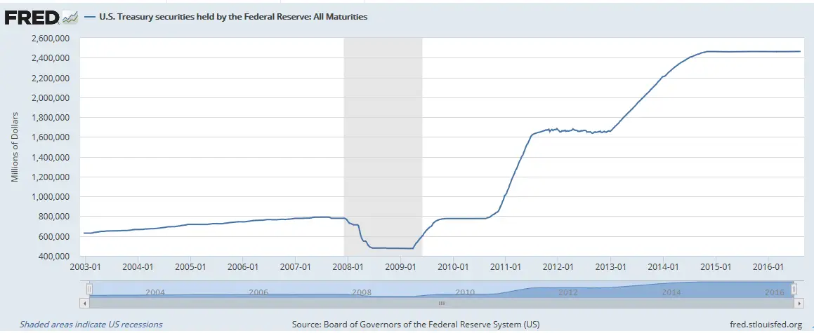
The following chart shows Federal Reserve holdings of U.S. Treasury securities. You will remember that Quantitative Easing (QE) is just a fancy term for the Federal Reserve buying Treasury Securities. So rather than the market absorbing the government debt it is held by the FED. This slight of hand is generally inflationary.
But we can see that although the inflation rate is falling the FED has not sold the Treasury Securities it bought it has simply stopped buying more. So in spite of the massive build up of debt held by the FED (remember those huge numbers on the left hand side are in MILLIONS so you need to add a bunch of zeros (6) to get the true impact of the magnitude of these purchases. In other words, the FED currently holds $2,462,865,000,000 worth of Treasury Notes up from 629,397,000,000 in January 2003. One Trillion (1,000,000,000,000) is a million millions (1,000,000 x 1,000,000). So back in 2003 the FED held just under 2/3rds of a Trillion Dollars in Treasury Notes. And now it holds $2.46 Trillion in Treasury Notes with all of the increase coming since 2009.
U.S. Treasury Securities Held By the Federal Reserve
 And this massive build up in debt has only achieved one of the most anemic recoveries in history.
One way of measuring the magnitude of an economic recovery is by calculating the increase in the number of jobs created. After all, more people working means more wealth is being created… fewer people working generally indicates the economy is sick.
Of course, it is important to look at the increase in the Labor Force as a percentage of the total rather than in absolute terms. A thousand new jobs in a community of 10,000 is a big deal but 1,000 new jobs in a country of 300 million is nothing. So, lets compare the results under 4 different presidents.
In the table below we can see the total non-civilian labor force at the start of each presidency and the number of jobs that increased during the presidency. We can see that the Obama “recovery” was barely better than the results Bush 2 got… which included his abysmal 2+million jobs lost in the last six months of his presidency. You would think that rebounding from such a bad place and pumping almost $2 Trillion dollars into the economy we would have gotten a bit more for our money. By the way, according to the BLS the oft quoted “more than 10 million jobs created is incorrect, the actual number as of August 1st 2016, is included in the chart below.
Jobs Increase as a % of Labor Force
| Year | President | Labor Force | Jobs Increase | % Increase |
| 1993-00 | Clinton | 128,400,000 | 25,452,000 | 19.82% |
| 1981-88 | Reagan | 108,026,000 | 17,885,000 | 16.56% |
| 2008-16 | Obama | 154,063,000 | 7,917,000 | 5.13% |
| 2000-08 | Bush 2 | 142,267,000 | 6,727,000 | 4.72% |
Source:

What type of Jobs are those? Mostly Government Jobs? Government Jobs put harder restrictions on everyone because higher taxes on all have to be had to pay for them. Be sure the facts are not misleading!
These are measurements of Civilian non-institutional population. According to the Bureau of Labor Statistics, the Civilian noninstitutional population (in the Current Population Survey) are persons 16 years of age and older residing in the 50 states and the District of Columbia who do not live in institutions (for example, correctional facilities, long-term care hospitals, and nursing homes) and who are not on active duty in the Armed Forces.
But the National Compensation Survey defines Civilian Workers as the sum of all private industry and State and local government workers. Federal Government, military and agricultural workers are excluded.
In this case the data would be using the first definition so yes it would include government workers (but not military). According to Pew Research the majority of gains in jobs under Obama came from Health Care, Food Services, Temporary Help, Retail, and Social Assistance. While the largest declines came from State and Local Government, Manufacturing,and specialty trade contractors. So although the number of jobs may have increased the quality of those jobs has move to lower paying jobs i.e. from Manufacturing and Contracting to working at McDonald’s and temp jobs.