• Home
  • Related Sites
    • Financial Trend Forecaster
      • Moore Inflation Predictor
      • NYSE Rate of Change (ROC)
      • NASDAQ Rate of Change (ROC)
      • Crypto ROC- BTC & ETH
    • Unemployment Data
      • Historical Employment Data
      • Unemployment Rate Chart
      • Labor Force Participation Rate
    • Optio Money
    • Elliott Wave University
    • More Resources
  • Definitions
    • What is Inflation?
    • What is Core Inflation?
    • Inflation vs CPI
    • What is Deflation?
    • What is Disinflation?
    • What is Agflation?
    • What is Stagflation?
    • What is Hyperinflation?
    • What is Quantitative Easing?
    • What is Quantitative Tightening?
    • What is Velocity of Money?
    • What is Fiat Currency?
    • How Do I Calculate Inflation?
    • What are “Sticky Prices” and Why Do They Matter?
  • Featured Content
  • About Us
  • Feedback
    • Sitemap
  • Subscribe Now

InflationData.com

Your Place in Cyber Space for Inflation Data

CPIWidget-Feb26
  • Numerical Inflation Data
    • Current Inflation Rate
    • Monthly Inflation Rate (Moved)
    • Historical U.S. Inflation Rates
    • Historical CPI
  • Inflation Charts
    • Ann. Inf. Rate Chart
    • Long Term Inflation >
      • Ave. Inf. by Decade
      • Total Inf. by Decade
      • Inflation 1913-1919
      • Inflation 1920-1929
      • Inflation 1930-1939
      • Inflation 1940-1949
      • Inflation 1950-1959
      • Inflation 1960-1969
      • Inflation 1970-1979
    • Cumulative Inflation
    • FED Monetary Policy and Inflation
    • Inflation and Recession
    • Confederate Inflation (1861 – 1865)
    • Misery Index
    • The 3 Stages of Inflation
    • 15-Yr Inflation Trends Chart
  • Inflation Calculators
    • Cumulative Inf. Calc.
    • How Much Would it Cost
    • Salary Inf. Calc.
    • Cost of Living Calc.
    • U.K. Inf. Calc.
    • Cost of Gas Calc.
    • Net Worth Calc.
    • Lifetime Earnings Calc.
    • Savings Goal Calc.
    • Financial Calculators
  • Inf. Adjusted Prices
    • Energy >
      • Inflation Adj. Gas Prices
      • Historical Oil Prices Chart
      • Crude Oil Price (Table)
      • Natural Gas Prices
      • Electricity Prices
      • Oil vs Gold
    • Gold >
      • Inflation Adjusted Annual Average Gold Prices
      • Gold is a “Crisis Hedge” not an  “Inflation Hedge”
      • Comparing Oil vs. Gold
    • Corn Prices
    • Education Inflation
    • Housing Prices
    • Mortgage Rates
    • NYSE Index
    • Inf. Indexed Bonds
    • Movie Revenues
    • Inflation-Adjusted Wages
  • Cost of Living
    • Calculate Cost of Living
    • Cost-of-living Adj. (COLA)
    • Consumer Price Index CPI
      • Historical CPI
      • Current CPI
      • CPI Release Dates
    • Gas Prices >
      • Cost of Gas
      • Cost of Gas Per Month
      • Gas vs. Oil Price Chart
    • Food Prices 1913 vs 2013
    • Health Insurance
  • Blog
    • Key Inflation Articles
    • International Inflation
    • Historical Inflation Rates for Japan (1971 to 2014)
You are here: Home » Blog » Precious Metals » Gold » Where is Gold Headed?

Where is Gold Headed?

Published on September 10, 2014 by Tim McMahon Leave a Comment

To get the true measure of anything it is important that you use a standardized measurement. This of course is why a “foot” or “inch” eventually became exactly a certain length and didn’t vary based on each particular person doing the measuring. And more recently it is why Celsius measurement relates to the exact freezing and boiling points of water at an exact atmospheric pressure. It is also why,  when we measure a commodity like Gold or the stock market we need to use a scale that doesn’t change. Unfortunately, the typical measurement i.e. the U.S. dollar is always changing in value. That is the dollar depreciates due to inflation thus changing the measurement on a daily (or at least monthly basis).

That is why here at InflationData.com we try to present all our measurements in terms of inflation adjusted dollars. And although that measurement is still dependent on trusting the U.S. Bureau of Labor Statistics it is still better than no adjustment at all.

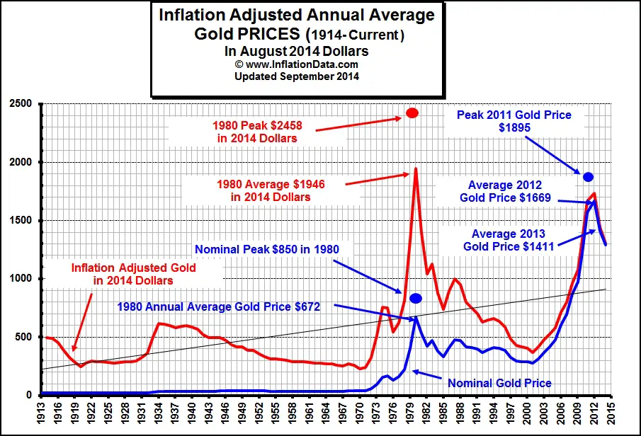
Today we are looking at the price of Gold and trying to determine where it is headed. From the chart below we can see that in inflation adjusted terms (the red line) the 1980 average price of gold peaked at $1946 in 2014 dollars while the average price in 2012 in inflation adjusted terms was $1669.

Inflation Adjusted GoldClick for Larger Image

Note that the peak price for gold occurred in 2011 but the highest average annual price occurred in 2012. But since then the average annual price has been steadily declining. Although the decline has not been as rapid as it was following 1980 it has declined steadily none-the-less. Similarly, the price of gold declined steadily from the 1980 peak through an interim bottom in 1985 where the annual average price had declined 51% from the average price in 1980.

1986 gave some hope to gold bulls as the price regained some of its losses, cutting the loss to “only” 39% in 1986 and 29% in 1987.  But then the losses began to mount again as 1988 the loss was 30%  and  by 2000 the loss in nominal terms was 57% but in inflation adjusted terms it was a whopping 79% so gold in fact did not keep up with inflation during this 20 year period and as a matter of fact it lost most of it’s value.

During the next decade though it began regaining its value and by 2012 it was only down 11% from it’s peak in 1980 in inflation adjusted terms. But that is still a loss. This highlights the importance of “When you buy”.  If you bought at or near the peak of 1980 it would have taken you 32 years to get near breaking even and that doesn’t count the lost income in the interim.

However if you had bought near the low at anytime during 2001 when the average price of gold was $275 and then sold anytime in 2012 you would have made approximately 368% on your money. Even if you missed the peak in 2012 (or the average) you would still be up 252% in 2014. So this underscores the importance of being a contrarian and buying low and selling high. And not falling for buy and hold even for Gold. (Although maintaining an insurance portion of Gold in case of catastrophe is an entirely different matter).

In the following chart our friends at Chart of the Day have created a chart of the gold price since 2000 and added resistance and support lines showing that the current price is bumping against resistance and could be getting close to repeating 1986’s rebound creating a good selling opportunity over the next few years. I firmly believe that each decade has a star performer and that the same star never repeats two decades in a row so.  As they say hindsight is always 20/20, the difficulty of course is determining what the star performer for any decade will be in the early part of the decade.

Gold Chart of the Day

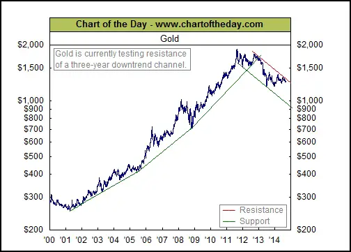
Chart of the Day Commentary

Today’s chart provides some long-term perspective on this millennium’s gold market. As today’s chart illustrates, the pace of the bull market in gold that began back in 2001 increased over time. In late 2012, however, the parabolic trend in gold prices came to an end and a new downtrend began in earnest. While gold has traded in a flat / choppy manner for more than a year, gold has managed to once again work its way back up to resistance (see red line) of its three-year downtrend channel. As today’s chart illustrates, however, gold has had a difficult time breaking through resistance over the past couple of months.


You might also like:

  • Gold is a “Crisis hedge” not an “Inflation Hedge”
  • Oil, Petrodollars and Gold
  • Comparing Oil vs. Gold
  • Is It Time to Admit That Gold Peaked in 2011?


About Tim McMahon

Connect with Tim on Google+.

  • Web
  • |
  • Twitter
  • |
  • Facebook
  • |
  • LinkedIn
  • |
  • More Posts(409)

Filed Under: Gold Tagged With: gold, inflation

Leave a Reply Cancel reply

Your email address will not be published. Required fields are marked *

This site uses Akismet to reduce spam. Learn how your comment data is processed.

Latest Posts

  • BLS Inflation Data Delayed
  • Updated Cumulative Inflation Calculator
  • Inflation-Adjusted Silver Prices
  • December Inflation Down Slightly, Not Flat
  • December 2025 Inflation Report for November
  • How Deflation Created the Middle Class
  • October Inflation Numbers Delayed
  • Why the 2.8% COLA May Fall Short of Real Inflation

Sponsored:

As a Seasoned Investor I thought I'd seen everything... But recently I discovered TradingView which has really improved the information I have at my fingertips.~ Tim McMahon, editor

TradingView gives me an edge... including powerful charting tools, real-time market data, and a global community of traders—all in one easy to use platform. It has hundreds of indicators, and even custom scripts for more advanced users, and you don't need to change Brokers just use its seamless brokerage integration... TradingView isn't just a charting tool—it's your full trading command center.

Trade smarter. Trade faster. Check Out TradingView for free.

----------

The Best Place to Buy Your Crypto

Coinbase is the largest Crypto Trading platform in the U.S. and the easiest to use. ~Tim McMahon, editor

Check out Coinbase here

Subscribe Now

eTrends Signup Form

Elliott Wave Resources

Free Elliott Wave Resources

What is Waveopedia?

Waveopedia is EWI’s free, comprehensive index of Elliott wave patterns and terms. Everyone from beginners to experts can benefit from it. It’s a great place to send your followers if they’re new to Elliott waves.

  • Deflation Hits China is the U.S. Next?

  • Why You Must Avoid the Herding Trap

  • Chasing Trends Can Cost You

  • More Education Resources

Post Archives

Home | Articles | Sitemap | Terms of Service | Privacy | Disclaimer | Advertise With Us

Copyright © 1996-2026 · Capital Professional Services, LLC · Maintained by Design Synergy Studio · Admin

Do Not Sell My Personal Information