The Bureau of Labor Statistics Released the Inflation Data for the Year ending in July on August 11th.
- Annual inflation was 1.73% in July – Up from 1.63% in June, but down from 1.87% in May,
2.20% in April, 2.38% in March, 2.74% in February, and 2.50% in January. - CPI 244.786 in July down from CPI 244.955 in June
- Monthly Inflation for July -0.07%, June 0.09%, May 0.09%, April was 0.30%, March was 0.08%, February was 0.31% and 0.58% in January.
- Next release September 14th
The reason the CPI went down but inflation went up is because July 2016 monthly inflation was -0.16% and this July was less negative. So CPI goes down for the month but not as much as last year so Annual Inflation goes up.
Annual Inflation Chart
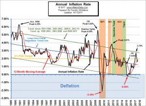 Annual inflation for the 12 months ending in July 2017 was 1.73% up from 1.63% in June but still below the 1.87% in May, 2.20% in April, 2.38% in March, 2.74% in February and 2.50% in January. The annual cyclical low was 0.84% in July 2016. The longer term cyclical low of -0.20%was in April of 2015.
We have to remember that typically the months of January through May are highly inflationary, June through September are moderately inflationary and October through December produce the lowest increase in prices and are often even deflationary. However, this year the high inflation months have not produced as much annual inflation as usual and if we only look at the last few months, it looks like inflation is falling.
See Annual Inflation Chart for more information.
———————-
Misery Index
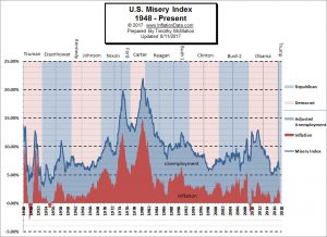 The misery index as of August 2017 (based on the most recent official government data for the 12 months ending in July) is at 6.03% (4.3% unemployment and 1.73% inflation) identical to last month but down from 6.17% in May and 7.44% in February and well below the peak of 12.87% in both October and November 2011 which was pretty miserable.
See the Misery Index for more info.
———————-
Is the NYSE Really Making New Highs?
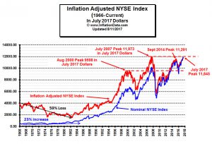 Inflation Adjusted NYSE-
When you adjust for the increase due to inflation, we can see from the red line (which is the “inflation adjusted NYSE Index stock price” in current dollars) that in inflation adjusted dollars the index is not where the media and investment analysts would have you think it is..
———————-
What Can We Learn About the Stock Market From the NY Subway?
 What is truly interesting is how the development of the NYC subway parallels the New York Stock market.
Elliott Wave International is a major proponent of “Socionomics” which tracks parallels in society and financial markets.
Just consider the story and video of the NY City Subway 2nd Avenue line.
———————-
Bitcoin: The New Safe Haven?
Bitcoin prices plunged more than 25% over the weekend of July 17th, 2017. In one weekend, Bitcoin, lost $10 billion, in market cap due to the crash. On Monday morning, July 17th, 2017, the Bitcoin market recovered 30-40% of that loss. In the following article Chris Vermeulen, “The Gold and Oil Guy” takes a look at Bitcoin and the Trends involved.…
———————-
Moore Inflation Predictor
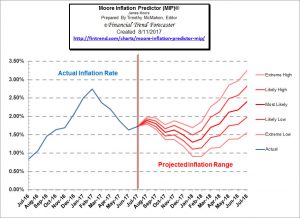 Last month we said that ” This month, the MIP is projecting an upturn for a couple of months and then we may see another slight downturn”. Although we were correct on direction the MIP was projecting a greater upmove than we actually got. Monthly inflation for July was a negative -0.07%, while the projected range for this time of year was 0.10%-0.15% so being negative gave us a much smaller rise in the actual annual inflation rate than we projected.
See Moore Inflation Forecast for more info.
———————-
NYSE Rate of Change (ROC)©
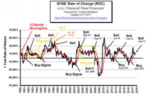 New Sell Signal
The NYSE Rate of Change (ROC) chart is helpful in getting the “big picture” of the stock market very quickly. The old saying “a picture is worth a thousand words” is very applicable to this chart. Once you understand how to read the ROC chart you can easily spot the direction of the market which makes it easy for you to know whether you want to be invested in the market or not.
See the NYSE Rate of Change.
———————-
NASDAQ Rate of Change (ROC)©
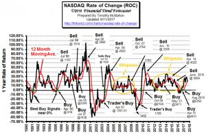 Hold Signal! Acceleration to the upside peaked in April and is currently at the moving average.
Annual returns in June were 28.65% but they fell to 24.75% in July and 18.9% in August. …
See NASDAQ ROC for more.
———————-
You might also like:
- Top 3 Technical Tools Part 1: Japanese Candlesticks
- Taking the Long View of the Market
- When Prices Are Falling, TWO Numbers Matter Most
- Investing: The Incredible Power Of Staying In The Now
- The Technical Failure That Could Clear The Oil Glut In A Matter Of Weeks
- Is A Big Move In Oil Prices Due?
- Is Your House is Wasting Energy & Costing You More Money
- Getting the Best Deal on a New Car
- How Does Your Debt Compare?
- 5 Caveats When Buying Your First Home
- 5 Financial Tips to Keep Your Children Fed While You’re Out of Work
- Is it Ever Wise to Owe Money to a Creditor?
- 4 Ways to Protect Your Credit Score
- What to Do if Served Foreclosure Papers
- A Series of Unfortunate Events: How Social Security Disability Can Help
- 1 Million Fewer Jobs but BLS Says 209 K More
- Unemployment Rates by State
- Employers Compensation Costs Increase
- 4 Ways Workers’ Comp Can Impact Your Personal Finances


Leave a Reply