
In today’s article John Mauldin looks at the “Big D” deflation plus the difference between the out look and time-frame of the average investor and that of the professional money manager. He also looks at the difference between “secular” and “cyclical” bull and bear stock markets. We also have an article by Jawad Mian entitled “A Little Less Deflation, A Little More Reflation, Please”. Enjoy! ~ Tim McMahon, editor
Thoughts from the Frontline: World War D—Deflation
By John Mauldin
Then we turn to Jawad, who will discuss why we could see a reflationary macro regime emerge in much of the developed world and where the resulting opportunities might lie. I will finish up with why I think that this reflationary period will be temporary, with a potential for a serious round of deflation further out in the future, even though I readily acknowledge that “temporary” could mean a few years. But the looming reality over the longer term is that the coming war over a return of deflation will be fought by central banks everywhere. It will truly be World War D.
Why start with equity markets when we are talking about deflation and inflation? Because we need to see the connections!
Secular Bear Markets
I first wrote about a coming secular bear market in 1999. I was early, of course. The market went up (a lot!) for the next year. Over the next few years I began to do some work looking at secular bear markets not in terms of price but in terms of valuations. My now very good friend Ed Easterling of Crestmont Research was doing similar analysis, and we compared notes. Then we published a series of reports in this letter, which I later adapted in two chapters (co-authored by Ed) of my book Bull’s Eye Investing in 2003.
I believe secular bull and bear markets should be seen in terms of valuation, and cyclical bull and bear markets in terms of price. A secular bull market should be approached with a more aggressive, relative return style of trading, while a secular bear should have an absolute return focus with appropriate risk controls. That difference in trading style is necessary because of how valuations will trend in the two different types of markets.
Let’s look at the updated charts that Ed sent me over the weekend from his fabulous, data-rich website. In general, secular cycles are long-term trends in valuation. These cycles include numerous interim surges and falls in price that reflect shorter-term psychology and economics. The long-term secular cycles can be seen in this first graph, with secular bears represented in red and secular bulls shaded green. The driver of these cycles is the relative valuation of the stock market as reflected in the price/earnings ratio (P/E). When P/E trends higher, it multiplies earnings growth and generates periods of above-average returns. When P/E trends lower, it offsets some or all of earnings growth and delivers periods of below-average returns. P/E is the blue line underlying the secular cycles on the chart.
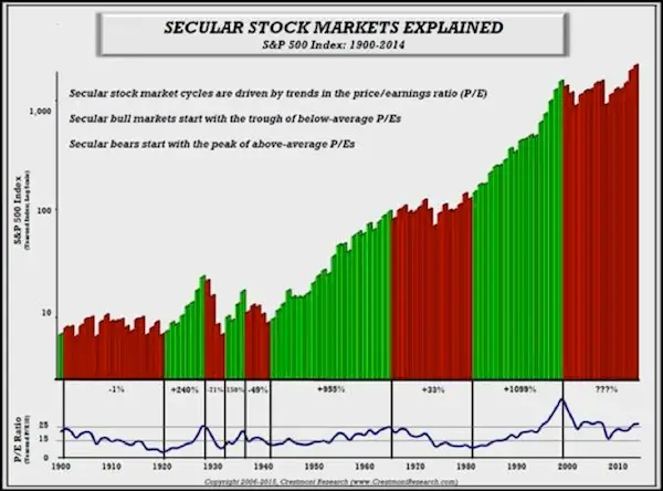
The P/E segments for all of the red-bar secular bears can be overlaid on a chart with time in years across the bottom and the level of P/E on the side (see chart below). First, secular bears tend to start in the red zone of high P/Es and decline to the green zone of low P/Es. This downshift into a secular bear is caused by a trend in the inflation rate from low, stable inflation to levels of either high inflation or deflation.
Second, this chart includes red and green arrow-lines that highlight the shorter-term cyclical bears and bulls during the current secular bear. The chart demonstrates that longer-term secular periods have cyclical bears and bulls within them, offering very profitable trading opportunities.
Third, the current level of the market P/E indicates that the stock market is fairly high. It is now well above the peaks of past secular bears and nowhere near the levels needed for a secular bull market start.
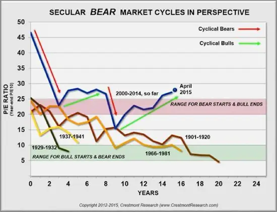
Even after more than 15 years in a secular bear market, the current secular trend has a ways to go to reach lower valuation levels. How can that be true after such a long period? In part, it’s because this secular bear started at such high levels. The current secular bear has experienced the same amount of P/E decline that many of the past secular bears experienced over longer and shorter periods, but the current secular bear started at twice the historical highs.
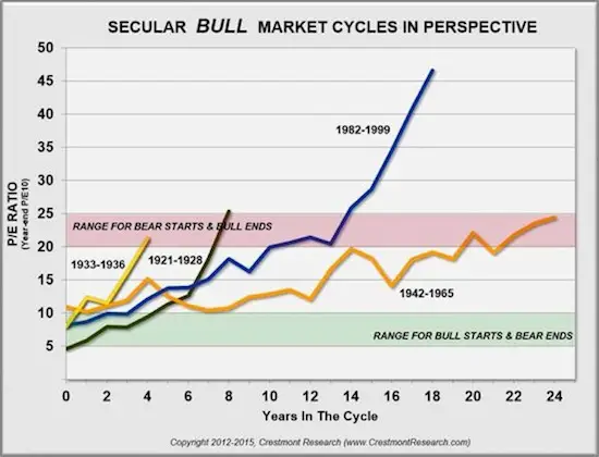
Bears start where bulls end and vice versa. As the secular bull market version of the previous chart shows, the late 1990s bubble took that secular bull market to unprecedented heights. A return from a period of either high inflation or deflation to low, stable levels of inflation will result in a rising trend in P/E during secular bull markets .
The “difference” between Jawad’s and my view on the inflation/deflation question is so important because turns within cycles have a major impact on pricing and valuations.
Yet even though we are in a secular bear that has come a long way with quite a ways to go, this secular bear looks and acts like previous secular bears. For example, here’s the daily graph for the previous secular bear in the 1960s and ’70s.
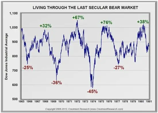
The cycles are very evident. Note the dramatic magnitude of their swings. Here’s the same format of chart for the current secular bear. Notice there are very similar patterns and magnitude… and new highs in the middle of the secular period.
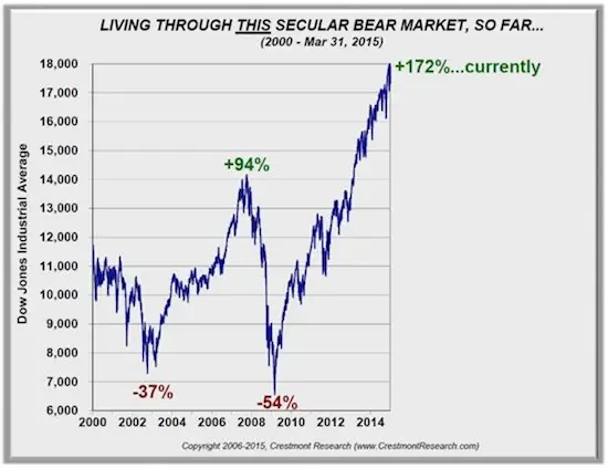
Right now, many of you are scratching your heads and wondering how we get to lower valuations. Maybe this time is different! Or perhaps we’ll see a longer secular bear market until we return to a “normal” economic environment; and then earnings, prices, and valuations will begin to more closely resemble historical patterns. Remember, rising periods of inflation have historically compressed valuations.
World War D
While deflation fears have persisted since the 2008 meltdown, they intensified last year, with global inflation readings falling to their lowest level since 2009. The collapse in oil prices, combined with generally soft macro data and a rising dollar, is aggravating concerns about the inflation outlook. Inflation expectations have plunged, and sovereign bond markets have rallied sharply, with yields of less than zero in parts of Europe. Negative-yield bonds now account for some €1.5 trillion of debt issued by governments in the euro area, equivalent to almost 30% of the total outstanding. Many expect even more of the global bond market to fall into negative yield territory. Half of all government bonds in the world today yield less than 1%.
Many fear that the current deflation outbreak will turn into a “vicious circle of deflation,” in which consumption is postponed and investment plans are curtailed in anticipation of lower prices. These behaviors contribute to a further drop in demand and additional reductions in prices. The burden of debt increases, since falling incomes make it more difficult to service existing debt as real interest rates rise. Thus, economic growth slows and inflation declines further, hurting consumption and investment even more – hence, the vicious deflationary spiral.
As Christine Lagarde warned in January 2014, “Deflation is the ogre that must be fought decisively.” It is no surprise then that global short-term nominal interest rates are reaching the zero lower bound. Oil-price-induced weak inflation readings have forced aggressive reactions from policymakers, with at least 24 central banks already engaging in some form of monetary easing in 2015. According to my friend David Rosenberg, nearly 90% of the industrialized world economy is presently anchored by zero rates. There is a global focus on fighting deflation.
Why is inflation still nonexistent? And what do we make of all this unprecedented monetary policy? Is debt deflation the biggest risk to the global economy? What are some of the major implications for investors? In the next section Jawad parses the economic data and surveys the macro landscape to offer his cyclical (1 to 2 years) outlook, and then I consider the secular (5 to 10 years) outlook, with a particular emphasis on the threat of deflation.
A Little Less Deflation, A Little More Reflation, Please
By Jawad Mian
Deflation is not always sinister.
I believe the deflation scare of 2014 will give way to a global economic surprise in 2015. The type of deflation likely to be observed this year will benefit the global economy and provide a welcome boost to real household incomes. In my mind, the collapse in oil prices is good deflation; a decline in demand, wages, or forward expectations causes bad deflation. Once the shock of the speed of the recent drop in oil prices is overcome, cheaper oil will undoubtedly be an important net positive for the world economy later in the year.
There is little evidence that expectations of future price declines are suppressing employment, wages, consumer spending intentions, or even global manufacturing activity. Global recruitment difficulties are back at 2006 levels, and there is mounting evidence that wage gains should begin to accelerate where they are needed most: the US, Germany, and Japan.
The US created nearly 3 million jobs in 2014, and real wages have risen more over the past year than at any other point since 2009. Strong momentum in the labor market, ongoing recovery in the US housing market, positive wealth effects from a buoyant stock market, and declines in energy prices should all combine to generate strong consumer-led growth.
It is getting more difficult to attract and retain labor. The tighter labor market has led Walmart, the nation’s largest private employer, to increase wages for 500,000 of its most poorly paid workers. The company plans to spend about $1 billion a year to raise the pay of all employees (1.3 million) to at least $9 an hour, and to at least $10 an hour by next February. I believe Walmart’s bold initiative will lead to higher wages being set for entry-level jobs throughout the retail sector, a trend that may impact over 15 million people.
A look at interest rates, currency values, and reduced energy costs suggests that Europe and Japan will receive a significant reflationary boost. Europe’s economic turnaround is in its early stages and could provide a positive growth surprise over the next two years. The liquidity spigots are wide open, and the largely recapitalized banking system is responding to credit demand, as indicated by the latest ECB bank lending survey. Money supply and bank lending have continued to recover, with loan growth in the euro area about to turn positive for the first time since 2012.
The recent German consumer confidence reading was the highest it has been since 2001. German unemployment is near post-reunification lows, and real wages are growing at the fastest pace in over 20 years. IG Metall, Germany’s largest union, just settled on a 3.4% annual pay rise for its workers in southern Germany. More importantly, the deal is seen as a bellwether for salary negotiations in the rest of the country. Reports suggest that 32 regional contracts (covering seven unions and about 6.5 million workers) expire this year.
This is an essential part of euro-area rebalancing that should support growth in neighboring countries by way of a competitive boost. The Spanish labor market has enjoyed its best year since 2007, and the eurozone’s overall unemployment rate has fallen to a 33-month low.
Deflation is in the process of ending in Japan. The Bank of Japan has successfully cheapened the yen to its most competitive level since 1973 on a real effective exchange-rate basis. Export volumes are rising, and Japan’s balance of payments on tourism has turned positive for the first time in a long time. According to Peter Tasker, in terms of discretionary spending, the tourist boom is equivalent to an increase in the Japanese population of 1.4 million.
To continue reading this article from Thoughts from the Frontline – a free weekly publication by John Mauldin, renowned financial expert, best-selling author, and Chairman of Mauldin Economics – please click here.
You might also like:
- April Ends another Deflationary Year
- “Glinda the Good” Deflation isn’t looking so… Good
- Deflation: The Last Argument of Central Banks
- Why the Fed Does Not Control Inflation and Deflation
About John Mauldin
Each week, well over a million readers turn to John Mauldin to better understand Wall Street, global markets, and the drivers of the world economy. And for good reason. John is a renowned financial expert, a New York Times best-selling author, a pioneering online commentator, and the publisher one of the first publications to provide investors with free, unbiased information and guidance, Thoughts from the Frontline—the most widely read investment newsletter in the world. More...
- Web |
- More Posts(10)

Leave a Reply