
The U.S. Bureau of Labor Statistics released their inflation numbers for July on August 19th. The basic summary they emailed read as follows:
| CPI for all items rises 0.1% in July as food prices rise but energy prices decline | |
| 08/19/2014 | |
| On a seasonally adjusted basis, the Consumer Price Index for All Urban Consumers increased 0.1 percent in July after rising 0.3 percent in June. The index for all items less food and energy rose 0.1 percent in July, the same increase as in June. | |
If you just read that what impression would you get? Maybe that inflation is UP? At least that is what the headline implies. But then it says, energy prices are down. And it also implies that inflation was up in June as well.
But when we look closer at the actual numbers we find that the Consumer Price Index (CPI) was 238.343 in June and 238.250 in July. So prices actually decreased in July. So how can the BLS say prices increased when their own index says they decreased?
Easy… through the magic of “Seasonal Adjustments”. They figure that if prices normally fall by 2% at this time of year but instead they only fell by 1% then according to seasonal adjustment they magically went up by 1%… never-mind the fact that they actually went down by 1%. This is why here at InflationData we try to ignore seasonal adjustments as much as possible. Unfortunately, with the government shouting them from the rooftops and the mass media picking them up, we have to mention that the “real” numbers say something else. Whether the BLS CPI numbers are “real” or not is another issue. (See Can We Trust Gov.t Numbers?)
Yes, prices are higher than they were a year ago. But the rate of increase is falling i.e. disinflation. In May prices were 2.13% higher than they were a year previous, last month prices were 2.07% higher than they were a year earlier and this month they are “only” 1.99% higher than a year ago. That sounds like disinflation to me.
According to AAA “The national average price for unleaded gasoline has dropped every day in July and has fallen on 31 consecutive days, which is just short of the multi-year record” and they go on to say that gas prices fell 16 cents for the month of July. According to the BLS “motor fuel” makes up 5.566% of the total Consumer Price Index. So gasoline prices are helping to drag down the inflation rate.
Our friends in California are always complaining about how high gas prices are and blaming the greedy oil companies. Today I happened to notice the AAA chart of gas Prices. And California certainly is among the highest in gasoline prices even though they have lots of oil wells and refineries right there, so transportation isn’t an issue.
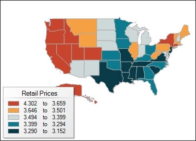
Aug 2014 Gasoline Prices
As we can tell from the chart, New York is right up there with California for gas prices. But it makes you wonder how little old New Jersey can be among the cheapest when it is only a couple of miles drive from NYC? Hmm. Doesn’t sound like a distribution issue. Or anything to do with “greedy capitalists”. Sounds more like a political problem to me when an artificial line drawn on a map makes such a big difference in prices, so I thought I’d look and compare the political landscape to the gas price landscape.
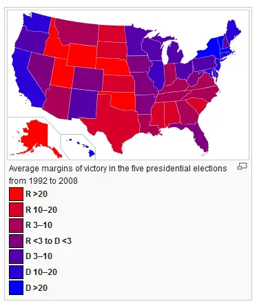
Red vs. Blue States
In the chart below we see not only whether a state voted Democrat or Republican but actually the margin of victory. So the more blue the more Democrat and the more red the more Republican (which by the way is backwards compared to the rest of the world) and incidentally almost exactly backwards for the gasoline chart as well. There appears to be a very high correlation between high gas prices and Democrat controlled states while Republican states tend to have lower gas prices. With a few exceptions like New Jersey, Minnesota, Utah and Idaho. The correlation even tends to apply to how strongly Democrat or Republican the state is. With evenly split states tending to have middle of the road gas prices.
So we might wonder why? But if we remember that crude costs and refinery costs are roughly the same nationwide and the major component of the difference in prices the consumer sees is actually highway taxes… I’ll let you draw your own conclusions.
You might also enjoy:
- Gasoline vs. Crude Oil Prices Chart
- Poverty Matters for Capitalists
- Historical Oil Prices Chart
- Inflation Adjusted Gasoline Prices
- Various Methods of Calculating Inflation
- Annual Inflation Rate Chart

Leave a Reply