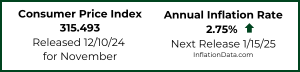
When inflation is high and commodity prices are rising on what seems like an almost daily basis, have you ever wondered how that might affect the price of stocks?
Recently I received the following question:
“In the years leading up to the great depression and the great recession, the DJIA nearly quadrupled.
My question is… what the cost of living did in these time periods and if there is a correlation between the stock market and the cost of living?
John Kelsch”
************
John,
Great question! You would think that if all commodities are going up stocks would probably go up as well, since companies produce commodities. But that isn’t always the case. Often high inflation can actually squeeze profit margins and cause companies to lose money or barely break even. So lets look specifically at the correlation between stock prices and the inflation rate.
First let’s look at the average inflation rate for the entire decade and the average annual rate of return in the stock market. In this case we will use the S&P 500 since it provides a fairly broad-based reference for the stock market.
In the following chart we can see the blue bars represent the average annual inflation for each year during the decade. So we can see for instance that in the years between 1913 and the end of 1919 they averaged 9.8% inflation. That is a high annual inflation rate! The stock market on the other hand generated just over 5% (5.68% to be exact). In the 1920’s which is the period in question the annual inflation rate was virtually non-existent (actually slightly deflationary at less than 1/10th percent deflation) and the stock market soared. In the 1930’s the stock market had a bad decade and basically finished where it started (after dropping like a rock). So from this chart you can see that there doesn’t appear to be a correlation between high inflation and high stock market returns. If anything there might be an inverse correlation with the stock market doing better during decades when the inflation rate is below 3%. With the exceptions being the 1930’s when there was outright deflation and the 2000’s.
The true measure of the return you get is called the “real” rate of return or in other words, the return after you take inflation into account. In the above chart, that would be the red line minus the blue bar. In the 1913-1919 period you can see that there was a major problem. The line in the middle of the bar that means that when you subtract the 9.8% from the 5.68% market return you are going to be in negative territory. The 1920’s on the other hand is going to produce a superb return as well as the 1950’s and the 1990’s. The 1970’s on the other hand are going to be negative.

Unfortunately, in order to get the true picture you need to see the actual level of the market returns minus the inflation rate. So in the following chart I’ve added the real rate of return for each decade. In this chart the key line is the red line. As we guessed the teens produced a negative real return at -3.93%. The 1920’s produced a positive 16.56% per year compound annual growth rate (including dividends). The 1930’s provided a bit of surprise in that because of deflation if you just got your money back at the end of the decade it would buy more so the annual return based on purchasing power was 1.96% even though stocks were basically flat.
This is a bit misleading because most people lost money because they sold at the bottom (this doesn’t take into account what would happen if you bought and sold during the period). We can also see that the 1950’s produced a real return slightly higher than the 1920’s. The 1980’s and 1990’s both did very well. By the way two good decades in a row led to the illusion that “stocks always rise in the long run.” But we can see that in real terms three entire decades out of ten had negative returns.

So as far as inflation and the stock market goes the best “real” returns come when inflation is moderate (around 2% -3%). When inflation is higher the economy is sputtering and often when it is lower it is because of a major economic “train wreck”. But as we saw in the 1930’s a bad economy doesn’t necessarily mean a bad stock market.
One factor not considered is the effects of taxation on your gains. For instance in the 1970’s you would have had to pay taxes on your 5% gain even though in “real” inflation adjusted terms you actually had a loss. So in this way high inflation can actually cost you twice, first in lost purchasing power and second in taxes on “phantom gains”.
For more information see: Inflation Adjusted NYSE Stock Index
Note: In this article we used the “Geometric Mean” aka. the compound annual growth rate (CAGR) rather than the straight average (arithmetic mean). See our article Average Annual Inflation Rates by Decade for more information on when to use the CAGR vs. an ordinary arithmetic average.

I enjoyed reading this post. I read your articles really often and you always find a way to entertain! Shares this to my Facebook and my fans loved it!
Keep up the good work :).|
This is a great post, I read your blog regularly and have to say,
you have some great content, keep it up!!|
Amazing article! Very impressed with the quality of this,
gotta share this to my social medias now! :D!|
I have a quick question. What is a better way to compute inflation returns? Should it be relative return of difference return?
I regressed US CPI vs. MSCI WORLD from 2007 till 2016 (rolling 1 year data) and correlation is positive in all those years except it gets mildly negative (almost zero) in 2007 and 2009. So yes its safe to make a comment that correlation between them is generally positive.
Even on occasions when it was slightly negative it was a case where inflation was going down while equities were rallying. So that is something like opposite of stagflation.
The true stagflation scenario (increasing inflation and falling equities) was only really observed during 1970s.
Is there corrlation between profit booking ion stocks and inflation, considering fact that inflation is lagging indicator.
here is my view, DJIA / S&P is a sample of scrips from stock market as a whole. hence it makes sense to measure the market performance with the DJIA/S&P index. whereas, inflation is measured by sampling the key commodities necessary for common life and not all these products are processed by the companies or at least they all are not financed through stock market. i believe this is one of the primary reason why there is no direct relation b/w indexes and inflation rate.
Thanks for the enlightening data; I think a major question for retirees is what to do to protect a portfolio. Do equities act as a hedge against inflation versus other holdings? If the FED persists with QE as promised, bonds don’t seem attractive, although many predict a dam-burst effect of inflation if QE doesn’t work. Timing financial armageddon is quite intimidating however. TIPS seemed the answer until the FED intervention.
Everyone seems to know that “we can’t go on like this,” but negotiation of the fall could put us in the “dropping knife” scenario.