Inflation Charts:
Here at InflationData we believe the old adage that a picture is worth a thousand words. So we emphasize using graphs, tables and charts. Some of our most popular charts are:
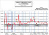
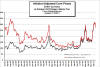
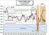 The Annual Inflation Rate Chart
which shows the annual
inflation rate from 1989 through
the present. It also shows the
effects of Quantitative Easing
and the long term trend of
inflation.
The Annual Inflation Rate Chart
which shows the annual
inflation rate from 1989 through
the present. It also shows the
effects of Quantitative Easing
and the long term trend of
inflation.
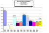 The
average inflation rate by decade
chart shows each decade between
1913 (when the Bureau of Labor
Statistics began tracking the CPI)
and the current decade, plus the
long term average inflation rate.
The
average inflation rate by decade
chart shows each decade between
1913 (when the Bureau of Labor
Statistics began tracking the CPI)
and the current decade, plus the
long term average inflation rate.
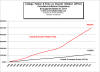
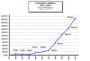 Just like compound interest compound
inflation grows faster and faster.
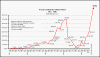
The
Cumulative inflation chart shows
how inflation has compounded over
the years since 1913.
Just like compound interest compound
inflation grows faster and faster.
The
Cumulative inflation chart shows
how inflation has compounded over
the years since 1913.
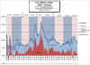
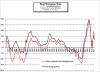
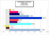 Total Inflation by decade is an
interesting comparison of the total
accumulated inflation during each
decade since 1913. Rather than
looking at
average inflation for each year
during a decade this chart looks at
the total.
Total Inflation by decade is an
interesting comparison of the total
accumulated inflation during each
decade since 1913. Rather than
looking at
average inflation for each year
during a decade this chart looks at
the total.
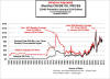
 The
inflation and recession chart
shows the correlation between
inflation and recession. Does rising
costs make people unable to afford
goods and so the economy would fall
into recession? This chart will tell
you.
The
inflation and recession chart
shows the correlation between
inflation and recession. Does rising
costs make people unable to afford
goods and so the economy would fall
into recession? This chart will tell
you.
 The
Misery Index was designed by
economist Arthur Okun as a "quick
and dirty" way to gauge the overall
well being of the average person. It
combines the inflation rate with the
unemployment rate.
The
Misery Index was designed by
economist Arthur Okun as a "quick
and dirty" way to gauge the overall
well being of the average person. It
combines the inflation rate with the
unemployment rate.
 One of the biggest hyperinflations
in history occurred during the U.S.
Civil war and was primarily a
monetary event. In
the chart of Civil War Inflation
we show the results.
One of the biggest hyperinflations
in history occurred during the U.S.
Civil war and was primarily a
monetary event. In
the chart of Civil War Inflation
we show the results.
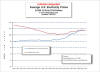
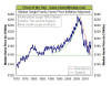
 Inflation Adjusted Crude Oil Prices
Chart shows crude oil prices
since 1946 along with their
inflation adjusted equivalent. So
you can see how current prices and
peaks like those in 1980 and 2008
compare.
Inflation Adjusted Crude Oil Prices
Chart shows crude oil prices
since 1946 along with their
inflation adjusted equivalent. So
you can see how current prices and
peaks like those in 1980 and 2008
compare.
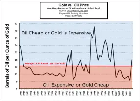 As commodities
gold and oil are subject to a variety of different economic and political forces. By comparing
Oil vs Gold directly we can
judge whether either is over or under
priced in an effort to make better
investment decisions.
As commodities
gold and oil are subject to a variety of different economic and political forces. By comparing
Oil vs Gold directly we can
judge whether either is over or under
priced in an effort to make better
investment decisions.
 Prices and wages don't increase at
the same rate, so you need to adjust
prices for inflation in order to see
how everything compares.
The Inflation Adjusted Natural Gas Chart shows the inflation adjusted price of natural gas since 1981.
Prices and wages don't increase at
the same rate, so you need to adjust
prices for inflation in order to see
how everything compares.
The Inflation Adjusted Natural Gas Chart shows the inflation adjusted price of natural gas since 1981.
 People often wonder how well crude
oil prices correlate to the price
they have to pay at the pump for
their gasoline. This chart shows
the correlation between crude oil
prices and gasoline.
People often wonder how well crude
oil prices correlate to the price
they have to pay at the pump for
their gasoline. This chart shows
the correlation between crude oil
prices and gasoline.
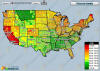 The
Cost of Gas chart is updated
daily and shows the
current average price of gas by
county throughout the continental
United States. It is interactive and
allows you to zoom in and drag it
around to view any specific county.
The
Cost of Gas chart is updated
daily and shows the
current average price of gas by
county throughout the continental
United States. It is interactive and
allows you to zoom in and drag it
around to view any specific county.
 The
Inflation Adjusted Cost of
Electricity Chart shows
electricity prices adjusted to
current dollars so you can compare
the purchasing power effect on the
price paid for electricity.
The
Inflation Adjusted Cost of
Electricity Chart shows
electricity prices adjusted to
current dollars so you can compare
the purchasing power effect on the
price paid for electricity.
 Gold is often considered to be an
excellent inflation hedge, but is
it? In this chart we look at the
Inflation Adjusted Price of Gold
to see how well it kept up with
inflation.
Gold is often considered to be an
excellent inflation hedge, but is
it? In this chart we look at the
Inflation Adjusted Price of Gold
to see how well it kept up with
inflation.
 This
Inflation Adjusted Price of Corn
chart depicts the rise in the
price of corn per ton since 1981 in
both nominal (actual price paid) and
in inflation adjusted terms.
This
Inflation Adjusted Price of Corn
chart depicts the rise in the
price of corn per ton since 1981 in
both nominal (actual price paid) and
in inflation adjusted terms.
 Education costs have risen
dramatically since 1985 and this
Education Inflation chart shows
both the nominal cost of inflation
and the inflation adjusted cost so
you can see how education costs have
increased compared to other costs.
Education costs have risen
dramatically since 1985 and this
Education Inflation chart shows
both the nominal cost of inflation
and the inflation adjusted cost so
you can see how education costs have
increased compared to other costs.
 Housing prices rose rapidly for the
twenty years from 1985 through 2005
and then they went into free-fall. In
this chart we show the
inflation adjusted housing prices
from 1970 through 2013.
Housing prices rose rapidly for the
twenty years from 1985 through 2005
and then they went into free-fall. In
this chart we show the
inflation adjusted housing prices
from 1970 through 2013.
 During the 40 years from 1971 to
2011 housing prices appreciated an
average of 4.81% a year, and
interest rates averaged 8.85%. In
this chart of the
real return on mortgage rates we
can see the historical rates since
1972.
During the 40 years from 1971 to
2011 housing prices appreciated an
average of 4.81% a year, and
interest rates averaged 8.85%. In
this chart of the
real return on mortgage rates we
can see the historical rates since
1972.
 Stock brokers are constantly touting
stocks and mutual funds as great
investments. But
how have stocks performed in
inflation adjusted terms? This
chart shows the NYSE in both nominal
and inflation adjusted terms.
Stock brokers are constantly touting
stocks and mutual funds as great
investments. But
how have stocks performed in
inflation adjusted terms? This
chart shows the NYSE in both nominal
and inflation adjusted terms.
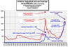
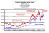
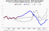 Although the Federal government has
discontinued publishing the M3 money
supply numbers it has been recreated
here in this
Annual U.S. Money Supply Growth
Chart.
Although the Federal government has
discontinued publishing the M3 money
supply numbers it has been recreated
here in this
Annual U.S. Money Supply Growth
Chart.
Calculators
- Inflation Calculator
- Cumulative Inflation Calculator
-
Salary Inflation Calculator
Is your salary keeping up with inflation? What you need next year just to keep up. -
How much would it cost calculator
Choose the inflation rate and calculate the cost after that much inflation. - To compare the cost of living in two cities use this cost of living calculator
- UK Historical Price Converter
-
Lifetime Earnings Calculator-
How much will you earn over your lifetime. - Compound Inflation Retirement Calculator
- Net Worth Calculator
- Inflation Rate Forecast
Featured Articles
- New Articles
- Deflation Articles
- Hyperinflation Articles
- Definitions
- Gold Articles
- What is Deflation?
- How to Calculate the Inflation Rate
Unemployment
Use our custom search to find more articles like this

Share Your Thoughts