What is The True Stock Market Price (Inflation Adjusted)?
With the recent Wall Street crash and recovery, how does the Stock Market compare? Where has the stock market really gone over the long run? Is the upward trend really just an illusion based on inflation?
Adjusting stock market prices for inflation using the "Consumer Price Index" is known as the Stock price in "real dollars". (A "real dollar" is the price after adjusting for inflation).
One of the worst problems with inflation is that distorts our perception... things are not always what they seem and this introduces uncertainty into our decision making process.
Here are some hypothetical scenarios:
- The stock market went up 5% a year and inflation went up 3%.
- The stock market went up 5% a year and inflation went up 5%.
- The stock market went up 5% a year and inflation went up 6%.
- The stock market went down 5% a year and inflation went up 2%.
In example #1 above inflation increased less than the stock market so the real return is 5% minus 3% so you had a "real return" of 2% (before taxes and after the inflation adjustment).
In example #2 inflation increased the same as the stock market so the real return is 5% minus 5% so you broke even (before taxes). But after paying taxes on the phantom gain of 5% you will actually lose money.
In example #3 above inflation increased more than the stock market so the real return is 5% minus 6% so you had a real loss of 1% (before taxes). But you will still have to pay taxes on the 5% gain making your real loss even worse.
In example #4 you have a 5% loss on the stocks plus a 2% loss of purchasing power for a net loss of 7% but you will be able to offset that somewhat by claiming the stock loss on your taxes.
As you can see the only way to see the true picture is to look at the inflation adjusted prices. We have created several other inflation adjusted price charts including Oil, Gold, Corn, Gasoline, Electricity, Mortgage Rates and Education.
The most commonly mentioned method to measure the stock market is the Dow Jones Industrial average.
I have often wondered why this index is so widely quoted by economic pundits, (other than the fact that it was originally created on May 26, 1896, making it the first index). At the time the DJIA represented the average of twelve stocks from various important American industries. Today the "DOW" is made up of 30 "representative" stocks and it's composition has changed many times over the last 100 plus years. Because the Dow takes out poor performing stocks and replaces them with better performing ones it has an inherent upward bias.
Rather than rely on "representative" stock indexes I prefer the real thing so I have created this "inflation adjusted stock price" chart by adjusting for inflation on the entire New York Stock Exchange (NYSE). The NYSE has the largest dollar volume of any stock exchange in the world. About 2,800 companies, representing a market capitalization of about $18 trillion, are listed on the NYSE, so it gives us a much broader view of the stock market than any 12 or 20 or 30 stocks could. In addition by it's very nature it gives you an idea of how the average investor would perform. After all, how likely is it that you will pick the top performing stocks without the benefit of hindsight? If you are an average investor it is likely that you will end up choosing stocks that will perform similar to the average of the entire market.
Plus with only 30 stocks a large move in any one of them could influence the entire DOW index. There have been days when Microsoft or Wal-Mart alone have created a significant move in the index even if all the other 29 stocks were doing nothing.
Historical Commentary:
Let's look at the stock market and see how it has fared in real inflation adjusted dollars compared to previous years.
As you can see from the above chart the blue line shows the "nominal NYSE index" (meaning the actual price quoted by the media). To get the "Inflation Adjusted" red line we adjust the stock price for inflation using the Consumer Price Index (CPI-U) which is typically referred to as the "Inflation Rate". This gives us the price in terms of modern dollars. In other words, the red line shows what the stock market would look like if there was no such thing as inflation.
In nominal terms (blue line) the NYSE stock index began 1966 just under 500. And by July of 1982 the nominal stock index had increased to 615 after having been even higher. So on the surface it would appear that the "stock market" posted an increase of roughly 23%. (615-500=115) and (115 ÷ 500=.23)
Now a 23% increase in 16 years would be a nominal increase of 1.43% a year (less if you consider compounding) which doesn't sound that great, but in those days stocks paid higher dividends than they do today. So investors expected to get their profit from dividends rather than capital appreciation. So most investors would be happy with a 23% increase in their stock portfolio over and above their dividends.
The inflation adjusted stock price
However, when you adjust for the increase due to inflation, we can see from the red line (which is the "inflation adjusted NYSE Index stock price" in current dollars) that in inflation adjusted dollars the index began 1966 higher and actually fell 59% through July of 1982.
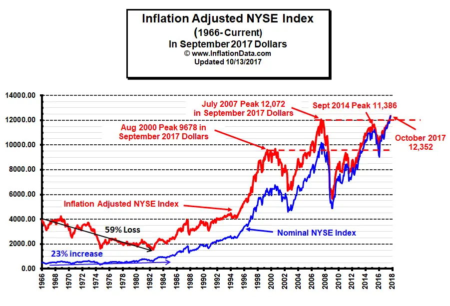
So rather than a 23% increase, if you count inflation and had held stocks for the 16 years from 1966 to 1982, you would have actually lost about 59% of your purchasing power due to inflation.
But to make matters worse you would have paid taxes on your dividends and "paper gains" further reducing your final remainder. This may be one reason companies began reducing dividends, so more money was pumped into increasing the stock price and wasn't taxable until you actually sold.
Current Commentary:
In the time since 1982 the stock market has increased both in nominal terms and in inflation adjusted terms. In inflation adjusted terms the NYSE stock index is above the peak of 2000 (first dotted red line). The August 2000 stock peak occurred at around 6800 in nominal terms or 9678 in September 2017 inflation adjusted terms. Then it bottomed in April 2002.
The market peaked again in July of 2007 at 12,072 in inflation adjusted September 2017 dollars. This resulted in a 24.7% increase in seven years from peak to peak or about 3.2% per year (compound interest). After the 2007 peak the market lost about 50% of its value and then made a substantial rebound peaking again in 2014 at 11,386 in inflation adjusted terms. But in inflation adjusted terms the NYSE did not exceed its 2007 highs. And in fact, fell below 2000 peak levels in January of 2016. So from August 2000 to January 2016 the market went exactly nowhere! (And that is using the official BLS inflation numbers, if inflation was actually higher the market went less than nowhere it actually lost money!) Recently the market has rebounded again and because inflation has been low the NYSE has exceeded the 2014 level and ten years later it has finally exceeded the 2007 peak in Inflation Adjusted terms!
On October 13th the NYSE closed at 12,352. Exceeding a previous peak is generally considered a bullish signal. Currently the NYSE ROC is in HOLD territory.
Timing
Our NYSE - ROC (Rate of Change) chart tracks the nominal rate of change in the NYSE and gives an excellent visual presentation of stock market nominal rates of return thus making it easier to determine when you should be in the market and when you should be on the sidelines.
For more information on the effects of cumulative inflation go to Cumulative Inflation by Decade for a full description.
Inflation Indexed Bonds (i-Bonds) are supposed to protect you from inflation while providing a reasonable return. How well have they done?
See Other Inflation Adjusted Prices:
- Historical Oil Prices Chart
- Annual Average Oil Prices in Table Form
- Inflation Adjusted Gasoline Prices
- Inflation Adjusted NYSE Stock Index
- Inflation Adjusted Price of Corn
- Inflation Adjusted College Education Costs
- Inflation Adjusted Price of Gold
- Real Mortgage Rates
 Connect with Tim on
 Use our custom search to find more articles like this

Share Your Thoughts