The U.S. Bureau of Labor Statistics released the March CPI and inflation numbers on April 14th. Annual Inflation fell from 1.02% for the 12 months ending in February to 0.85% for the 12 months ending in March. Interestingly, prices rose 0.43% for the month of March alone, so monthly inflation in March was almost exactly half of the total inflation for the entire year. The Consumer Price Index (CPI-U) was 238.132 up from 237.111 in February 2016 and 236.119 for March 2015.
According the BLS Commissioner’s report, ” The food index declined in March, while the indexes for energy and for all items less food and energy rose, leading to the slight seasonally adjusted increase in the all items index. The food index fell 0.2 percent after rising in February, as five of the six major grocery store food groups declined. The energy index rose for the first time since November, with all of its major components except natural gas increasing.”
Current Annual Inflation Chart
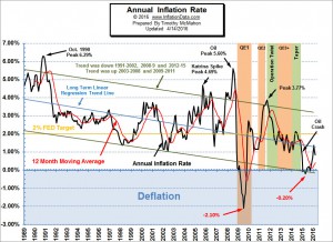 We’ve updated the current annual inflation chart which shows the Current Annual Inflation Rate starting in 1989.The current long term trend is down. Inflation peaked in March 1980 at 14.76% (not shown). Then peaked again at 6.29% in October of 1990. And when the price of Oil Peaked in July 2008 inflation peaked again at 5.60%.
Over the last twenty-one months since the 2014 peak in the CPI index, we have had eleven months of monthly deflation (annual disinflation) i.e. where prices were slightly lower than they were the previous month. So it appears that deflationary forces are building… although we may have seen the bottom with the deflationary crash in 2009.
January 2015 was the first time since 2009 that we had annual deflation (prices lower than a year earlier) rather than just disinflation. But this annual deflation is not the same nature as that of 2009. Back then deflation resulted from an implosion of the money supply (stock and housing market crash) while the current deflation is primarily the result of lower energy prices. Read more …
Inflation Adjusted Stock Market (NYSE)
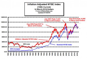 We’ve also updated the Inflation adjusted NYSE stock market chart. Investment advisers will tell you that over the long term the market “always goes up” and if you look at the blue (non-inflation adjusted) line on the chart you can see that although it occasionally “corrected” severely it has made a series of higher highs. But if you look at the red “real” inflation adjusted price you will see that the recent peak was actually lower than the 2007 peak. And currently the NYSE is very near the 2000 peak. So over the last 16 years (in inflation adjusted terms) the NYSE has gone exactly nowhere. And from 1966 through 1983 the market actually lost 53% of its value in real inflation adjusted terms. Read more…
Misery Index
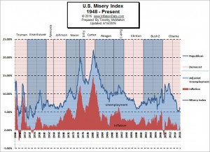 Since both high unemployment and high inflation are major factors to the average wage earner, the misery index is a quick and dirty metric to gauge the health of the economy because as inflation rises the cost of living increases and as unemployment rises more people cross the economic line into poverty.
The original Misery index was created by economist Arthur Okun during the Johnson administration in the 1960’s, unfortunately, data for the misery index is only available back to 1948 due to the lack of unemployment numbers prior to 1948. Read more …
Stock Market Rate of Change Charts
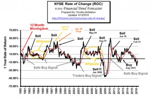 Our NYSE and NASDAQ Rate of Change (ROC) charts are helpful in getting the “big picture” of the stock market very quickly. Since these charts shows the rate of return rather than the current price it is much easier to see performance, we don’t have to guess if we are up or down from last year. If we are below the zero line… we are down, if we are above the zero line… we are up. The key is to exit positions while we are in positive territory (with a gain) so we can avoid the loss and then we can reenter when we get a buy signal. Both charts are nearing new buy signals. Check them out… NYSE- ROC … NASDAQ- ROC …
Moore Inflation Predictor
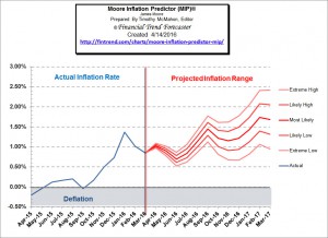 The Moore Inflation Predictor© (MIP) is a highly accurate graphical representation designed to forecast the inflation rate. By watching the turning points, we can profit from inflation hedges (like Gold, Real Estate and Energy Producers) when the inflation rate is trending up and from Bonds when the inflation rate is trending down. Last month’s MIP projected an extreme low of 0.87% so at 0.85% we slightly underestimated the magnitude of the move. See what the MIP is projecting now …


These people, BLS etc. would lie if the truth would sound the best.