The U.S. Bureau of Labor Statistics released the Annual Inflation Rate data for the year through the end of May on June 12th 2018.
Annual Inflation is Up
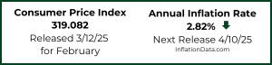
- Annual inflation rate was 2.80% in May up from 2.46% in April, 2.36% in March and 2.21% in February.
- CPI-U was 251.588 in May, 250.546 in April, 249.554 in March, 248.991 in February, 247.867 in January and 246.524 in December.
- Monthly Inflation for May was 0.42%, April was 0.40%, up from 0.23% in March 2018. May 2017 was only 0.09%
- Next release July 12th
Monthly Inflation:
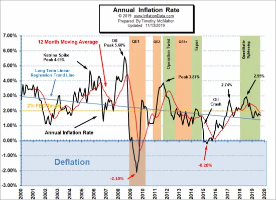
Annual inflation for the 12 months ending in May was 2.80% up sharply from April’s 2.46% the increase was primarily because May 2017’s monthly inflation rate was only 0.09% so when May 2018 came in at 0.42% we saw a 0.33% jump. The primary factors were much higher gasoline prices (up 1.7%) and Shelter was up 0.3%. Medical care was up 0.3% while food was unchanged. See Annual Inflation Chart for more info.
Typically the monthly inflation rate is highest during the first quarter (January through March) with April and May often being among the high months but not always. Last year May was exceptionally low while this year was higher.
The lowest monthly inflation is typically during the last quarter (October through December) with June through September typically being moderate. Last year’s summer months were exceptionally low however so even if they are replaced with moderate months this year we could see annual inflation creeping up.
Although the monthly differences seem relatively small, if we had 12 months of 0.42% inflation we would have 5.04% annual inflation but 12 months at 0.23% would only result in 2.76% annual inflation. But when higher months are combined with lower inflation months and even some negative months the annual inflation becomes much lower. So we can hope that the last quarter of this year brings the inflation rate back down. Currently our Moore Inflation Predictor is projecting that the annual inflation rate will rise above 3% over the next couple of months before falling back below toward year’s end.
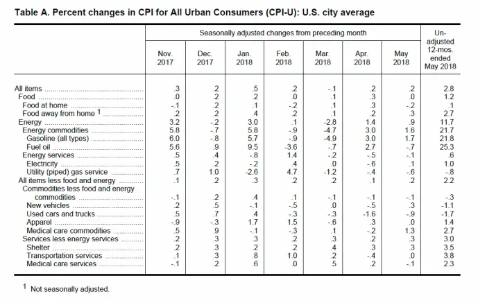
The U.S. Bureau of Labor Statistics Commissioner reported “Over the last 12 months, the all items index rose 2.8 percent before seasonal adjustment. The indexes for gasoline and shelter were the largest factors in the seasonally adjusted increase in the all items index, as they were in April. The gasoline index increased 1.7 percent, more than offsetting declines in some of the other energy component indexes and led to a 0.9-percent rise in the energy index. The medical care index rose 0.2 percent. The food index was unchanged over the month. The index for all items less food and energy rose 0.2 percent in May. The shelter index rose 0.3 percent in May. The indexes for new vehicles, education and communication, and tobacco increased in May, while the indexes for household furnishing and operations, and used cars and trucks fell. The indexes for apparel, recreation, and personal care were unchanged.”
So although we calculate the annual inflation rate “before seasonal adjustment” as 2.80% up from 2.46% last month the BLS rounded last month’s index to 2.5% and then uses “Seasonally Adjusted” numbers.
Click for Larger Image
Misery Index
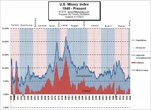 The misery index as of June 2018 (based on the most recent official government inflation and unemployment data for the 12 months ending in May) is at 6.60% up from 6.36% last month. This is due to a combination of factors. Unemployment is down sharply from 4.1% in March to 3.8% in May but during the same period inflation is up from 2.36% to 2.80%.
[Read More…]
Moore Inflation Predictor
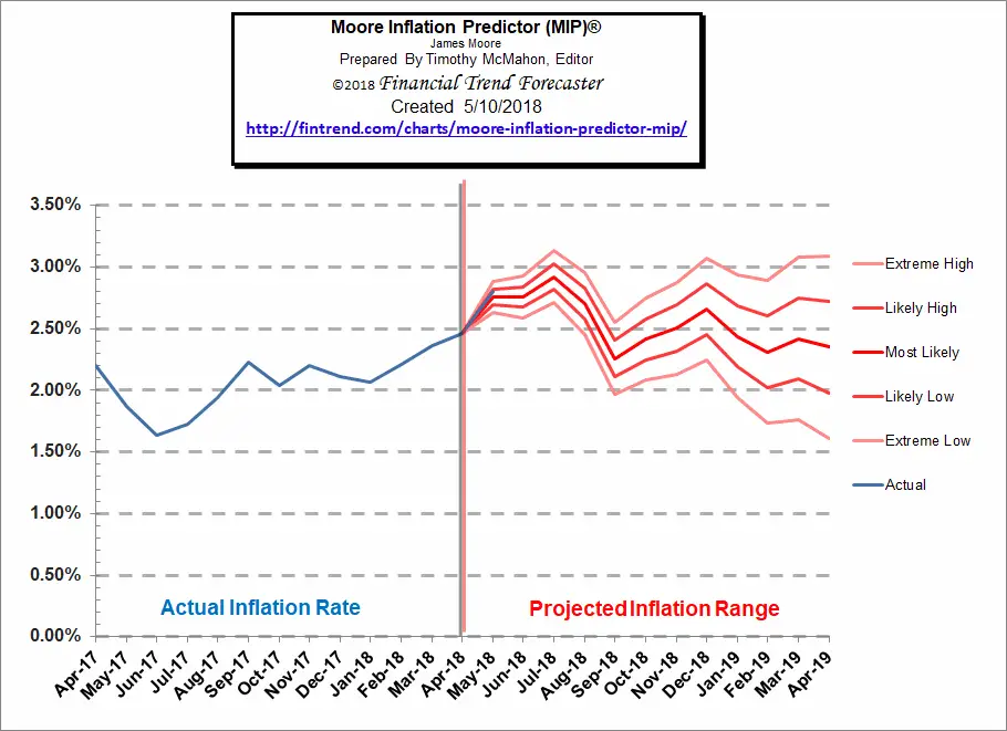
As you can see from the chart above, last month our MIP Chart was projecting a sharp increase and the actual line was right on target with our projection. Our “extreme high” which was 2.89% compared to the actual which turned out to be 2.80%. Our mid-range high was 2.82%. So the actual rate fell between the median and the midrange high projection.
See Moore Inflation Forecast for this month’s projection.
NYSE Rate of Change (ROC)©
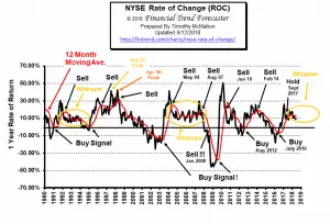
The NYSE index remains in the “Whipsaw period” being above its moving average in November, below in December, above in January, below in February, back up to the moving average in March and below once again in April through June. In May the annual rate of return fell to 9.24%, in June although the market was up the Annual rate of return continued to fall very slightly to 8.99%, still a respectable annual rate of return and the monthly rate of return was a positive 1.78% so we opt to continue holding. If history is any indication this “whipsaw” period could last quite a bit longer with annual rates of return hovering around current levels. In December we said, “However at this point in the cycle we could very well be seeing a whipsaw and with the annual rate of return at 14% we wouldn’t jump to sell too quickly.” Which is why we have labeled it “Hold”.
See what the falling NYSE ROC means for you now.
NASDAQ Rate of Change (ROC)©
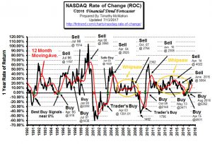
The NASDAQ continues to outperform the NYSE. The annual return for the NASDAQ is 20.01% down from 29.56% in March and 22.21% last month. Over the last month the NASDAQ is up 3.46%.
See NASDAQ ROC for more.
You Might Also Like:
From InflationData.com
- Inflation Risk
- InflationData Ranked Number 1 Inflation Blog
- How Does Inflation Affect the Price of Gold?
- The Effects of Inflation and Interest Rates on Commodity Prices
- Annual Inflation Rates Not Uniform Throughout the Country
- Hyperinflation: 5 Currencies that Self-Destructed
- How Oil Prices Affect Inflation
- Ways Inflation Affects the Real Estate Market Pt. 1
- Ways Inflation Affects the Real Estate Market Pt. 2
- The Quantity Theory of Money
- How the Inflation Cycle Influences the Job Market
From UnemploymentData.com.
- 5 Things You Can Do with a Degree in Special Education
- May Unemployment Lowest Since 2000
- 5 Business and Part-Time Employment Ideas for College Students
- Want to Be a Mechanic? Top Tips for Success
- Looking Into Career Options? A Brief Overview of the Biotechnology Industry
- 4 Careers Where Knowing How to Interpret Data Is Crucial
- Tips for Getting Ahead of the Competition in a Tough Job Market
- 5 Career Choices That Can Lead to Financial Stability
From Financial Trend Forecaster
- IEA: High Oil Prices “Taking A Toll” On Demand
- North Korean Chickens Not Hatched Yet
- When Will Electric Cars Take Over The Roads?
- Will Rising Bond Yields Send Stock Prices Tumbling?
- A New Lithium War Is About To Begin
- The Bullish And Bearish Case For Oil
- This Chart Says to Be Open to Better than Expected Market Outcomes
- Is the Current Highly Volatile Market Really Bearish?
- Recent Breakouts Say a Lot about Markets and Economy
- Are Wars Bullish or Bearish for Stocks?
- Tariffs May Not Slow Profit Momentum
- Was the 1,175 Point Drop in the DOW Unpredictable?
From OptioMoney.com
- How to Lower the Chances of Bankruptcy as a Personal Business Owner
- How to Handle Medical Bill Debt
- The Costs of Moving: 4 Thrifty Tips to Keep Your Next Move Cheap
- How Smart Entrepreneurs Manage and Insure Their Assets
- The Average Mortgage Credit Score Is 754: How to Make Sure Yours Is Good Enough
- Frugal Finance: 5 Thrifty Tips to Lower Your Family’s Expenses
- 6 Budgeting Pointers to Get Your Finances Back on Track
From Your Family Finances
- Buying a New Car? How Your Credit Score Can Affect Your Purchase
- Top Considerations for Making Your Home Remodel Affordable
- Coin Collecting: 6 Ways to Get the Most Money out of Your Collection
- 4 Home Improvement Projects You Can Save Money On
- How To Spot Major Used Car Maintenance Issues Like A Pro

Leave a Reply