Health insurance costs seem to be a major concern these days. But prior to the 1960s, most people didn’t even have health insurance. Why was that? Perhaps because health care costs were so low. According to Parents Magazine the average cost of a normal delivery and newborn care as of 2018 was about $30,000 and if you needed a C-section it was about $50,000. According to the U.S. Census Bureau, the median Household income (i.e. total of both wage earners) is $57,617. So a C-section costs almost all the money a family made in a whole year.
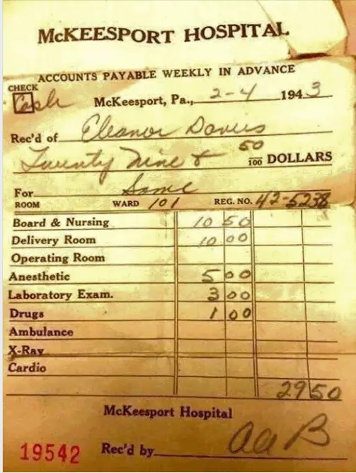
But back in 1943, Mrs. Davis paid a whopping $29.50 for her hospital stay. This may not have included the Doctor’s bill so we might assume that the total cost was twice as much. So perhaps $60 total? The minimum wage in 1943 was 30¢/hr. so if Mrs. Davis worked a 40 hour week she made $12 per week. So her entire delivery cost was roughly 5 weeks income (at minimum wage!) If her husband worked in manufacturing he would earn about $41 per week, so her delivery including doctor and hospital would have cost about 1.5 weeks wages, compared to 6 months today. Plus hospitals made payment plans available. No wonder they didn’t need insurance.

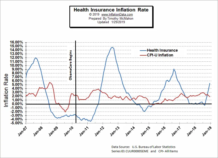
Insurance was such a non-issue that the U.S. Bureau of Labor Statistics didn’t even begin tracking insurance costs separately until 2005 (when they set the index equal to 100). On the chart below, we can see the annual percentage increase of health insurance compared to the Consumer Price index. Obviously, some years health insurance costs increased much more than the average item. For instance, in 2007, insurance costs increased 12% while overall prices increased 4% at most. Then prices actually fell more than average beginning in mid-2008 through mid-2011. Then health insurance costs jumped again to regain losses, peaking at an almost 15% increase in 2012. Prices began increasing at a slower rate and once again prices actually fell briefly in 2014 (i.e. prices are below the zero line) but recovered in 2016. And were basically flat with 0% growth from mid-2017 through mid-2008 before spiking again in the second half of 2018. However, based on this chart it is easy to see that health insurance prices are more volatile than average, but it is still difficult to determine whether they actually increased faster than average.
So, we need to look at cumulative prices to get the full picture.
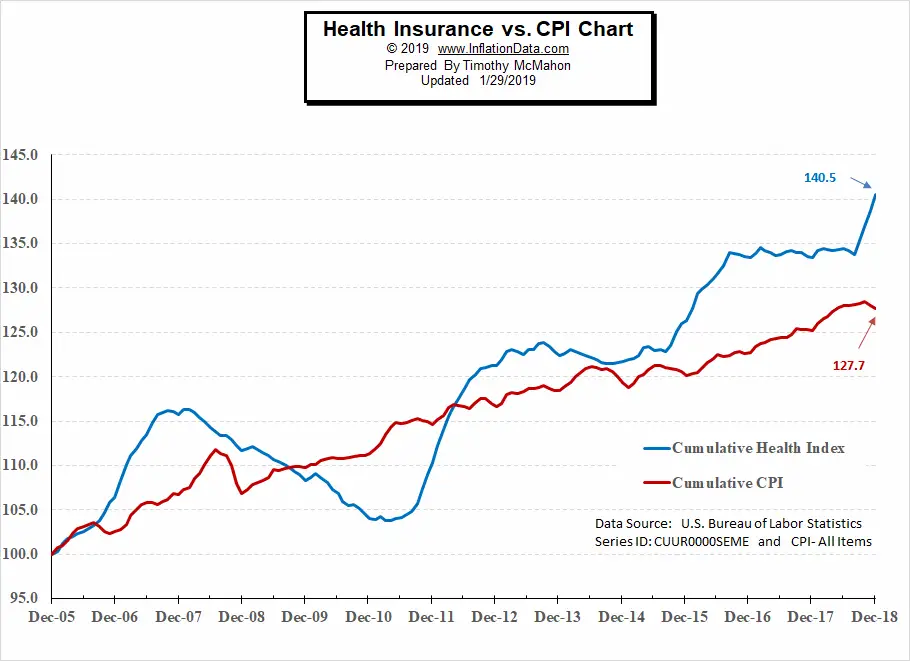
In the chart above we can see how the health insurance index compares to the Consumer Price Index for all Urban Consumers (CPI-U). Since the Health index was set to 100 in December 2005. The BLS set the CPI-U to 100 on an average date somewhere between 1982 and 1984 so by 2005 the actual index had approximately doubled to 196.8. So we had to mathematically adjust the CPI-U index to also be 100 on December 2005 for chart purposes. The Health insurance Index is in Blue and the CPI-U index is in red. From this chart, it appears that Health insurance rose sharply higher than average for the first two years then actually fell from 2008-2010 while most prices fell and then recovered. But then health insurance costs spiked and not only caught up with overall prices but actually shot above and never looked back. From the chart, we can see that the CPI increased roughly 27.7% from 100 in December 2005 to 127.7 in December 2018. During the same timeframe, health insurance costs increased by 40.5% from 100 to 140.5. So yes, Health Insurance costs increased about 46% faster than prices in general.
See Also:
- Inflation Adjusted Oil Price
- Inflation Adjusted Electricity Prices
- Gold and Inflation
- Inflation Adjusted Gasoline Prices
- What is the Real Definition of Inflation?
- Cost of Living


