Source: inflationdata.com | Inflation-Adjusted Oil Prices Commentary | Crude Oil Prices in Table Form
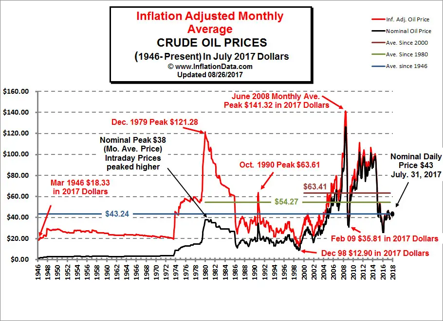
This Chart presents Monthly Average Crude Oil Price and Inflation Adjusted Crude Oil Prices in chart form. The red line on the chart below shows oil prices adjusted for inflation in March 2015 dollars. The black line indicates the nominal price (in other words the price you would have actually paid for a barrel of oil at the time).
To Print this Chart: When Printer dialog box appears be sure to switch to Landscape mode
 Note: Please feel free to link to this page but not to the image itself as the image may be renamed (or deleted) when it is updated but the page URL will remain the same.
To read the full commentary about this chart go here.

