
Inflation tends to arrive in 3 stages:
Stage 1
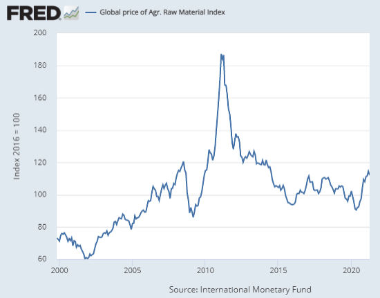
The first stage is the price manufacturers pay for their raw materials. This can be tracked in a variety of ways including the Global Price of Agrigated Raw Materials published by the St. Louis Federal Reserve. Interestingly, raw materials prices peaked in February 2011 at 187.2 and then fell steadily over the next 4 years. Prices stabilized for a few years before plummeting due to COVID. Since then raw materials prices have spiked sharply. But are still nowhere near 2011 levels. One of the reasons for the sharp spike in 2011 was serious flooding causing massive crop loss driving the price of four basic crops (wheat, rice, corn, and soybeans) much higher while heavy rains in Colombia drove up coffee prices. This combined with a shortage of “rare earth materials” due in part to a Chinese chokehold on the supply of rare earth metals like neodymium, a “rare earth” necessary for products including smartphones, headphones, and hybrid electric cars. For instance, producing a Prius requires roughly 2.2 pounds of neodymium. All of these factors combined to create the “perfect storm” for raw materials prices.
From 2016 through the COVID trough in 2020 raw materials prices stair-stepped down but have since spiked upward again.
Stage 2
The second stage is the price manufacturers charge middlemen i.e. wholesalers, retailers, and distributors. The Bureau of Labor Statistics (BLS) tracks this as the Producer Price Index (PPI). They break this down by industry with everything from logging to Dog and Cat food production. They also track a combined index of all manufacturing Industries, which we see in the chart below.
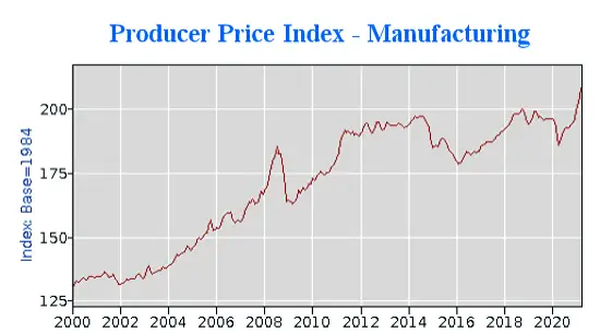
As we can see manufacturers had to raise prices in 2011 to compensate for increased costs of materials but did not lower them until 2015, although materials prices had fallen much earlier. This is probably because manufacturers couldn’t raise prices enough to cover their increased costs in 2011, so they needed several years to recoup their losses.
Since the COVID trough, we have seen a sharp spike in the prices manufacturers charge corresponding very closely to the increase in raw materials costs.
Stage 3
The final stage is when the increased costs trickle down to consumers. This is tracked by a variety of different consumer price indexes including the CPI-W and the most common CPI-U i.e. Consumer Price Index for all Urban Consumers.
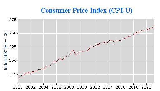
As we can see Consumer Prices have increased much more steadily than either raw materials or producer prices. But to get a better view of the rate of increase we have to look at the inflation rate which measures the change in the index from one year to the next. One way to look at it is to think of the CPI index as miles and the inflation rate as miles per hour. So we can see from the above chart that from 2000 to 2021 the CPI index traveled from mile marker 169 to mile marker 267 for a total index increase of 98 points. If we divided the increase by the starting point we would get a total percentage increase. 98/169 = 0.57988 or 57.99% so over the years since 2020 prices (on average) have increased almost 58%. Some prices have increased more and some less. But on average something that cost $1.00 in 2000 would cost $1.58 now.
The Inflation Rate
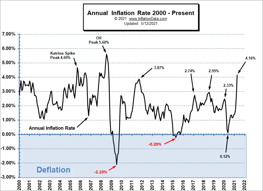
During the journey from 2000 to 2021 sometimes prices were going up quickly and sometimes they were going up slowly and occasionally they even went backward (i.e. deflation) for a brief time. In 2009, we can see that prices declined by -2.10%. And in 2015, they declined by -0.20% i.e. virtually at a standstill. 2020’s 0.12% was once again virtually zero. At other times, hurricane Katrina and oil price spikes increased inflation up to 5% or more. Recently, we have once again approached the high end of the scale at 4.16%.
 Inflation Causes
As alluded to above, sometimes weather or political factors affect supply and this can temporarily increase the inflation rate. Or factors like COVID or a stock market crash can decrease demand driving inflation down. But money supply is also a major consideration. If the government prints too much money it must go somewhere if people use that money to buy food, gas, and other consumables we will see price inflation. However, if instead, that money flows into real estate or the stock market we will see a bubble that can eventually pop destroying capital and bringing the money supply back into equilibrium.