
Crude Oil Prices in Inflation-Adjusted Terms
This Chart presents Monthly Average Crude Oil Prices and Inflation-Adjusted Oil Prices (adjusted to January 2025 prices).
For more information, see Annual Average Oil Prices in Table Form.
An interesting NPR story about How An Engineer’s Desperate Experiment Created Fracking and Twenty years later, the U.S. was the biggest oil and natural gas producer on the planet due primarily to hydraulic fracking.
In this chart, we can see:
- In June 2008, oil peaked at a nominal price of $126.33 (inflation-adjusted price of $186.22)
- Oil prices fell to the ridiculously low COVID-induced glut price of $11.18 in April 2020 (inflation-adjusted $14.07).
- The average inflation-adjusted price for crude oil since 1946 is $58.07, which is still about one-third of the 2008 price.
- The average inflation-adjusted price since 1980 is higher at $71.25
- The average inflation-adjusted price since 2000 is even higher at $79.58
The increase in the average inflation-adjusted prices over more recent periods indicates that oil prices are increasing faster than inflation, possibly indicating the increasing difficulty in finding and recovering oil. The extreme volatility of oil prices tends to mask this trend.
Inflation-Adjusted Crude Oil Chart
Updated July 15, 2025
The red line on the chart shows Illinois Sweet Crude oil prices adjusted for inflation in June 2025 dollars. The black line indicates the nominal price (in other words, the price you would have actually paid at the time). The horizontal lines indicate the average inflation-adjusted price for different periods, i.e., since 1946, since 1980, and since 2000.
The nominal price for a barrel of Illinois Crude Oil peaked in June 2022 at $107.12, which on an inflation-adjusted basis was $116.61 which wasn’t as high as at previous peaks like June 2008 when it was the equivalent of $186.22.
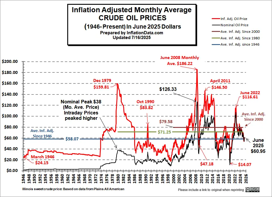 The major peaks occurred in December 1979, June 2008, April 2011, and June 2022 in inflation-adjusted terms. Another interesting item to note is that the inflation-adjusted average price (horizontal lines) has been increasing as mentioned above. This may be the result of increased extraction costs as oil becomes harder to find, and it requires much greater technology to extract it.
The absolute peak occurred in June 2008. From there, we see one of the sharpest drops in history. Note that the fall from the 1979 peak took until 1986 (7 years) to fall as much (percentage-wise) as Crude lost in only six months from 2008-2009.
At the 1979 peak , the nominal monthly average oil price peaked at $38 per barrel (although the intraday prices spiked much higher).
Nominal Oil Prices:
In nominal terms, we see a fall from $126.33 in June 2008 to $31.04 in February 09, but by June 09, oil is back to $61.46, and by April of 2011, it was back to $102.15. Fortunately, from there, it decreased to $76.90 in September but then started increasing again. The average for the year 2011 was $87.04. 2012 was very close, with the nominal average price being $86.46. Crude oil prices rose in 2013 to an average price of $91.17. The first 11 months of 2014 had an average price of $89.08, with a nominal peak in June at $98.18, but December’s sharp drop brought the annual average price down to $85.60. The average nominal price for 2015 was $41.85. So we saw another sharp drop, almost as sharp as in 2008.
The common price quoted is the all-time high for Crude Oil prices, i.e., the price that the highest barrel ever sold for. That price doesn’t really have much effect on the price consumers paid. What really matters is the average price the refineries had to pay for the whole month.
Interestingly, the highest monthly average price occurred in December 1979, while the highest annual high oil prices occurred in 1980. This means prices spiked higher in late 1979 and then declined slightly but overall remained at higher levels throughout 1980 than they were in 1979.
Adjusted for inflation, the 1979 $38 peak oil price is the equivalent of paying $148.22 today. (Note: This number is constantly changing as we adjust for inflation at the current moment.)
Interestingly, prices fell so far from the 1990 peak that by December 1998 (on an inflation-adjusted basis), they were only about 2/3rds of what they were in 1946. The inflation-adjusted price of a barrel of oil in 1946 was $22.40, while in December 1998, it was only $15.77.
In the 2008 run-up, the annual average price for all of 2008, was nominally $91.48 and fell much lower in 2009 to an average of $53.48. So on an annual average basis, prices were very close to 1979 but slightly below, but on a monthly inflation-adjusted basis, 2008 prices exceeded 1979 prices but for a shorter duration.
As we can see from the chart, inflation-adjusted prices were higher in 2008 than in either 2011 or 1979, but beginning in 1980, the prices stair-stepped down rather than falling sharply as they did in 2008. Part of the reason for this was that 2008 prices were driven by a speculative bubble, while 1979-80 prices were driven up by OPEC. Another factor in the sharp fall in prices in 2008 was the market crash which drove all prices and demand down due to a lack of market liquidity.
Note: The prices we use are for Illinois Crude Oil (Sweet) which will generally be a couple of dollars less than the West Texas Intermediate (WTI) or NY Crude spot price. For instance, in March of 2013, West Texas Intermediate crude averaged $90.50/ barrel while Illinois Sweet averaged $87.50. Oil prices vary based on grade (Sweet, Intermediate, or Sour) and location, i.e., how easy it is to get it from the field to the refinery, and also based on supply in that area. So “West Texas” alone has three different prices, West Texas Intermediate – Area #1 $90.50, West Texas Intermediate – All Other Areas $91.00, West Texas Sour $83.05. West Texas Sour is worse quality than West Texas Intermediate (requires more refining). At the same time, South Texas Sour only brings $79.00, presumably because it is more difficult to transport South Texas Sour than West Texas Sour due to a lack of pipeline capacity.
Note:
During the 1970s, Oil prices were subject to price controls except for “stripper” wells which were exempt. These price controls resulted in shortages and lines at the gas station in addition to some shootings and even deaths due to people “cutting in the gas line”. For prices during this period, we use the free market stripper prices, which more accurately indicate what prices would have been without the artificial government price controls.
Data Sources:
Illinois Oil and Gas Association
You might also like: