What is the Misery Index?
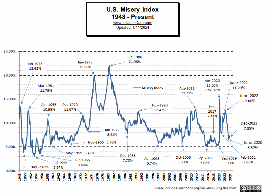
The misery index attempts to quantify how the average citizen is doing economically. It is calculated by simply adding the Annual inflation rate to the Seasonally Adjusted unemployment rate. One of the charts below includes inflation, unemployment, the misery index, and who was President at the time.
As inflation rises, the cost of living increases, and as unemployment rises more people cross the economic line into poverty. Therefore, this index is a quick and dirty metric to gauge the health of the economy since both high unemployment and high inflation are major economic factors for the average wage earner.
Unfortunately, although data for the annual inflation rate is available back to 1914 (the CPI index began in 1913), data for the misery index is only available back to 1948 due to the lack of unemployment numbers prior to 1948. The original Misery index was created by economist Arthur Okun during the Johnson administration in the 1960s, not by Robert Barro as some people mistakenly believe. Barro created the “Barro Misery Index” (BMI) in 1999, which added interest rates and Gross Domestic Product (GDP) trend into the mix.
Approximately ten years later, Steve Hanke updated Barro’s work by applying it to other countries outside the United States. Hanke’s modified misery index uses unemployment, plus inflation, as Okun did, but then adds interest rates, and then subtracts the year-over-year percent change in per-capita GDP growth. Assuming that high-interest rates also add to the “Misery” but growth in GDP reduces the misery. Interestingly, when the original misery index was conceived by Okun the index was actually quite low by recent standards.
Surveying Happiness and Weighting the Misery Index
According to a paper in the American Economic Review called “Preferences over Inflation and Unemployment: Evidence from Surveys of Happiness unemployment causes 1.7 times as much misery as inflation, so the misery index should probably be calculated by multiplying unemployment by 1.7 and then adding it to inflation, but that is NOT the way it is done.
Recent events in the post-COVID era seem to bear out this conclusion as the country seems to be suffering less with high inflation and very low unemployment. Those suffering the most are those on fixed incomes who must deal with the declining purchasing power of their limited budgets.
Current Commentary:
Current Misery Index:
Unemployment 3.8% + Inflation 3.48% = 7.28%
With inflation skyrocketing in early 2022, the misery index was approaching the miserable levels of 2011, when it reached 12.73% with high unemployment and low inflation. But this time, conditions were reversed. People still had jobs, and household savings were at record-high levels. Just before the pandemic, households held about $1 trillion in what was effectively cash, a figure that had ballooned to $4.7 trillion by the second quarter of 2022. So, despite the fact that rising wages have not kept up with inflation, and although inflation hit those on fixed incomes especially hard, the general populace was able to fall back on the savings they amassed during the pandemic.
In this chart, we can see the peaks and valleys of the index, with most of the low points occurring above 5%, with only a couple in the 1940s and 1950s that are below 5%. Those were generally during times of war when unemployment was excessively low. Only twice in the current millennium has the misery index fallen close to 5%. Even in the boom of 2006, it was 5.71%.
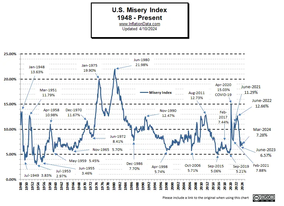 Conversely, the misery index can rise drastically when inflation or unemployment gets high. The highest point since the government began tracking unemployment in 1948 was in June of 1980, under Jimmy Carter, when the misery index reached 21.98% (even the COVID shutdown didn’t drive it that high).
In September 2019, the Misery index bottomed near all-time lows at 5.21%. By March 2020, it had climbed slightly to 5.94%. But in April, due to the COVID-19 shutdown and consequent high unemployment, the Index shot up to 15.03% based on 14.7% unemployment, but inflation was a minuscule 0.33%.
In May, both inflation 0.12% and Unemployment 13.30% fell, resulting in an index reading of 13.42%. So there was low inflation and high unemployment. By the end of 2021, the conditions had reversed… to low unemployment and high inflation.
Misery Index 2021-2024
| Month | Unemployment | Inflation | Misery Index |
| January 2021 | 6.3% | 1.40% | 7.70% |
| February 2021 | 6.2% | 1.68% | 7.88% |
| March 2021 | 6.0% | 2.62% | 8.62% |
| April 2021 | 6.1% | 4.16% | 10.26% |
| May 2021 | 5.8% | 4.99% | 10.79% |
| June 2021 | 5.9% | 5.39% | 11.29% |
| July 2021 | 5.4% | 5.37% | 10.77% |
| August 2021 | 5.2% | 5.25% | 10.45% |
| September 2021 | 4.8% | 5.39% | 10.19% |
| October 2021 | 4.6% | 6.22% | 10.82% |
| November 2021 | 4.2% | 6.81% | 11.01% |
| December 2021 | 3.9% | 7.04% | 10.94% |
| January 2022 | 4.0% | 7.48% | 11.48% |
| February 2022 | 3.8% | 7.87% | 11.67% |
| March 2022 | 3.6% | 8.54% | 12.14% |
| April 2022 | 3.6% | 8.26% | 11.86% |
| May 2022 | 3.6% | 8.58% | 12.18% |
| June 2022 | 3.6% | 9.06% | 12.66% |
| July 2022 | 3.5% | 8.52% | 12.02% |
| August 2022 | 3.7% | 8.26% | 11.96% |
| September 2022 | 3.5% | 8.20% | 11.70% |
| October 2022 | 3.7% | 7.75% | 11.45% |
| November 2022 | 3.7% | 7.11% | 10.81% |
| December 2022 | 3.5% | 6.45% | 9.95% |
| January 2023 | 3.4% | 6.41% | 9.81% |
| February 2023 | 3.6% | 6.04% | 9.64% |
| March 2023 | 3.5% | 4.98% | 8.48% |
| April 2023 | 3.4% | 4.93% | 8.33% |
| May 2023 | 3.7% | 4.05% | 7.75% |
| June 2023 | 3.6% | 2.97% | 6.57% |
| July 2023 | 3.5% | 3.18% | 6.68% |
| August 2023 | 3.8% | 3.67% | 7.47% |
| September 2023 | 3.8% | 3.70% | 7.50% |
| October 2023 | 3.9% | 3.24% | 7.14% |
| November 2023 | 3.7% | 3.14% | 6.84% |
| December 2023 | 3.7% | 3.35% | 7.05% |
| January 2024 | 3.7% | 3.09% | 6.79% |
| February 2024 | 3.9% | 3.15% | 7.05% |
| March 2024 | 3.8% | 3.48% | 7.28% |
Misery Index Table 2014-2023:
| Year | Jan | Feb | Mar | Apr | May | Jun | Jul | Aug | Sep | Oct | Nov | Dec |
| 2024 | 6.79% | 7.05% | 7.28% | |||||||||
| 2023 | 9.81% | 9.64% | 8.48% | 8.33% | 7.75% | 6.57% | 6.68% | 7.47% | 7.50% | 7.14% | 6.84% | 7.05% |
| 2022 | 11.48% | 11.67% | 12.14% | 11.86% | 12.18% | 12.66% | 12.02% | 11.96% | 11.70% | 11.45% | 10.81% | 9.95% |
| 2021 | 7.70% | 7.88% | 8.62% | 10.26% | 10.79% | 11.29% | 10.77% | 10.45% | 10.19% | 10.82% | 11.01% | 10.94% |
| 2020 | 6.09% | 5.83% | 5.94% | 15.03% | 13.42% | 11.75% | 11.19% | 9.71% | 9.27% | 8.08% | 7.87% | 8.06% |
| 2019 | 5.55% | 5.32% | 5.66% | 5.60% | 5.39% | 5.35% | 5.51% | 5.45% | 5.21% | 5.36% | 5.55% | 5.79% |
| 2018 | 6.17% | 6.31% | 6.46% | 6.36% | 6.60% | 6.87% | 6.85% | 6.60% | 5.98% | 6.22% | 5.88% | 5.81% |
| 2017 | 7.30% | 7.44% | 6.88% | 6.60% | 6.17% | 6.03% | 6.03% | 6.34% | 6.43% | 6.14% | 6.30% | 6.21% |
| 2016 | 6.27% | 5.92% | 5.85% | 6.13% | 5.72% | 5.91% | 5.74% | 5.96% | 6.46% | 6.54% | 6.29% | 6.77% |
| 2015 | 5.61% | 5.47% | 5.43% | 5.20% | 5.46% | 5.42% | 5.47% | 5.30% | 5.06% | 5.17% | 5.50% | 5.73% |
| 2014 | 8.18% | 7.83% | 8.21% | 8.25% | 8.43% | 8.17% | 8.19% | 7.80% | 7.56% | 7.46% | 7.12% | 6.36% |
| 2013 | 9.49% | 9.68% | 9.07% | 8.56% | 8.96% | 9.35% | 9.36% | 8.82% | 8.38% | 8.26% | 8.24% | 8.20% |
Summary:
In 2019, the peak was 5.79% in December, and the Low was in September at 5.21%. Previous peaks were 6.87% in July 2018 and 7.44% in February 2017.
In 2020, the peak occurred at 15.03% in April when the country shut down due to the COVID scare. This was just two months after making the low for the year at 5.83%.
In 2021, the low was in January at 7.70%, and it steadily increased to 11.29% in June. Despite falling unemployment, inflation rose faster than unemployment fell. From there is declined for a couple of months but then shot back up to 11.01% in November and finished the year at 10.94% in December.
January 2022 began with another massive increase in inflation to 7.49%, although Unemployment fell slightly to 4.0% taking the misery index up to 11.48%. The misery index peaked at 12.66% in June with 9.06% inflation and 3.60% unemployment.
January 2023 began with inflation down from its 2022 peak to 6.41%, and Unemployment near record lows of 3.40% taking the misery index down to 9.81%.
Note: During times of deflation (i.e. negative inflation) the misery index might not be truly representative of the actual misery of the general population. Although falling prices can help alleviate suffering, deflation does not necessarily guarantee “good times” if that were the case the “Great Depression” would have to be renamed “Happy Days” since prices fell 9% in 1931 and then another 10% in 1932.
For more information see: The Great Depression The Deflationary 1930′s– 1930-1939.
Even though the “Roaring 20’s” has the reputation of being a fun time combined with massive deflation, not everyone benefited. Those in the cities prospered, but farmers suffered severely as the prices of their produce fell drastically in 1921 and 1922. This was made worse by the fact that a much larger portion of the population were farmers. In 1920, 27% of the workforce was dedicated to farming, but as time went by, farming became much more mechanized, so fewer farmers were needed. By 1990, farmers had dropped to only 2.6% of the population. See The “Roaring Twenties” Inflation and Deflation 1920-1929.
Another example of falling prices hurting the general population happened during the 2008-2009 crash when falling Real Estate and Stock prices increased suffering rather than alleviating it. The index bottomed at 5.06% in September 2015 but then began increasing again leading up to the election in 2016 and then began falling again immediately after the election.
Misery Index Chart
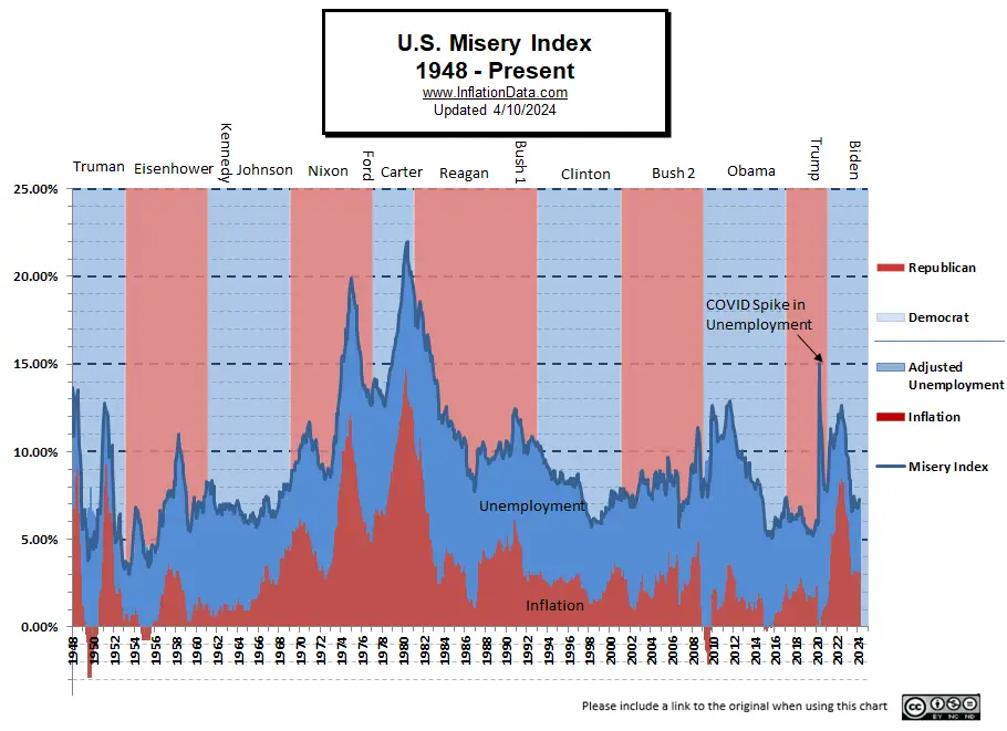 The Misery Index and Politics
Historically, a high (or climbing) misery index has been a political football resulting in a change of Presidents, while a low (or falling) misery index resulted in reelection. Eisenhower (R) was reelected in November 1956 with a misery index of 6.53%. Johnson (D) ended with a misery index of 8.13 in November of 1968, and Humphrey (the Democratic candidate replacing Johnson) lost to Nixon.
Early in the Nixon (R) administration, the misery index climbed to a high of 11.67% in December 1970. From there, through the election in November 1972, the index was falling, and Nixon was re-elected. As a matter of fact, according to Wikipedia, “Emphasizing a good economy and his successes in foreign affairs, such as ending American involvement in Vietnam and establishing relations with China, Nixon won the [re]election in a landslide.” However, the Misery Index bottomed two months later at 8.55%, and from there, the misery index climbed drastically.
Finally, Nixon resigned when his misery index climbed to 17.01% in July of 1974. Although Watergate was the trigger, one has to wonder if the economy was doing well, would Watergate have been such an issue?
Gerald Ford (R) took office in September 1974 with the index at 17.85%. It peaked at 19.9% a few months later and then fell steadily as his term progressed to 12.66% in December 1976, but he still lost. Perhaps if his term had been slightly longer (i.e., he had a full term), he might have been reelected.
Jimmy Carter (D) quoted the misery index extensively during his 1976 Presidential campaign to unseat Ford, even though Ford actually presided over a declining Misery index. Carter, on the other hand, presided over an increasing misery index of his own, starting his term at 12.72% and increasing to levels well above Ford’s highs. Carter’s misery index peaked at 21.98% in June of 1980. His misery index was still above 20% come November 1980, so Reagan (R) was able to use Carter’s own words and the misery index against him in the following election and make Carter a rare one-term President.
Reagan took office in January 1981 with a misery index of 19.33%. By November of 1984, the misery index had fallen steadily to 11.25%, and Reagan was reelected. By November 1988, the misery index was 9.55%, and so the Republicans were able to elect Bush 1 (R) in the hopes of more prosperity to come. But four years later (November 1992), the misery index was higher at 10.45%, and Clinton was elected.
In January, the index stood at 10.56%. By November 1996, it had fallen to 8.66%, and Clinton (D) was reelected. By November 2000, the misery index still stood at 7.35%, and Bush 2 (R) was elected. This election and the Nixon win over Johnson are the only two elections in the history of the index where it was relatively low when parties changed. But in both cases, it was climbing fairly steeply prior to the election. So it is possible that people felt they were becoming worse off.
During Bush 2’s first term, the misery index rose slightly to 8.92% by November 2004, and the election was very close. Resulting in Bush 2 barely getting re-elected. In July of 2008, toward the end of Bush’s 2nd term, the misery index climbed to 11.40%. And by September of 2008, it was still 11.14%. Even though it had fallen to 7.87% by November, the public mood was still miserable due to the stock market crash, and unemployment continued to rise. The deflationary component of the misery index was due to a massive contraction in the money supply due to a stock market crash rather than any positive economic factors.
In effect, the crashing stock market led everyone to feel poorer (and most were poorer as the value of their house and any investments had declined precipitously) thus, the market trumped the Misery index itself. So the social mood was ready for a change in political parties. Worldwide this same phenomenon appears to hold as well, this seems to be confirmed by the elections in both France and Greece, where their economies were faltering, and the seated Presidents were both voted out. In the 2012 election, Obama was apparently seen as presiding over a falling Misery index, so he was reelected.
In the 2016 election, the index had bottomed in 2015 at 5.06% and had been climbing, reaching 6.29% by November this was combined with an increase in Civil unrest as evidenced by “Black Lives Matter” activities. A recent Gallup poll revealed that Americans are worried about race relations. 42% in the U.S. worried a “great deal” about race relations, up from 17% in 2014. Thus Hillary Clinton was defeated, and Trump was elected. For more information on how Social Mood affects politics, and the economy, See: Social Mood Resources at your Fingertips.
Definition
The misery index is defined as, a measure of the economic well-being of the country, which is calculated by adding the unemployment rate and the inflation rate.
Misery Index Component Numbers 2009-2020
| Date | U-3 Unemployment | CPI-U Inflation | Misery Index |
| Jan-09 | 7.80% | 0.03% | 7.83% |
| Feb-09 | 8.20% | 0.24% | 8.44% |
| Mar-09 | 8.60% | -0.38% | 8.22% |
| Apr-09 | 8.90% | -0.74% | 8.16% |
| May-09 | 9.40% | -1.28% | 8.12% |
| Jun-09 | 9.50% | -1.43% | 8.07% |
| Jul-09 | 9.50% | -2.10% | 7.40% |
| Aug-09 | 9.70% | -1.48% | 8.22% |
| Sep-09 | 9.80% | -1.29% | 8.51% |
| Oct-09 | 10.10% | -0.18% | 9.92% |
| Nov-09 | 9.90% | 1.84% | 11.74% |
| Dec-09 | 9.90% | 2.72% | 12.62% |
| Jan-10 | 9.70% | 2.63% | 12.33% |
| Feb-10 | 9.70% | 2.14% | 11.84% |
| Mar-10 | 9.70% | 2.31% | 12.01% |
| Apr-10 | 9.80% | 2.24% | 12.04% |
| May-10 | 9.60% | 2.02% | 11.62% |
| Jun-10 | 9.50% | 1.05% | 10.55% |
| Jul-10 | 9.50% | 1.24% | 10.74% |
| Aug-10 | 9.60% | 1.15% | 10.75% |
| Sep-10 | 9.60% | 1.14% | 10.74% |
| Oct-10 | 9.70% | 1.17% | 10.87% |
| Nov-10 | 9.80% | 1.14% | 10.94% |
| Dec-10 | 9.40% | 1.50% | 10.90% |
| Jan-11 | 9.10% | 1.63% | 10.73% |
| Feb-11 | 9.00% | 2.11% | 11.11% |
| Mar-11 | 8.90% | 2.68% | 11.58% |
| Apr-11 | 9.00% | 3.16% | 12.16% |
| May-11 | 9.00% | 3.57% | 12.57% |
| Jun-11 | 9.10% | 3.56% | 12.66% |
| Jul-11 | 9.10% | 3.63% | 12.73% |
| Aug-11 | 9.10% | 3.77% | 12.87% |
| Sep-11 | 9.00% | 3.87% | 12.87% |
| Oct-11 | 8.90% | 3.53% | 12.43% |
| Nov-11 | 8.70% | 3.39% | 12.09% |
| Dec-11 | 8.50% | 2.96% | 11.46% |
| Jan-12 | 8.30% | 2.93% | 11.23% |
| Feb-12 | 8.30% | 2.87% | 11.17% |
| Mar-12 | 8.20% | 2.65% | 10.85% |
| Apr-12 | 8.10% | 2.30% | 10.40% |
| May-12 | 8.20% | 1.70% | 9.90% |
| Jun-12 | 8.20% | 1.66% | 9.86% |
| Jul-12 | 8.30% | 1.41% | 9.71% |
| Aug-12 | 8.10% | 1.69% | 9.79% |
| Sep-12 | 7.8% | 1.99% | 9.79% |
| Oct-12 | 7.9% | 2.16% | 10.06% |
| Nov-12 | 7.8% | 1.76% | 9.56% |
| Dec-12 | 7.8% | 1.74% | 9.54% |
| Jan-13 | 7.9% | 1.59% | 9.49% |
| Feb-13 | 7.7% | 1.98% | 9.68% |
| Mar-13 | 7.6% | 1.47% | 9.07% |
| Apr-13 | 7.5% | 1.06% | 8.56% |
| May-13 | 7.6% | 1.36% | 8.96% |
| Jun-13 | 7.6% | 1.75% | 9.35% |
| Jul-13 | 7.4% | 1.96% | 9.36% |
| Aug-13 | 7.3% | 1.52% | 8.82% |
| Sep-13 | 7.2% | 1.18% | 8.38% |
| Oct-13 | 7.3% | 0.96% | 8.26% |
| Nov-13 | 7.0% | 1.24% | 8.24% |
| Dec-13 | 6.7% | 1.50% | 8.20% |
| Jan-14 | 6.6% | 1.58% | 8.18% |
| Feb-14 | 6.7% | 1.13% | 7.83% |
| Mar-14 | 6.7% | 1.51% | 8.21% |
| Apr-14 | 6.3% | 1.95% | 8.25% |
| May-14 | 6.3% | 2.13% | 8.43% |
| Jun-14 | 6.1% | 2.07% | 8.17% |
| Jul-14 | 6.2% | 1.99% | 8.19% |
| Aug-14 | 6.1% | 1.70% | 7.80% |
| Sep-14 | 5.9% | 1.66% | 7.56% |
| Oct-14 | 5.8% | 1.66% | 7.46% |
| Nov-14 | 5.8% | 1.32% | 7.12% |
| Dec-14 | 5.6% | 0.76% | 6.36% |
| Jan-15 | 5.7% | -0.09% | 5.61% |
| Feb-15 | 5.5% | -0.03% | 5.47% |
| Mar-15 | 5.5% | -0.07% | 5.43% |
| Apr-15 | 5.4% | -0.20% | 5.20% |
| May-15 | 5.5% | -0.04% | 5.46% |
| Jun-15 | 5.3% | 0.12% | 5.42% |
| Jul-15 | 5.3% | 0.17% | 5.47% |
| Aug-15 | 5.1% | 0.20% | 5.30% |
| Sep-15 | 5.1% | -0.04% | 5.06% |
| Oct-15 | 5.0% | 0.17% | 5.17% |
| Nov-15 | 5.0% | 0.50% | 5.50% |
| Dec-15 | 5.0% | 0.73% | 5.73% |
| Jan-16 | 4.9% | 1.37% | 6.27% |
| Feb-16 | 4.9% | 1.02% | 5.92% |
| Mar-16 | 5.0% | 0.85% | 5.85% |
| Apr-16 | 5.0% | 1.13% | 6.13% |
| May-16 | 4.7% | 1.02% | 5.72% |
| Jun-16 | 4.9% | 1.01% | 5.91% |
| Jul-16 | 4.9% | 0.84% | 5.74% |
| Aug-16 | 4.9% | 1.06% | 5.96% |
| Sep-16 | 5.0% | 1.46% | 6.46% |
| Oct-16 | 4.9% | 1.64% | 6.54% |
| Nov-16 | 4.6% | 1.69% | 6.29% |
| Dec-16 | 4.7% | 2.07% | 6.77% |
| Jan-17 | 4.8% | 2.50% | 7.30% |
| Feb-17 | 4.7% | 2.74% | 7.44% |
| Mar-17 | 4.5% | 2.38% | 6.88% |
| Apr-17 | 4.4% | 2.20% | 6.60% |
| May-17 | 4.3% | 1.87% | 6.17% |
| Jun-17 | 4.4% | 1.63% | 6.03% |
| Jul-17 | 4.3% | 1.73% | 6.03% |
| Aug-17 | 4.4% | 1.94% | 6.34% |
| Sep-17 | 4.2% | 2.23% | 6.43% |
| Oct-17 | 4.1% | 2.04% | 6.14% |
| Nov-17 | 4.1% | 2.20% | 6.30% |
| Dec-17 | 4.1% | 2.11% | 6.21% |
| Jan-18 | 4.1% | 2.07% | 6.17% |
| Feb-18 | 4.1% | 2.21% | 6.31% |
| Mar-18 | 4.1% | 2.36% | 6.46% |
| Apr-18 | 3.9% | 2.46% | 6.36% |
| May-18 | 3.8% | 2.80% | 6.60% |
| Jun-18 | 4.0% | 2.87% | 6.87% |
| Jul-18 | 3.9% | 2.95% | 6.85% |
| Aug-18 | 3.9% | 2.70% | 6.60% |
| Sep-18 | 3.7% | 2.28% | 5.98% |
| Oct-18 | 3.7% | 2.52% | 6.22% |
| Nov-18 | 3.7% | 2.18% | 5.88% |
| Dec-18 | 3.9% | 1.91% | 5.81% |
| Jan-19 | 4.0% | 1.55% | 5.55% |
| Feb-19 | 3.8% | 1.52% | 5.32% |
| Mar-19 | 3.8% | 1.86% | 5.66% |
| Apr-19 | 3.6% | 2.00% | 5.60% |
| May-19 | 3.6% | 1.79% | 5.39% |
| June-19 | 3.7% | 1.65% | 5.35% |
| July-19 | 3.7% | 1.81% | 5.51% |
| Aug-19 | 3.7% | 1.75% | 5.45% |
| Sep-19 | 3.5% | 1.71% | 5.21% |
| Oct-19 | 3.6% | 1.76% | 5.36% |
| Nov-19 | 3.5% | 2.05% | 5.55% |
| Dec-19 | 3.5% | 2.29% | 5.79% |
| Jan-20 | 3.6% | 2.49% | 6.09% |
| Feb-20 | 3.5% | 2.33% | 5.83% |
| Mar-20 | 4.4% | 1.54% | 5.94% |
| Apr-20 | 14.7% | 0.33% | 15.03% |
| May-20 | 13.3% | 0.12% | 13.42% |
| June-20 | 11.1% | 0.65% | 11.75% |
| July-20 | 10.2% | 0.99% | 11.19% |
| Aug-20 | 8.4% | 1.31% | 9.71% |
| Sep-20 | 7.9% | 1.37% | 9.27% |
| Oct-20 | 6.9% | 1.18% | 8.08% |
| Nov-20 | 6.7% | 1.17% | 7.87% |
| Dec-20 | 6.7% | 1.36% | 8.06% |
See Also:

In the write-up, it says June 1982 was the peak, but the chart says June 1980. I believe the chart is correct.
Thanks Tom! You are absolutely right. I’ve fixed it
Comparing the misery index now in 2022 to the peak during the Jimmy Carter era is only meaningful if the calculation of inflation (and unemployment) is made using the same methods. It would be interesting to see the misery index using all 1976 methods to compare the two time periods. Or alternatively, using all 2022 guidelines. If not exact, at least an approximation would be somewhat useful.
If done with stats as calculated in 1980, the misery index would now be 37. Off the chart! That’s 12% inflation (before substitution and hedonics) and 25% unemployment (before long-term discouraged workers were officially removed in in 1994). THAT is the reality in 2023.
Too bad they never factored in a component for when the party in charge is deliberately trying to crash the economy and destroy our culture.
The Nation is Miserable!
The Misery Index is for crybabies. I lived through the 75 peak and the 80 peak when just starting my work life.
I was never miserable, I did fine. I’m doing fine now too.
People need to grow up, get to work and stop letting boogie men paralyze them.
When bureaucrats, politicians, elites, and experts dictate policy, only the misery index increases exponentially.
False assumption, GDP reduces Misery, not distributed “per-capita”.
Amy, You are right that in a Macro sense an increase in GDP will have the greatest effect in trickling down to individual wealth. However, in a “micro” sense what individuals are going to see is Inflation (as an increase in their Cost of Living) and Unemployment (decrease in the amount of money the average family has to spend) nowhere does an individual see GDP. Although, a secondary result of less purchasing power would be a DECREASE in the amount of stuff produced because people don’t have the money to buy it (thus a rising Misery index would result in a falling GDP).
Is the data given at the end of your article seasonally adjusted? Also what made you start your calculation in 2009 after the peak of the great recession in 2008? You also mention how others have improved the way we should calculate the misery index which method do you think is the most accurate representation?
Melanie,
Yes the traditional Misery Index uses the Seasonally adjusted Unemployment rate but the inflation rate is annual so it isn’t seasonally adjusted. As far as starting our calculations in 2009 the chart goes all the way back to 1948 so we have the data that far back since that is when the government started tracking unemployment. The table does only go back to 2009 since that is when we started publishing it but if you want to see what it was like before 2009 you can look at the chart. As far as a personal preference, I think that weighting the unemployment rate higher than inflation might be a bit better representation of actual misery.
How does our money supply nearly double in the last 5-6 years (tradingeconomics.com) and inflation stay at 1.13%? I was under the impression that inflation was just an increase in the money supply and if ours just about doubled why don’t the inflation numbers indicate it?
Excellent Question because it shouldn’t work that way. There are a couple of possible explanations. The first is that the money supply didn’t really expand. As you know statistics can be made to say a lot of things. So a lot depends on how you measure the money supply and when you start measuring. An argument can be made that you should include the stock market in the “money supply” since stocks are considered by most people as part of their wealth and are readily convertible to cash. So they are valuable and fairly liquid. If that is the case, the money supply contracted massively during the 2008 crash. So over the last 6 years the money supply has expanded again as the stock market came back but stocks are still just slightly above their 2007 peak. So has the money supply expanded or is it just back to 2007 levels? Also has all the inflation gone into the stock market leaving the items measured by the CPI only up a little over 1%?
The second issue is velocity of money and the money multiplier if the money is just sitting in the banks as “reserves” it is not being multiplied and so it isn’t inflationary. Once the banks start loaning more of it out at greater multiples (via fractional reserve) inflation will pick up.
Of course as we’ve been saying for a while the CPI probably underestimates the actual inflation rate by at least 1% but that is still minor compared to the massive increase in the money supply. See also Is Quantitative Easing the same as “Printing Money”?