• Home
  • Related Sites
    • Financial Trend Forecaster
      • Moore Inflation Predictor
      • NYSE Rate of Change (ROC)
      • NASDAQ Rate of Change (ROC)
      • Crypto ROC- BTC & ETH
    • Unemployment Data
      • Historical Employment Data
      • Unemployment Rate Chart
      • Labor Force Participation Rate
    • Optio Money
    • Elliott Wave University
    • More Resources
  • Definitions
    • What is Inflation?
    • What is Core Inflation?
    • Inflation vs CPI
    • What is Deflation?
    • What is Disinflation?
    • What is Agflation?
    • What is Stagflation?
    • What is Hyperinflation?
    • What is Quantitative Easing?
    • What is Quantitative Tightening?
    • What is Velocity of Money?
    • What is Fiat Currency?
    • How Do I Calculate Inflation?
    • What are “Sticky Prices” and Why Do They Matter?
  • Featured Content
  • About Us
  • Feedback
    • Sitemap
  • Subscribe Now

InflationData.com

Your Place in Cyber Space for Inflation Data

CPIWidget-July26
  • Numerical Inflation Data
    • Current Inflation Rate
    • Monthly Inflation Rate (Moved)
    • Historical U.S. Inflation Rates
    • Historical CPI
  • Inflation Charts
    • Ann. Inf. Rate Chart
    • Long Term Inflation >
      • Ave. Inf. by Decade
      • Total Inf. by Decade
      • Inflation 1913-1919
      • Inflation 1920-1929
      • Inflation 1930-1939
      • Inflation 1940-1949
      • Inflation 1950-1959
      • Inflation 1960-1969
      • Inflation 1970-1979
    • Cumulative Inflation
    • FED Monetary Policy and Inflation
    • Inflation and Recession
    • Confederate Inflation (1861 – 1865)
    • Misery Index
    • The 3 Stages of Inflation
    • 15-Yr Inflation Trends Chart
  • Inflation Calculators
    • Cumulative Inf. Calc.
    • How Much Would it Cost
    • Historical Inflation Calculator since 1774
    • Salary Inf. Calc.
    • U.K. Inf. Calc.
    • Cost of Gas Calc.
    • Net Worth Calc.
    • Lifetime Earnings Calc.
    • Savings Goal Calc.
    • Financial Calculators
  • Inf. Adjusted Prices
    • Energy >
      • Inflation Adj. Gas Prices
      • Historical Oil Prices Chart
      • Crude Oil Price (Table)
      • Natural Gas Prices
      • Electricity Prices
      • Oil vs Gold
    • Gold >
      • Inflation Adjusted Annual Average Gold Prices
      • Gold is a “Crisis Hedge” not an  “Inflation Hedge”
      • Comparing Oil vs. Gold
    • Corn Prices
    • Education Inflation
    • Housing Prices
    • Mortgage Rates
    • NYSE Index
    • Inf. Indexed Bonds
    • Movie Revenues
    • Inflation-Adjusted Wages
  • Cost of Living
    • Calculate Cost of Living
    • Cost-of-living Adj. (COLA)
    • Consumer Price Index CPI
      • Historical CPI
      • Current CPI
      • CPI Release Dates
    • Gas Prices >
      • Cost of Gas
      • Cost of Gas Per Month
      • Gas vs. Oil Price Chart
    • Food Prices 1913 vs 2013
    • Health Insurance
  • Blog
    • Key Inflation Articles
    • International Inflation
    • Historical Inflation Rates for Japan (1971 to 2014)
You are here: Home » Blog » Inflation » Quantitative Easing » Commodity Prices Falling Despite QE

Commodity Prices Falling Despite QE

Published on January 28, 2014 Updated on March 29, 2014 by Elliott Wave International Leave a Comment

Traditional wisdom tells us that when the money supply expands the price of commodities rises. Today Robert Prechter takes a look at what has actually happened to commodity prices since 2008 during a period when theoretically the FED has been pumping up the  money supply. ~Tim McMahon, editor

Commodities Falling Despite QE: What Does That Mean?

Robert Prechter: “Charts tell the truth. Let’s look at some charts.”

By Elliott Wave International

During QE3, the latest round of the Fed’s quantitative easing, the stock market rose. We all know that.

But did you also know that commodities fell?

That’s right: QE3 had zero effect on commodities — or maybe even a negative effect. In fact, an unbiased observer of the trend might conclude that the Fed drove commodity prices down.

That, of course, would be heresy to investors who believe that the Fed’s actions have been inflating all financial markets.

What should you make of the fact that commodities have failed to respond to the massive, historic, unprecedented central-bank stimulus? We see it as a red flag.

What’s more, you may be surprised to know that not one of the Fed’s stimulus programs — QE1, QE2 and QE3 — pushed up commodity prices.

As Robert Prechter, the president of Elliott Wave International, wrote in his November 2013 Elliott Wave Theorist, “Charts tell the truth. Let’s look at some charts.” These four charts and analysis that he published in May, July, and November 2013 tell the story:

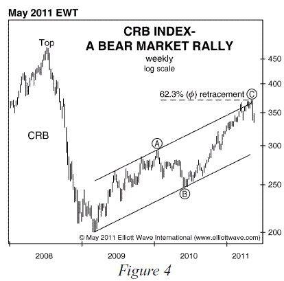
(Robert Prechter, July 2013 Elliott Wave Theorist)

The CRB index of commodities has been losing ground for more than two years, as shown in Figure 3. Notice the four short arrows on the chart. Based on their positions, you might think they would mark the timing of accurate sell signals generated by a secret indicator. But there’s no secret indicator. These happen to be the times at which the Fed launched its inflationary QE programs!

AFFA-CRBIndexFig3-1

Investors almost universally take news at face value rather than paradoxically as they should. So they believed the Fed’s QE actions would be bullish for commodities. But — ironically yet naturally — every launch of a new QE program provided an opportunity to sell commodities near a high.

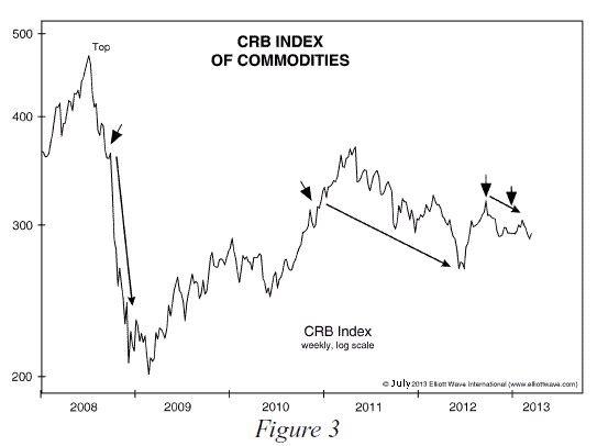
The first time the Fed bought a slew of new assets (QE0) was in 2008, and commodities went straight down during the entire buying spree.

QE1 (see below) was just a swapping of assets, not new buying, so it wasn’t inflationary; ironically, commodities rose during this time.

AFFA-Fed-Res-2
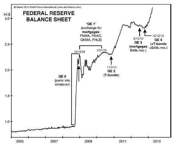
Are commodities just late and poised to soar? I don’t think so. Figure 4 shows a chart of the CRB index published in The Elliott Wave Theorist back in May 2011.
AFFA-CRBIndexFig4-3

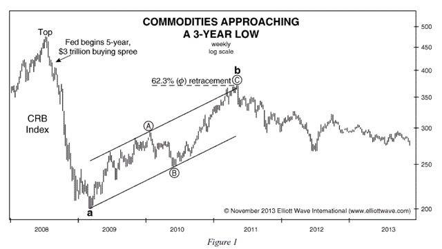
Prechter gave another update in his November 2013 Elliott Wave Theorist:

Commodities are in a bear market. Figure 1 proves that the Fed’s feverish quantitative easing (QE) — i.e. record fiat-money inflating — is not driving overall prices of goods higher.
AFFA-Comm-Low-4

Prechter’s final point from the November 2013 Elliott Wave Theorist summarizes it best:

None of the believers in omnipotent monetary authorities and their pledges to inflate saw any of those changes coming. Meanwhile, we couldn’t see how it could turn out any other way.

The largest inverted debt pyramid in the history of the world is the reason that QE won’t work. The future is already fully mortgaged.


15 Hand-Picked Charts to Help You See What’s Coming in the Markets
Prepare for 2014 with a complimentary issue of Robert Prechter’s Elliott Wave Theorist Have you ever seen price charts that tell a story clearly? Prechter chose 15 charts to explain to his subscribers where the financial markets are headed in 2014. They cover markets like the S&P 500, NASDAQ, the Dow, commodities, gold, and mutual funds. With this information, they are now prepared to be on the right side of the financial markets. You can be, too, because, in a rare opportunity, we can offer you a look at the whole issue — FREE.Prechter says that “charts tell the truth.” Here is your chance to see what truths these charts are telling. If a picture is worth a thousand words, then this latest publication is like reading more than 15,000 words of his market analysis.Get your FREE 10 page issue of Robert Prechter’s Theorist now >>

You might also enjoy:

  • Inflation and Commodity Prices
  • Falling Oil Prices: Worrying Trend or Saving Grace?
  • The Case For Hyper-Deflation
  • Inflation in the Real World
  • Why would Gold fall during an Investment Crisis?

Filed Under: Quantitative Easing Tagged With: money supply, QE, quantitative easing

Leave a Reply Cancel reply

Your email address will not be published. Required fields are marked *

This site uses Akismet to reduce spam. Learn how your comment data is processed.

Recent Posts

  • June Inflation Down Sharply
  • How Explosive Growth in AI Triggers Inflation
  • Warsh’s First FOMC: No Dot, No Guidance, and No Dovish Pivot
  • May Inflation Up to 4.25%
  • May 2026: BLS April Inflation

Subscribe Now

eTrends Signup Form

A Message from Our Editor

Eliminate Debt

Post Archives

Sponsored:

As a Seasoned Investor I thought I'd seen everything... But recently I discovered TradingView which has really improved the information I have at my fingertips.~ Tim McMahon, editor

TradingView gives me an edge... including powerful charting tools, real-time market data, and a global community of traders—all in one easy to use platform. It has hundreds of indicators, and even custom scripts for more advanced users, and you don't need to change Brokers just use its seamless brokerage integration... TradingView isn't just a charting tool—it's your full trading command center.

Trade smarter. Trade faster. Check Out TradingView for free.

----------

The Best Place to Buy Your Crypto

Coinbase is the largest Crypto Trading platform in the U.S. and the easiest to use. ~Tim McMahon, editor

Check out Coinbase here

Home | Articles | Sitemap | Terms of Service | Privacy | Disclaimer | Advertise With Us

Copyright © 1996-2026 · Capital Professional Services, LLC · Maintained by Design Synergy Studio · Admin

Do Not Sell My Personal Information