Chart Source- www.InflationData.com
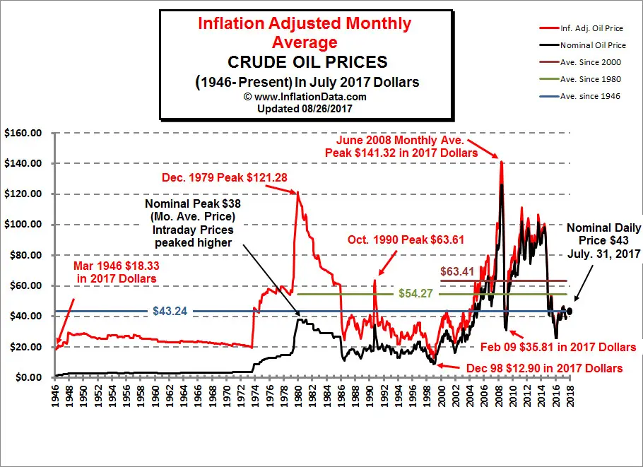
This Chart presents Monthly Average Crude Oil Prices in chart form. The red line on the chart below shows oil prices adjusted for inflation in May 2012 dollars. The black line indicates the nominal price (in other words the price you would have actually paid for a barrel of oil at the time). Read more about Oil Prices Chart. Crude Oil Prices in Table Form
Oil Price Chart (prints better in Landscape mode)
For more information see Annual Average Oil Prices in Table Form.